


THE SCREENSHOT TOPIC RETURNS
Posts

author=Clareain_Christopher

I've noticed that you are obsessed with symmetry in your maps. Make furnishings and decorations a little more asymmetrical, it will lend a bit of realism to your maps.

Er, greyscale. I definitely meant greyscale.
So I got one of the cutscene animations done. This is what your typical cut scene will look like. This is not a battle animation, it's in the overworld map, and done with a (ton of) series of picture commands using separate 3D rendered images.
@Tau and Nevermore: Thanks for the feedback, yeah it can look like that at times, indexing colors will do that unfortunately.
@Orias: Thank you very much! I think you and I may be the only two people who like that portrait =]
@Clareain_Christopher: I'm enjoying your screenshot man, it's got a nice tropical vibe to it yet still feels traditional Japanese.
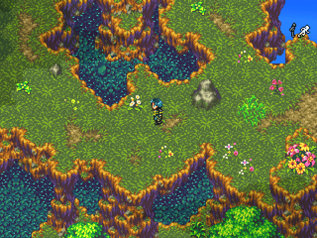
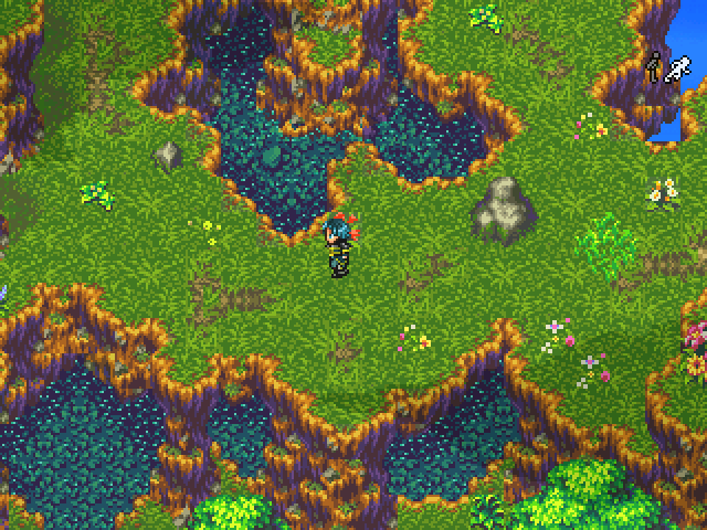
Just two more for now, new location from Eden Gate.

-Enjoying the quite life

-Traversing the kingdom on my mount.
@Orias: Thank you very much! I think you and I may be the only two people who like that portrait =]
@Clareain_Christopher: I'm enjoying your screenshot man, it's got a nice tropical vibe to it yet still feels traditional Japanese.
Just two more for now, new location from Eden Gate.
-Enjoying the quite life
-Traversing the kingdom on my mount.
@Lotus_Games
<3 that sheep.
Wonder how large that city will be? Either way,
I'm enjoying the maps and want to play through 'em.
<3 that sheep.
Wonder how large that city will be? Either way,
I'm enjoying the maps and want to play through 'em.

@Bloodrose - Very fluid, and the model is quite detailed. I like it!
@Lotus - That looks excellent man, truly!
(Old)
(New)
New recolor look better or.. ?
@Lotus - That looks excellent man, truly!
(Old)
(New)
New recolor look better or.. ?
LockeZ

I'd really like to get rid of LockeZ. His play style is way too unpredictable. He's always like this too. If he ran a country, he'd just kill and imprison people at random until crime stopped.
5958
Well, the new color of the grass matches the trees, leafy flowers and tall grass match better than the old one did. If you got rid of the doodads (or lowered the saturation of the ones in the top screen) either one would look equally fine, it's just a matter of how vibrant and lively you want your game to feel.
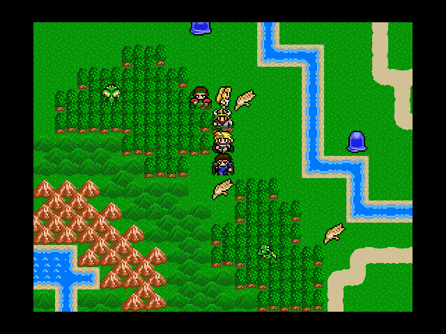
Just showing off how I wanted to make the world a little more dynamic/not so static in Centuria.
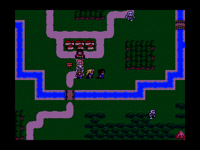
Arriving outside of Brooktown on a nice sunny day and all is well (except the random monsters running around)!
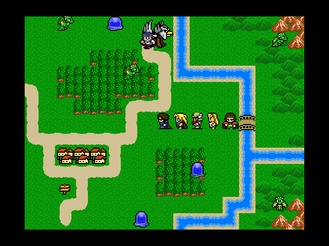
Until the people of Brooktown reveal that they are lazy and wimpy, asking you to go collect the wheat in their fields for them because they are afraid of the basilisks and slimes.
After rescuing animals from goblins in a dungeon for the people of Brooktown, you are instructed to collect ingredients to make Baa-Mojo so that the sheep will have sex (this really happens). What do you need to collect? Mold. From skeletons. At night.
Arriving outside of Brooktown on a nice sunny day and all is well (except the random monsters running around)!
Until the people of Brooktown reveal that they are lazy and wimpy, asking you to go collect the wheat in their fields for them because they are afraid of the basilisks and slimes.
After rescuing animals from goblins in a dungeon for the people of Brooktown, you are instructed to collect ingredients to make Baa-Mojo so that the sheep will have sex (this really happens). What do you need to collect? Mold. From skeletons. At night.

@Tau - The old one looks so much better.
@UPRC - Looks great, but my only problem is the sprite for the towns/sign. I'm not sure if those sprites are custom or not, but for some reason the lack of shading on them compared to the characters, mountains and trees bugs me.
@UPRC - Looks great, but my only problem is the sprite for the towns/sign. I'm not sure if those sprites are custom or not, but for some reason the lack of shading on them compared to the characters, mountains and trees bugs me.
Everything in those screenshots is ripped and edited to some extent (except the grass and water, those are mine). From a graphical perspective, the game is a cross between NES and SNES (all tiles are NES era, all characters are NES or early SNES era). There's absolutely nothing in Centuria that will make anyone go, "That looks awesome!"
The roads and water are also one colour (though the water has ripples) and grass is one colour with a bunch of lighter dots. So yeah, there is some stuff that isn't very detailed.
The roads and water are also one colour (though the water has ripples) and grass is one colour with a bunch of lighter dots. So yeah, there is some stuff that isn't very detailed.
@Clareain_Christopher: Haha thanks again, you'll enjoy some of the other mounts if you like that one =] This city/kingdom is one of the bigger ones in the game, it's a total of 4 1280X960 maps so it's pretty big! It'll be the central hub for many of your activities and a great location to take a break from all the dungeon crawling, monster hunting, and level grinding... you'll get to shop for accessories, purchase pets, buy mounts to travel on, race on a circuit, and even buy and decorate your own house so there is a fair bit to do here =] I'll have the game done around end of the year is what I am going for, maybe you'd be interested in beta testing if you want to play it earlier =]
@Tau: Thanks so much! As for your images I like the newer one better it appears to be more vibrant where the old image is a bit dulled down with the grass.
@UPRC: I love the retro feel and the dynamic world map sounds very interesting, can't wait to see it in action!
@Tau: Thanks so much! As for your images I like the newer one better it appears to be more vibrant where the old image is a bit dulled down with the grass.
@UPRC: I love the retro feel and the dynamic world map sounds very interesting, can't wait to see it in action!
@Lotus_Games
I thought my 145 by 180 no-lag map was an achievement ;.;
Also, if you want beta testing, I could do so and release beta videos of it.
@Tau
I'm more of the 'color' guy, so I like the newer piece better.
I guess it's a matter of how you want the map to look, or how cloudy it is on THAT map. Either way could probably work IMO.
Haha that is an achievement, actually my maps are 1280X960 pixels not tiles...in terms of tiles that's about 80X60. I'd love to collaborate with you on those beta videos, I look forward to working with you!

@Tau- I believe the hero stands out more amongst the darker grass, I like the brighter color much better.
I love the vibrant feel to it, over the "musty" feel of the original.
And yeah, not sure how the clouds are in the map, so I can't really comment on some of the plants looking darker, that's probably just the clouds moving overhead.
I love the vibrant feel to it, over the "musty" feel of the original.
And yeah, not sure how the clouds are in the map, so I can't really comment on some of the plants looking darker, that's probably just the clouds moving overhead.

@Lotus: I always like to see some progress, the maps are nice as usual but Im not a fan of the Avatar.
@Tau: The world maps' nice buddy, I read your update and I hope you just keep up the good work. Games maturing in terms of graphical design.
@Tau: The world maps' nice buddy, I read your update and I hope you just keep up the good work. Games maturing in terms of graphical design.


I finished the small desert where the mechanic that will build the miner armor suit will be located. I am happy how the sand and lava came out, but I might change the stairs with dunes.
The town now has npcs, all custom sprites that look like the old dragon quest sprites, in the same style. Yawn. Also, Gravel has been introduced.
The style is definitely style that you've got going on there facesforce, but I don't quite like the tree in the second screenshot. It reminds me of RPG Maker 2000's RTP water tile. I'd suggest trying to make it look more "leafy" if you can.
@Everyone - Thanks guys, I went with more vivid version then the old one.
@UPRC - That world map looks so.. busy. Maybe too much though? I don't know.
@facesforce - Pretty much what UPRC said actually. I had something but that kinda sums it up.
Some more changes to DT.. Boats!
@UPRC - That world map looks so.. busy. Maybe too much though? I don't know.
@facesforce - Pretty much what UPRC said actually. I had something but that kinda sums it up.
Some more changes to DT.. Boats!


