THE SCREENSHOT TOPIC RETURNS
Posts
This map took me around 2-3 days of hard work, but it's become one of, if not my best map so far. This is the underground prison beneath Gesallia Kingdom which will be rather extensive beyond this. Also, the reason for the highly noticeable lines making it seem like a folded piece of paper, and cut off of a few tiles..well, it's a problem with the map saver script I'm using, which can't be fixed as far as I'm aware. Other than that, what do you all think of it? :)


Nice. The only issue I have is that the stairs to the right should probably be made of stone as wood sticks out too much when everything else is stone-made. Also, recolouring those spikes to match either the floor or walls would be a good idea, since they naturally grow out of the same materials as the rest of the cave. Otherwise, good work.
Damn Sana! I like it. Especially the bloody bits and the dark water.
Although I can't help to think how much better it would look without those lines, couldn't you just screenshot and piece them together? It's hard to enjoy it as a whole.
Also, this is nitpicking, but wouldn't prisoners have like rags rather than their fancy clothes they had on at the time?
Ignore this though, that's probably a lot of extra work.
author=LibertyThe stairs are actually stone, lol but I'll recolor 'em to make it look less wood-like~ (Also the spikes)
Nice. The only issue I have is that the stairs to the right should probably be made of stone as wood sticks out too much when everything else is stone-made. Also, recolouring those spikes to match either the floor or walls would be a good idea, since they naturally grow out of the same materials as the rest of the cave. Otherwise, good work.
author=InfectionFilesIt's much faster just doing the crap line method and despite it being faulty it gets most of the area in it. Ah, and about the prisoner clothes..lol going by a few famous video game jail scenes (such as Final Fantasy VII, and Chrono Trigger) they still had their regular clothes on. Two of the characters have tattered clothes, such as the dude on the bench, and the cloaked guy facing the wall. :)
Damn Sana! I like it. Especially the bloody bits and the dark water.
Although I can't help to think how much better it would look without those lines, couldn't you just screenshot and piece them together? It's hard to enjoy it as a whole.
Also, this is nitpicking, but wouldn't prisoners have like rags rather than their fancy clothes they had on at the time?
Ignore this though, that's probably a lot of extra work.
Nice shot Sana, the pillar to the left of the bridge is missing its top however. Also try playing around with shadows they can go a long way in making your map pop out and look even more interesting.
author=Lotus_GamesYeah, I'm still delving more into photoshop's tools so I can do a little blending and stuff on the layers, and shadows. Lol, I did mention in my first post that the lines cut off several tiles, so it's there..just not visible in the screenie.. :p
Nice shot Sana, the pillar to the left of the bridge is missing its top however. Also try playing around with shadows they can go a long way in making your map pop out and look even more interesting.
LockeZ

I'd really like to get rid of LockeZ. His play style is way too unpredictable. He's always like this too. If he ran a country, he'd just kill and imprison people at random until crime stopped.
5958
If you took screenshots yourself and painstakingly assembled them in Photoshop, you could fix the misaligned tiles, but you couldn't fix the misaligned fog. So it's seriously not even worth it. It's just a screenshot, not the real game, we can imagine what it looks like in game from that.
I'm actually okay with the idea of prisoners keeping their own clothes; this is common practice in temporary jails, and also it's probably helpful for important characters to not change their appearances so that players will recognize them. I feel like the prisoner in full armor is over the line though, unless the player just watched the enemies capture him five minutes ago. Can his sprite be changed to someone with normal clothes?
The map itself is quite nice overall. Engraven angelic pillars in a cave are pretty strange, which makes me assume this isn't just a random orc den, and that the jail is run by some kind of high-class organization. Only mapping issue that strikes me as odd is that the ground, walls, and stalagmites seem to be made of three different kinds of rock. Can you recolor them all to that same shade of teal? The stalagmites are the most noticably different.

Ok, I admit: this menu design is totally lame, but it's functional.
Character development of my main character Laura will realized by a big puzzle board.
It's a mix of Final Fantasy X Sphere Grid and Final Fantasy XII License Board
For every Level Up you get one of three different colored puzzle pieces. Yellow for the beginning, green for advanced progression and red for the end game. The four directions of the board represent the stats Attack, Defense, Magic and Speed. Occasionally you will discover a hidden blue field below a usual field where you can fill a blue puzzle piece and learn a new tech.
If you have any suggestions how to improve my design, especially in conjunction with the overall Puzzle theme, let me know!
The Puzzle theme is an incredible idea with pretty much endless possibilities.
Do you have different shape puzzle pieces? One idea would be to have different shaped puzzle pieces that add stats, but the player can only use them if they fit into the puzzle they're already building. So a player could be potentially sitting on a bunch of stat bonuses but if they put the pieces together poorly, they won't be able to use them.
Do you have different shape puzzle pieces? One idea would be to have different shaped puzzle pieces that add stats, but the player can only use them if they fit into the puzzle they're already building. So a player could be potentially sitting on a bunch of stat bonuses but if they put the pieces together poorly, they won't be able to use them.
Sana, there are some contrast issues people have noted, but that's a fantastic map. It looks both fun and easy to navigate, and is quite gorgeous. Mad props.
Itaju, it might not be pretty but it definitely is easy to read and seems like it'd be easy to understand in-game. The cursor doesn't stick out well against the yellow, though, unless it blinks in-game?
Itaju, it might not be pretty but it definitely is easy to read and seems like it'd be easy to understand in-game. The cursor doesn't stick out well against the yellow, though, unless it blinks in-game?
Wow, Itaju. This project is showing a lot of potential for sure. We have too few games which provide an interesting level up scheme. Do keep us updated.
@LockeZ:
I think that generally speaking the graphics of your game is improving. It used to be heterogenous before, with different elements picked here and there and assembled together.
It's much more harmonious now.
I think the barrels are too tall though, compared to the charset that is and the other elements of the map.
Also, have you given up on spriting? I remember you posting an attempt in the creation forum if I remember correctly. Because spriting your own sprites would certainly help give more personality to your project.

I pimped my menu design A LOT.
Faces are temporary and don't represent my heroine at all (it's Emma Watson to be more specific. :D )
@tpasmall: i considered having different shaped pieces but that would be too complicated to script and too complicated to play out.
LockeZ

I'd really like to get rid of LockeZ. His play style is way too unpredictable. He's always like this too. If he ran a country, he'd just kill and imprison people at random until crime stopped.
5958
@Itaju: I don't like the dark yellow background color behind the menu on the left, but I love the menu itself. I do feel like the text on the character profiles is too big. A little whitespace would be appreciated there, so it doesn't all run together. What's that in the background behind the middle portrait?
Thanks for the feedback. Good to hear about the graphics matching better. It's definitely an issue I've been working on, I wasn't sure if it was something anyone but me would be able to tell the difference though. I'll see if I can work on the barrels.
I am still trying to sprite at least some of my own stuff, and am forced to do so for the battle characters, but I am using the RMXP scale for the characters. I think everyone in the video except the colonel is just a frankensprite, but I am having to do most of their battle poses myself (a couple people helped me with a couple but that didn't last long). I'd love to roll my own 100% original sprites, but with all these battle poses holy shit sprites are already so much work and I keep getting sick of editing then and going back to working on my text-based game. But that's terrible and I get what you're saying.
author=Creation
@LockeZ:
I think that generally speaking the graphics of your game is improving. It used to be heterogenous before, with different elements picked here and there and assembled together.
It's much more harmonious now.
I think the barrels are too tall though, compared to the charset that is and the other elements of the map.
Also, have you given up on spriting? I remember you posting an attempt in the creation forum if I remember correctly. Because spriting your own sprites would certainly help give more personality to your project.
Thanks for the feedback. Good to hear about the graphics matching better. It's definitely an issue I've been working on, I wasn't sure if it was something anyone but me would be able to tell the difference though. I'll see if I can work on the barrels.
I am still trying to sprite at least some of my own stuff, and am forced to do so for the battle characters, but I am using the RMXP scale for the characters. I think everyone in the video except the colonel is just a frankensprite, but I am having to do most of their battle poses myself (a couple people helped me with a couple but that didn't last long). I'd love to roll my own 100% original sprites, but with all these battle poses holy shit sprites are already so much work and I keep getting sick of editing then and going back to working on my text-based game. But that's terrible and I get what you're saying.
Yes, I know what you mean about the spriting. This is also how I started, frankenspriting. Then, I copied the Earthbound style and slowly but surely started to create stuff from photographs instead of from other sprites.
I guess it depends what you are looking for. I'm personally not a big fan of the short legs in the RMXP charsets with the giant eyes, I find it difficult to make a ''serious'' game themed game with those guys. But then again, as I recalled, your game had funny moments so that might work out after all.
I guess it depends what you are looking for. I'm personally not a big fan of the short legs in the RMXP charsets with the giant eyes, I find it difficult to make a ''serious'' game themed game with those guys. But then again, as I recalled, your game had funny moments so that might work out after all.
I hate it when I can work on my project only a couple hours in a week... *sigh*
Oh well, here’s an updated picture of the cast (or at least part of them).
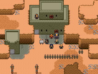
Oh well, here’s an updated picture of the cast (or at least part of them).

author=LockeZ
@Itaju: What's that in the background behind the middle portrait?
That's the puzzle board you saw in the screenshot before. It's so important that it's always seen in the background of my menu.
Here another screen of the status menu.

Note the navigation tree structure in the upper left corner.
The puzzle piece to the right of the picture indicates that there is a puzzle piece to spend.
The stats you see are separated into primary stats (left) and secondary stats (right). Primary stats influence the respective secondary stats to the right.
This way any point spent in any primary stat also influences the other play styles.
Any point spent in Attack (physical damage) raises damage coefficient of critical hits by 5% which influences both physical and magic damage.
Defense increases Regeneration (Heal over Time) while speed raises both offense and defense by accelerating Tech Charge but also speeding up Hit Recovery and raising Evasion (complete negation of damage).
Itaju: I like the menu, but why not move the puzzle piece that indicates pieces to spend, on the left side where all that blank space is? It'd make it look cleaner and neater.
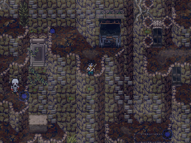
KoG: Neato~ Love that skeleton panicking to the left of the last screen. Why not add shadow to the text so it pops out a bit more from the text box? Mapping is great as usual, the the mix of different bits in the second screen is a little off-putting. That last screen is nice, though. :D
KoG: Neato~ Love that skeleton panicking to the left of the last screen. Why not add shadow to the text so it pops out a bit more from the text box? Mapping is great as usual, the the mix of different bits in the second screen is a little off-putting. That last screen is nice, though. :D


