


THE SCREENSHOT TOPIC RETURNS
Posts


Changed the palette a bit.
The three enemies are fully able to attack and move and stuff. The system supports up to 5 but the 5th is still causing some problems (maybe copied something wrong or I don't know).

I think it looks fine, except for the fact that one could mistake them for cyan pebbles.

author=Scalytank
This water looks good :)
Those leafs are falling like a "weather" effect, right?
You got it ;) check the vid some pages before to see it in motion.

I love this, automn, the barrier and the water (just a detail really but in automn wouldn't the river be rather swollen?).
@Itaju
Me being a nitpicker.
The color for the underwater grass/dirt is a little too grey. It looks a lot like gravel.
Me being a nitpicker.
The color for the underwater grass/dirt is a little too grey. It looks a lot like gravel.
author=Dyhalto
@Itaju
Me being a nitpicker.
The color for the underwater grass/dirt is a little too grey. It looks a lot like gravel.
that's what it is :)

Itaju, there are some major issues with your tiles from a pixel art perspective, most of which have to do with noise, saturation, and readability.
1.)Because the tiles are noisy/grainy (MnB/Refmap pulled this off successfully so maybe reference them) it hurts the readability. The high contrast also upsets the hierarchy of visual priority. If your floor tiles (grass, dirt, long grass) were less saturated and had less variation between color, it would start to look more like a solid plane that the sprites are interacting on, and we would be able to see the sprites more clearly.
I think if you took a more holistic approach to the rendering of your forms, you'd get a much more organic look. When you look at a tree you don't internalize every leaf that its branches consist of, rather you get impressions of clusters of leafs. Remember, this is pixel art, and relatively low res, so imitating how our eyes interpret shapes combined with the cluster loving form of pixel art, makes sense. Same thing applies to that water and probably the grass/bush auto-tile.
2.)In addition to the oversaturation of your colors, you're also using a lot of straight color ramps, so the colors give a flat/dull impression overall. If you employed some hue shifting, you might get more dynamic 3Dimensional look. (SD3 does this all the time, and I can tell you're copying SD3 tiles, which is fine, there's a lot to learn from them, and part of that is understanding how they applied colors effectively.)
The trees are an example of how this current style is detrimental. In the river scene I can't tell where the tree begins and ends, because it's flooded with a bunch of different colors, and the green blends into the grass behind it. This is what I mean by graphical priority. The 2nd layer of a chipset should be easily distinguished from the first layer, that is, using a different green ramp for trees so we can readily tell the layers/objects apart. Also when you use such vibrant yellows and reds, it forces our eyes to want to look at it, when we should be looking at the sprites.
I hope this is helpful and will clarify anything if you need me too, but it's one of the most important/fundamental lessons I've learned in my tribulations through pixel art.
LockeZ

I'd really like to get rid of LockeZ. His play style is way too unpredictable. He's always like this too. If he ran a country, he'd just kill and imprison people at random until crime stopped.
5958
Lord Justice, ruthless dictator, holds an important cabinet meeting. To keep his cabinet's attention, he has strapped them all, including himself, to a live intercontinental ballistic missile for the duration of the meeting.
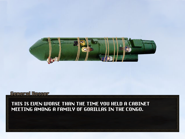

LockeZ, is that a setup for a scene in Family Guy? (I do love your mix of XP and photographs: they mix together really well!)
Itaju, just to confuse your opinion further, I liked the feel of the water before. Everything in the world looks like it's made of colourful little circles, so the water looks a little less impressive now. I dunno, it's probably just me being annoying and swaying your opinion.
Itaju, just to confuse your opinion further, I liked the feel of the water before. Everything in the world looks like it's made of colourful little circles, so the water looks a little less impressive now. I dunno, it's probably just me being annoying and swaying your opinion.

These are 3 screenshots from the game I 'm working on, it 's currently in demo stage. I don't know why it is still pending, so if any mods are here, can you approve it ? :D


LockeZ
I'd really like to get rid of LockeZ. His play style is way too unpredictable. He's always like this too. If he ran a country, he'd just kill and imprison people at random until crime stopped.
5958
author=Caz
LockeZ, is that a setup for a scene in Family Guy? (I do love your mix of XP and photographs: they mix together really well!)
My tilesets are based on photos too, for the most part, with some exceptions. One day I'll replace the exceptions. Ultimate goal is to get rid of everything that clashes with the photographs, except for the sprites, which will stay.
@Mr_Detective: On that top screenshot, what the heck is up with the white area near the top? It looks like a wall, except you have people and tables and objects on it as if it were part of the floor. (Also you misspelled "off") Meanwhile I can't see anything in the last screenshot because of the spell animation, but I can see enough to tell that your top bars have two numbers overlapping each-other, which is unreadable. But maybe that's also part of the spell animation, the numbers are in the process of changing or something. Try getting a better screenshot to replace that one, maybe one of a spell that doesn't make everything on screen impossible to see.
On the first one, that white part was supposed to be a higher floor. I don't know how you can look it as a wall, since it didn't seem hard to tell...
I also posted that image on many places, and so far nobody said anything was wrong.
Darn it... Thanks for correcting me.
You are right, there were actually 2 more enemies behind, thus making the numbers overlapping another. I'll fix that in the full game.
I also posted that image on many places, and so far nobody said anything was wrong.
(Also you misspelled "off")
Darn it... Thanks for correcting me.
Meanwhile I can't see anything in the last screenshot because of the spell animation, but I can see enough to tell that your top bars have two numbers overlapping each-other, which is unreadable.
You are right, there were actually 2 more enemies behind, thus making the numbers overlapping another. I'll fix that in the full game.
LockeZ
I'd really like to get rid of LockeZ. His play style is way too unpredictable. He's always like this too. If he ran a country, he'd just kill and imprison people at random until crime stopped.
5958
If it's a slightly raised floor, that makes sense, I think it just looks a lot like a modern indoor wall tile I'm used to seeing in a lot of other games. However, if that's the case, I assume that gray shadow near the bottom is the vertical step up? In that case you should move the table up about six pixels, it's hanging off the side. It's sort of a big open empty platform, I'm not sure why a classroom would have a huge open space like that, usually they are pretty compact.
Isn't there a north-facing chair tile in VX Ace that looks like the person is actually sitting in it? Hmm. Maybe there isn't. You could probably make one with ease, though, it's just a matter of moving the chair down half a tile and setting it to height 1, and maybe deleting the legs of the character. It's not super necessary since tons of games do it the way you do and so the player's brain goes "oh, this engine has kind of limited graphics" instead of "oh, that's dumb." But it's one of those little things that would make you stand out a bit.
Isn't there a north-facing chair tile in VX Ace that looks like the person is actually sitting in it? Hmm. Maybe there isn't. You could probably make one with ease, though, it's just a matter of moving the chair down half a tile and setting it to height 1, and maybe deleting the legs of the character. It's not super necessary since tons of games do it the way you do and so the player's brain goes "oh, this engine has kind of limited graphics" instead of "oh, that's dumb." But it's one of those little things that would make you stand out a bit.

