


THE SCREENSHOT TOPIC RETURNS
Posts

author=Craze
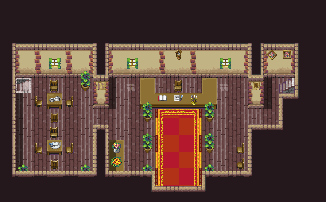
it's like somebody took a photo of spilled strawberry syrup on the ground and then it was horribly resized for rpgmaker
EDIT: sorry (not really) you're probably trying to be "dark" and "edgy" or something but that looks horrible
Your insight is astounding. Thank you.
LockeZ

I'd really like to get rid of LockeZ. His play style is way too unpredictable. He's always like this too. If he ran a country, he'd just kill and imprison people at random until crime stopped.
5958
Well, he's right. The ground does not look like ground, and does not even look like anything at all. The discoloration on it is horrible, like someone took a photograph and used MS Paint to change it to a 256 color image, and it lost all but four colors in the process. The edges of the platform look like the platform is two-dimensional and made of torn paper. The wall and energy beams are pixel art, while the bug-people are some kind of painting that was put through a photoshop filter.
On top of all that, if you replace the textures and objects with ones that look decent, the map is still totally boring and empty. Literally the only thing in it is that gate, otherwise it's just a random illogical corridor with absolutely nothing of interest.
It's not as bad Noacceptance772's work, I guess. It's close. You could get there if you wanted, it wouldn't be a lot of work. Stretch the player sprite out disproportionately to 2x its current height and 4.6x its current width, and add a menu with purple text on a speckled tan background that uses like fifteen different fonts.
That comment was a bit more helpful, thanks. I'll see what I can do. Although in my defense, downsizing it did make it seem a bit clunky. Still, it could use work.

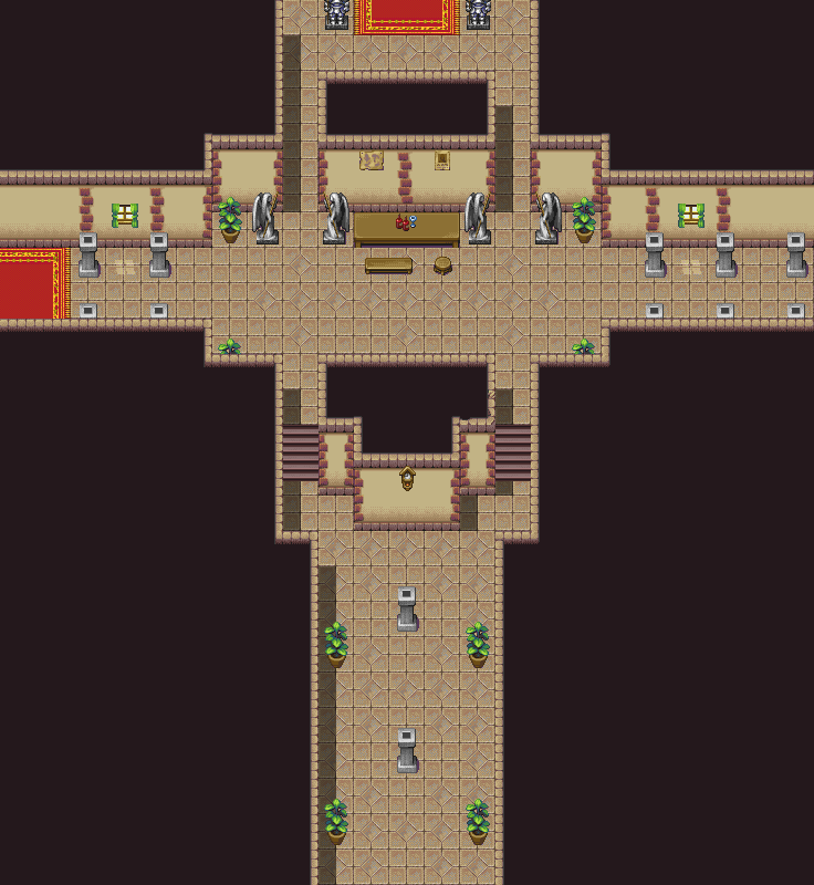
Did some more work on the house. I reduced the size of the rooms. I should note that this is a fairly well-off merchant's house that 11 people live in, so the average household probably isn't the best baseline.


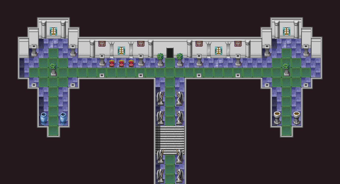
@Lotus_Games : I absolutely adore those screens : it's fresh, fun and so incredibly dreamy.
@JosephSeraph : like those very strazight RTP combined with a rather complex background, particularly the bottom one.
@SnowOwl : Everybody his/her taste I guess, I'm quite impressed with the screenshot, in particularly those two larvas on each side of the (electric?) fence with their respective matrice behind them. Interesting.
@Alichains : looking much better, really good actually.
More pictures of the house. This time the kitchen and the basement.

After seeing it in game, I realized that I should center it more and maybe take some tiles out on the side.

After seeing it in game, I realized that I should center it more and maybe take some tiles out on the side.
A collection of sample maps I made with the DS tiles. Most of these were made before the tiles were completed. There are a few lingering errors due to some hiccups during the tile arrangement process. Oh well!


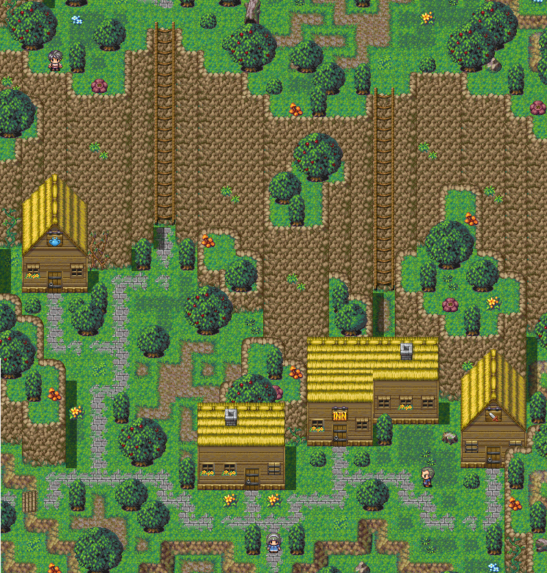


Really wish those tiles were painted instead of pixel art, but good looking resources nonetheless. I do like those sprites way better than the default ones. Their shape looks so much more proportionate.
@Chana: Thanks =] I had a lot of fun working with rtp again.
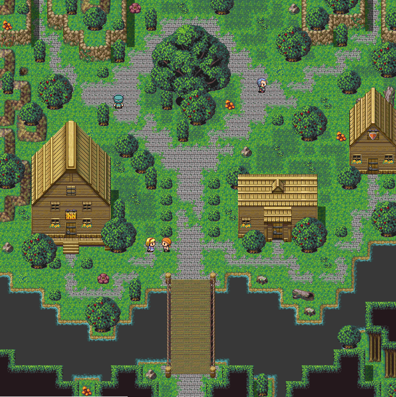
I've just gotten into studying pixel art and I'd like some feedback, critiques on my image below. I know I have a ways to go but I'd appreciate some guidance from those of you who draw pixel art.

I've just gotten into studying pixel art and I'd like some feedback, critiques on my image below. I know I have a ways to go but I'd appreciate some guidance from those of you who draw pixel art.
Hmm, well if you want some real feedback on this:
Te road is seeming to overlap the grass at the top. The grass under the road is fine, but you might want to change something about the rough cutoff, maybe put some pixels to make it look more like overlapping grass.
The trees seem a bit weird to, there is no ticker mass at the bas to indicate some roots and there are no branches or whatsover other than the top.
The grass poles you made are a nice touch, but you might want to change them with an actual structure.
You might want to try and get some diversity in the pine trees too.
Anyways, I'm not the best spriter myself, but that's what I can indicate to you, hope it helps =). I like how you worked with dimensions and perspective =).

We would call that NPA (not pixel art) because you're using all sorts of photoshop effects. (Gradients, smoothed lines, transparency, etc.) Traditional pixel art is all hand drawn, each pixel placed with purpose. The lines that are hand drawn are jaggy. The sea has some line-hugging banding when it fades to the sky. Also the colors make it look flat even with the forced perspective, because of the lack of contrast/variation in the pallet.
I do get a sort of cel-shaded wind waker vibe from it though. Is that what you're going for? There are some great examples of this on http://www.pixeljoint.com/ if so.
I do get a sort of cel-shaded wind waker vibe from it though. Is that what you're going for? There are some great examples of this on http://www.pixeljoint.com/ if so.
@Trujin: I appreciate the feedback, I'm not sure I understand what you mean in your first point but I agree that the trees could use more variety and perhaps more work on their base. The tree sprite actually has two branches though, I suppose because of the style and size they are hard to see.
@Corinthian: You're right I am using photoshop effects so I guess it is NPA as you say but I didn't use brushes for anything you see, they were all made using the pencil tool. I guess the pixel effect is lost with the gradients and the transparency with the clouds but I feel my clouds are weak right now so that was the only reason I chose to reduce their visibility. I agree with the forced perspective comment, it could use more work in terms of my color values but something important to note is I made this on my HD 32" monitor which has a wider range of color than my laptop and when I was making it I kept hue, saturation, and value in mind which is why it looks great on the 32" but when I viewed my post on my laptop which does not display as many colors, my pixel art became more flat. That could be why it appears that way to you but I realize I have to work for all monitors so I'll adjust those colors even more. Finally aside from the gradients, the rest of the image is pixel art with each pixel considered. I think the smoothing effect you see is the anti-aliasing effect I went for but maybe it's too much anti-aliasing? I'm not going for the cell-shaded look, I can see where you are coming from but I think it's because the image is a relatively flat landscape with minimal texturing applied. I was going for a more modern retro style and minimalist approach with this piece.
I appreciate all the feed-back so far I'll continue to study up on it, if anyone has any more suggestions I'd love to hear them.
P.s. Thanks for the link KOG, I've actually looked into it already but it's nice to re-visit =]
By the way if there are serious/interested pixel artists looking for inspiration, I ran into this guy...Paul Robertson's work...it's very cool to check out!

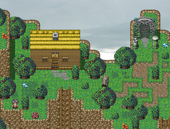
Deckiller, putting a bar on a cliff you can only access with a ladder looks like a sure-fire way to rapidly decrease the town's population.

@Lotus: Yea, Paul Robertson does some crazy, beautiful stuff. I remember first seeing Pirate Baby Cabana Battle Street Fight 2006 a long time ago and wishing it was a real game.
Thanks to advances in the fields of science and camera technology, we are able to bring to you today's presentation: a moving picture-show!
This is what I've been goofing around with for the past few days (between feverishly finishing my webdev work). It's an RPG battle system written in Unity3D, and it's got splashes of FFX's Conditional-Turn-Based battles and Paper Mario's "Timed Hits". It's very work-in-progress, but I've got the groundwork laid for attack animations, Timed Hits, CTB, Status Effects, enemy AI, and randomly generated enemies. I have big plans for these battles in my next game :)
If I had my druthers my characters would backflip everywhere instead of walking.

author=slashphoenix
Stuff
There's always the Scott Pilgrim game...
And you building a battle system from scratch has actually interested me. I'm actually curious to see what you'll end up doing with it. Probably because I can see myself having to do the same in the future eventually. Most of my possible RPG projects seem possible to do well in an RPG Maker engine, but the mecha game might require some scratch built stuff.
Well if I can keep up the pace I'm going at, hopefully I can show you some more at the end of the weekend or next week. The battles are honestly not terribly original on their own - they're a simple a mash-up of FFX and Paper Mario - but the way they will be tied into the exploration should add a lot of variability, mystery and charm.
Anyway, I can't say much about RM since I haven't used it since I was horribly butchering RPG2k3 with mods, but VX or ACE seem to have a lot of scripting potential. I use Unity because I've been working with it for two years now and I'm really comfortable with it, but I love it because I can make it do anything I want it to now, with few limits.
Anyway, I can't say much about RM since I haven't used it since I was horribly butchering RPG2k3 with mods, but VX or ACE seem to have a lot of scripting potential. I use Unity because I've been working with it for two years now and I'm really comfortable with it, but I love it because I can make it do anything I want it to now, with few limits.

author=Craze
Deckiller, putting a bar on a cliff you can only access with a ladder looks like a sure-fire way to rapidly decrease the town's population.
Genius observation.
Yes, Ace does have a lot of scripting potential. However, what troubles me is that the mecha game may require me to make layered sprites. It's okay to have handheld weapons not showing in battle when not attacking, but back mounted weapons are going to be trouble. I'll need to set up points of connection in the sprites so the game knows where to draw the weapon relative to the main body. I guess I could make all the mechs the exact same size and move in the exact same way and do something like Victor's Visual Equips script but for battlers. I'd like to have some size variation in the mechs, but that seems impossible right now.


