


THE SCREENSHOT TOPIC RETURNS
Posts
The town mayor hates alcoholics but since every RPG town has to have a bar he decided to put one in such a dangerous location ;)

Craze: Personally I'd edit the tile set so that the paintings hang lower on the walls. Seems like they're cutting into the ceiling trim and the comparison to the window height is even stranger. Also seems like shelf units should be scooted up a half tile. But again it's a tileset thing and not your mapping. Otherwise looks good to me.
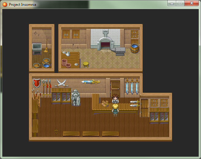
So finally mapped out my blacksmith/weapon shop. Didn't have an anvil so I had to draw it from scratch. I'm not a pixel artist, but I think it came out alright. I may try making a hammer to sit on top next. Also edited the barrel to contain water. I like my shops to be more cluttered than this, but all the weapon graphics are meant to face towards the player-- which makes it difficult to fill up the foreground with anything except the tops of display cabinets.
So finally mapped out my blacksmith/weapon shop. Didn't have an anvil so I had to draw it from scratch. I'm not a pixel artist, but I think it came out alright. I may try making a hammer to sit on top next. Also edited the barrel to contain water. I like my shops to be more cluttered than this, but all the weapon graphics are meant to face towards the player-- which makes it difficult to fill up the foreground with anything except the tops of display cabinets.
Looks nice! I'd add a shadow under the anvil to match the other objects on the map. Also if you want to clutter the map even more try adding a double ceiling instead of just a single, on the lower room, try playing around with rugs to break up the wooden panels that fills it up, try adding a fire in the fireplace and overlaying some subtle lighting effects to give the room more ambiance, finally try adding some extra objects like plants and floral life in your maps...they can add to color contrast and make you're maps look more alive and interesting. An extra thing you could do is add more npcs that come and go in your maps to make them look more busy and to add more life. So in this case the npcs would enter through the door, look around, maybe shop at the front desk or maybe just leave and repeat with different events.
LockeZ

I'd really like to get rid of LockeZ. His play style is way too unpredictable. He's always like this too. If he ran a country, he'd just kill and imprison people at random until crime stopped.
5958
Daria: The tileset was not imported correctly - the shadows are not semitransparent. Move those two swords on the counter down about five pixels, they'll fit on the counter then. The anvil looks really good, if you hadn't told me I would have assumed it came with the tileset. It's a good shop, I like it.
Craze: Aside from Daria's point about the paintings, that looks quite good, keep doing what you're doing. You make good real maps when you try, it makes me sad when you make copout maps of winding glass platforms in outer space and towers with labyrinths of forests inside them. ;_;
Craze: Aside from Daria's point about the paintings, that looks quite good, keep doing what you're doing. You make good real maps when you try, it makes me sad when you make copout maps of winding glass platforms in outer space and towers with labyrinths of forests inside them. ;_;
Lockez: Actually they are transparent, but I need to lower the transparency (And make them less bright!). It's currently set to like 75% but since all my town interiors use one giant tileset I wasn't going to bother fixing it until I was done mapping. As it is I keep going back and adding items here and there. Thanks though. (:
Lotus: Oh there will be lighting. But this is one map in a queue of 39 others.
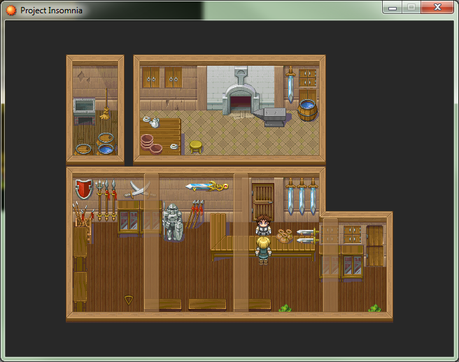
Note taken about the anvil shadows. Guess I forgot to draw it. Not sure what you mean by double ceiling, but it gives me an idea. Maybe some transparent ceiling beams? *runs off to experiment!*
Lotus: Oh there will be lighting. But this is one map in a queue of 39 others.
Note taken about the anvil shadows. Guess I forgot to draw it. Not sure what you mean by double ceiling, but it gives me an idea. Maybe some transparent ceiling beams? *runs off to experiment!*

LockeZ
towers with labyrinths of forests inside them. ;_;
probably shouldn't tell you that this is the second optional dungeon

Daria: Yeah, I should probably move the paintings down, huh...
EDIT: damn shadow pen error, consider the shadows over the stream fixed

Thanks!
I shall look into most of those perspective problems.
About the picture it actually accepted blending (I was using this awesome plugin: http://rpgmaker.net/engines/rm2k3/utilities/11/)
But it started causing bugs and I'm without internet, can't report 'em)
But I think I'll quit using overlay effects)
hose are very early WIPs, I'll adapt every tile to work on this perspective ^^
And I like that perspective better. =D
Oh... New Yume Nikki clone in the making! =A=
Some bad stuff happened and I wanted to release stress, so:


@Daria, I personally think the ceiling would look cooler if it were black. I mean, since it doesn't get to be lit; most games do ceilings this way. =D
I shall look into most of those perspective problems.
About the picture it actually accepted blending (I was using this awesome plugin: http://rpgmaker.net/engines/rm2k3/utilities/11/)
But it started causing bugs and I'm without internet, can't report 'em)
But I think I'll quit using overlay effects)
hose are very early WIPs, I'll adapt every tile to work on this perspective ^^
And I like that perspective better. =D
Oh... New Yume Nikki clone in the making! =A=
Some bad stuff happened and I wanted to release stress, so:
@Daria, I personally think the ceiling would look cooler if it were black. I mean, since it doesn't get to be lit; most games do ceilings this way. =D
JosephSeraph: I thought of making the beams darker, but the ceiling trim autotile is lit from above. Thought they ought to match color.
And OOooh... 8bit-ish graphics. I love the style, although I have no idea what's going on in the first map.
And OOooh... 8bit-ish graphics. I love the style, although I have no idea what's going on in the first map.

@Joseph: Removing the standard textbox was a brilliant move. It makes the words more natural and it doesn't have the "I'm in your face, bright blue, Please Read Me" factor that normal textboxes do, and I think that adds a lot given the atmosphere of your screenshots (and I assume your game).
LockeZ
I'd really like to get rid of LockeZ. His play style is way too unpredictable. He's always like this too. If he ran a country, he'd just kill and imprison people at random until crime stopped.
5958
Daria: If you have such strong shadows, make them black instead of gray. I think they will look a lot more natural. RMXP's shadows in the RTP tilesets are gray, but they're a lot more see-through than that, so it isn't as obvious. When they're that strong it looks bad. The ceiling thing is a little goofy, BUT it lets you make ceiling fans and ceiling lights, so maybe that makes up for it. Probably should make the beams match the thickness of the wooden edges of the black background?
SaferBroseph: I have no clue what all that crap filling the room is supposed to be, but the words "Yume Nikki Clone" tell me that it's probably not supposed to be anything and there's no meaning in any of it, and I should probably stop thinking so hard. But if you were trying to make it look like anything specific other than potted poinsettia flowers, you should probably redraw it.
SaferBroseph: I have no clue what all that crap filling the room is supposed to be, but the words "Yume Nikki Clone" tell me that it's probably not supposed to be anything and there's no meaning in any of it, and I should probably stop thinking so hard. But if you were trying to make it look like anything specific other than potted poinsettia flowers, you should probably redraw it.
Okay, okay. I fixed the shadows ya broken record. :P
And tried out the smaller beams, I dunno. Still can't decide if this technique is cool or stupid.
For easier comparison, here are all the screens again.
Small beams
Large beams
No beams
And tried out the smaller beams, I dunno. Still can't decide if this technique is cool or stupid.
For easier comparison, here are all the screens again.
Small beams
Large beams
No beams
:origin()/pre10/dff2/th/pre/i/2015/267/4/2/persona_5_mc_fanart__by_tri11-d9arw3g.jpg)
@Daria: I see someone already gave you feedback to make those beams smaller. I made an example map for you with the previous suggestions I gave you in mind. I couldn't find the chipset you used so I had to improvise and because I don't have xp or vx on my computer (though it looks like you might be using gamemaker?) I had to make the example map below using Photoshop.

So here are my suggestions:
1. Think about structure when you are making your maps. A support beam is going to be both vertically and horizontally connecting the ceilings to the walls.
2. Think about the real world when making your maps. You have no light source inside your map, it's fine during day time as natural light might come in through window cracks but what about night time? Your map would realistically go completely dark and make it impossible to see during lights out. In my example map, you can see I added two chandeliers on the table as well as fire in the section above.
3. What would happen if a person came from the outside into your shop? Your floors would probably get dirty. It's an added detail but you can see I added a straw mat near the entrance of the shop.
4. How would the shop keep/blacksmith get from the entrance to behind the counter? Does he hop over it everyday he comes in for work? That might make for interesting dialogue in game but more likely he would need a section of the counter open for him to pass through. You can see from my example map how I set this up.
5. Your storage room is closed off on all sides. How would a broom and sink even get there? How would the blacksmith or npcs get into this room? You can see from my example map I just added a door connecting the two sections.
Finally you can see what I did using my previous suggestions to you in mind. I used double ceilings rather than single to give more depth. There is a carpet/rug to break up the wooden floor more. I placed objects on various sides to add to more clutter. I also added more npcs to give the scene more life. And the plants and vines I placed add more eye candy to the scene. Of course this is an interior map and not some deserted ruins so you have to limit how many vines you would use, but I feel it break up segments of the walls for a more interesting look.
You can see what a subtle lighting effect...emitting a glow from the fire place can do for your map as well.
Ok so hopefully my example map helps. I enjoyed making it, cheers =]
@Lotus
Heh. I'm actually using XP with the default RTP. Although I've made some edits where needed.
To address a few points (although I appreciate the feedback!)
The lighting in this room is a. overhead or b. on the walls you can't see. Not to mention the windows that are visible from the exterior of the building. I'm not asking for a leap of imagination; I add lighting effects as overlay after the fact, so you will see light (if not the light source) in the final product. To be totally honest, after hand painting so many light maps... I was kind of trying to get away with a map that didn't have a ton of lamps plastered all over the place. XD The fireplace will also be lit, but I'm having issue with the fire event. Anyway I totally want to give the forge a red glow.
Also in the real world not all doors face north/south. The storage room is accessible from the east/west. Again, not a leap of imagination in other areas of my game you can pass under certain autotile ceiling trims. Players will be totally accustomed to this mapping technique long before they ever reach the blacksmith.
Carpet's not a bad detail, but I'm going to have to make one as nothing I currently have set up in my tileset looks right. I think I want something red.
LockeZ
I'd really like to get rid of LockeZ. His play style is way too unpredictable. He's always like this too. If he ran a country, he'd just kill and imprison people at random until crime stopped.
5958
author=DariaIn video games, all openable doors face the camera. Because otherwise you cannot tell where they are, and they are easily the single most important object on 90% of maps. But since that door isn't openable or even reachable, it was fine not being visible.
Also in the real world not all doors face north/south.
It's okay LockeZ, in the first map of the game I've implemented a covert tutorial that will alert gamers to this strange phenomenon by placing a treasure chest in a room that you have to pass under the ceiling tile to reach. Greed will learn 'em.
Your right Daria but as Lockez pointed out already, doors have a great deal of importance on maps. It is hard to say because it is only a video game but you want to be as true to life as possible in terms of what a human being universally understands of the world (For example, the light source in the room or even a carpet in front of the door) But because it is a game you must think about play-ability as well. If this were a 3d game and the player could see East and West as North and South, I'd say your logic works perfectly well but looking at your map above...as a player I would have no idea that it would be possible to enter that storage room. Looking at a 2d game with a top down 45 degree view, it is important to place objects, especially those of importance such as entrances and exits clearly for the player.
Anyways I can't wait to see the improved map you come up with =]
Anyways I can't wait to see the improved map you come up with =]
LockeZ
I'd really like to get rid of LockeZ. His play style is way too unpredictable. He's always like this too. If he ran a country, he'd just kill and imprison people at random until crime stopped.
5958
author=Daria
It's okay LockeZ, in the first map of the game I've implemented a covert tutorial that will alert gamers to this strange phenomenon by placing a treasure chest in a room that you have to pass under the ceiling tile to reach. Greed will learn 'em.
It's less that the player doesn't know that he or she can pass under walls, it's more that that player doesn't know which walls can be passed under.
Like, FF1 through FF4 were full of hidden passages and you had to bump up against every single east, south and west facing wall in the game to find them all. But I think somewhere along the line in the 20 years since then, everyone figured out that that was really stupid. I know what you're doing isn't nearly to that degree, but it's still impossible to tell where you can and can't go. So I wonder if you could make some sort of visual cue. Like, having a lighting effect that passes through the door's opening every time, so you can always see the light going in one side of the wall and out the other?
How about the fact that the path is open on the other side of the wall? Seriously when mapping that's been my rule of thumb. If I want the player to pass through the opening I make a clearly defined path. If I don't want them to go that route then I block the wall with shelving or some other obvious obstacle.
This isn't a dungeon maze where players have to constantly guess the route. It's more than likely a three room house where the bathroom is obviously adjacent to the the bedroom with no visible door. Surprise, surprise the wall is passable.
AND none of this occurs on the beaten path, most players are going to enter an NPCS's home, talk to who they're going to talk to and leave. The only time does the question of "which wall do I pass under" even apply is when the player is dicking around.
I really don't know what else to say, I understand what your concern is and why 99% of the time I wouldn't suggest anyone else mapped this way because it is very easy to do wrong. But short of playing through my current build you're just going to have to take me at my word that I know what I'm doing.
That said, thank both you and Lotus for for feedback. Lotus in particular brought up some helpful suggestions that I will take into consideration. Thanks!

