


THE SCREENSHOT TOPIC RETURNS
Posts

Thanks for the replies and I think the "invisible doors" are a complete nonissue precisely for the reasons Daria stated above.
To be true I'm really liking her mapping style. (and I kinda think it looks better without overlays... Like those you've shown now)
It's fresh and creative. <3
To be true I'm really liking her mapping style. (and I kinda think it looks better without overlays... Like those you've shown now)
It's fresh and creative. <3
Why do people feel the need to put ugly, pointless, distracting objects like beams in their maps? Shoving crap into every corner of a map just makes it annoying to navigate and gets you no points from me.
Lotus_Games' use of them is the worst offense, because they make no sense in addition to being a distraction.
Seriously, just don't do this.
Lotus_Games' use of them is the worst offense, because they make no sense in addition to being a distraction.
Seriously, just don't do this.

@JosephSeraph: Thanks!
OKAY! I'm killing the ceiling crap, it's a technique I'll keep in mind for dungeons, but ultimately it didn't work here. Also taking into consideration some of Lotus's suggestions here is the finished map. I added more clutter to the forge, cleared up the path between the washroom and the forge, added a red carpet to the front door, and greened up the place. The storefront is streamlined to look more like a display room and I think it looks "classy". If I've violated some unwritten law of retro RPGs then write me a code violation; It's done. :P
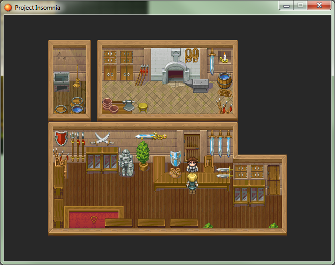
OKAY! I'm killing the ceiling crap, it's a technique I'll keep in mind for dungeons, but ultimately it didn't work here. Also taking into consideration some of Lotus's suggestions here is the finished map. I added more clutter to the forge, cleared up the path between the washroom and the forge, added a red carpet to the front door, and greened up the place. The storefront is streamlined to look more like a display room and I think it looks "classy". If I've violated some unwritten law of retro RPGs then write me a code violation; It's done. :P
@Daria: Wow, a lot closer to how you envisioned! I like the added touch with the light source and I see you have a carpet now to break up the section of the room below =] Did you make that carpet from scratch? By the way what is that triangular object over the carpet pointing down?
@Joseph: I really like that style man, it's very retro and interesting to look at =]
@Karsuman: If you take the time to read, my map is based off of what Daria wanted which was clutter. As far as the beams I added them after Daria himself/herself added them just to show how it could be done without looking too broad. Anyways I based my example map to help Daria and his or her own style which is a lot more than I can say you are doing with your post, which is being blissfully ignorant of my image and not really helping Daria. Yeah too much clutter can block navigation..but this is an interior map, not a two tile width dungeon. When was the last time you went into a shop and it wasn't cluttered with decoration and items for sale, placing these on the outer edges does not limit navigation by the way. I'd suggest people be careful of your suggestions personally.
author=Lotus_Games
Anyways I based my example map to help Daria and his or her own style which is a lot more than I can say you are doing with your post, which is being blissfully ignorant of my image and not really helping Daria.
Oh, I'm aware of your image. But here's the thing - if you're going to be adding beams to a map, it's not just going to be one map. Beams are a common element of housing so you'd realistically see them all over. To not liberally apply beams to your other houses as well would be a case of inconsistent mapping. This means I'll have to suffer with these stupid things blocking my vision in every house I walk inside of - no thanks.
You were also rambling about realism when your beams were about as far away from realistic as possible. Beams are not structured in weird random maze-like patterns.
author=Lotus_Games
When was the last time you went into a shop and it wasn't cluttered with decoration and items for sale, placing these on the outer edges does not limit navigation by the way.
You realize I was complaining about the beams specifically, right?
Though, as a shopkeepr, I might have second-thoughts about keeping spears that are larger than I am in easy reach of any jerk that walks into my store....
author=Lotus Games
I'd suggest people be careful of your suggestions personally.
Very subtle passive-aggressive behavior there.

Just to let anyone browsing this thread know - I've added a Looking for Feedbacl checkbox to game image submissions. When an image has that checked off, it will automatically be featured in the list on the recently revamped dev portal. I have put up a sample image there now (it is actually the last image I posted that I wanted feedback on for a game of mine still in development).
When people post on your image, you will get a notice automatically.
When people post on your image, you will get a notice automatically.
@Lotus: *cough*her own*cough*
And I edited the carpet. it's actually a square of wallpaper surrounded by a wood trim border I originally hacked off some other sprite (or maybe I drew it-honestly can't remember). Oh and the triangle is a blinking cursor that indicates where the front door is.
@Karsuman: The wood beam thing was my idea, but you're right. It makes zero sense to have it visible in this one singular map and no others. And ultimately it's just distracting. Furthermore, I was only using it to hide some poor mapping which is just terrible. With all that in mind I scrapped it.
@Daria: Haha, well alright now I know. I like the carpet...that was a clever idea using wallpaper to texture it =]
I'm continuing to study pixel art and came up with this concept for a game. I'd like feedback on not only the pixel art but also the style...does it look like something you would want to play?

I'm continuing to study pixel art and came up with this concept for a game. I'd like feedback on not only the pixel art but also the style...does it look like something you would want to play?

I rellay enjoys the colors and stuff, but personally, I'd try to have the same size for pixels in every object on the screen (they are bigger in the house and the clouds than the tree and the protag)

Lotus: I really like the stars and the dirt/grass is beautiful. The larger pixels used for the house and clouds makes sense to me because those are larger scale objects (and I wouldn't have thought anything of it if Itaju hadn't pointed it out). The Christmas trees are really damn tiny though and don't match the scale of anything else. At least the fluffy trees could pass for young trees.
Nah, this is an issue known as Resolution Clash, and is pretty bad at times. Though I think it can be developed in the right direction, some sprites in this screenshot look a little unpolished. (actually I think it's just the bigger trees but I just woke up)
They're a little messy. And this messiness makes it look like it's not on purpose.
They're a little messy. And this messiness makes it look like it's not on purpose.
LockeZ

I'd really like to get rid of LockeZ. His play style is way too unpredictable. He's always like this too. If he ran a country, he'd just kill and imprison people at random until crime stopped.
5958
Tiny hero wearing a t-shirt and shorts basically means hero who can't do anything. That's kind of a turn-off for me. But that's not an objective complaint, it's just me not liking certain types of stories. But you asked if it looked like something I'd play, so there. If those are nunchucks she's carrying, discard everything I said!
It reminds me of Treasure Adventure Game, with the tiny useless hero and the house and the way you use the colors in the ground and the sky. Try putting some more stuff in the background, maybe. Large bushes and much larger trees would be a start, but also taller stuff, like distant cliffs.
It reminds me of Treasure Adventure Game, with the tiny useless hero and the house and the way you use the colors in the ground and the sky. Try putting some more stuff in the background, maybe. Large bushes and much larger trees would be a start, but also taller stuff, like distant cliffs.
Those are some very helpful suggestions...I didn't realize the pixel consistency till it was mentioned so I'll play around with that some more for the house especially. I'll also make the trees larger...that makes sense to me. Also Lockez, it's suppose to be a wand...I was inspired by Ni No Kuni haha, I've never played Treasure Adventure Games but I'll take your advice on adding more parallax scenery. Thanks for the feedback guys/gals they helped a lot this time around =D
LockeZ
I'd really like to get rid of LockeZ. His play style is way too unpredictable. He's always like this too. If he ran a country, he'd just kill and imprison people at random until crime stopped.
5958
Play the first fifteen minutes, you won't regret it, it might give you some ideas. And it's free. (Or just google image search the game, maybe. Or watch the first episode of a let's play.)
If you keep playing you might regret it. The second half of the game is very poorly paced. But it does good stuff with pixels.
If you keep playing you might regret it. The second half of the game is very poorly paced. But it does good stuff with pixels.

TAG is a horrible game. Nobody should put themselves through that.
Better solution: play anything by Nifflas.
http://nifflas.ni2.se/?page=Knytt+Stories
http://nifflas.ni2.se/?page=Within+a+Deep+Forest
Within a Deep Forest is one of my most favorite indie games. The atmosphere and gameplay are two things you won't forget for a very long time, and the art style is similar to what you've been working toward.
Oh one another thing I noticed and keep in mind I'm not a pixel artist (but I have had four years of life drawing studies). But your screen uses indirect lighting (ie there's no clear direction where the sun is shining from) but those bigger trees are being lit up from the north west. It would be better to shade them so that te underside of the of the leaves are darker. Also don't think of your leafy tree mass as one bubbly shape that needs to be shaded. Rather it's a collection of individual leaves that you should attempt to define.
@Lockez: Awesome, I'll check it out now man. Thanks for the tip.
@Daria: I appreciate the critiques, that's a good one and I'll fix the lighting on them as well, as for the individual leaves...this is actually a style of pixel art that goes for minimalism so you wouldn't see individual leaves defined here...I can image in say a secret of mana game that might work but those objects are much larger and easier to define more details.
@Daria: I appreciate the critiques, that's a good one and I'll fix the lighting on them as well, as for the individual leaves...this is actually a style of pixel art that goes for minimalism so you wouldn't see individual leaves defined here...I can image in say a secret of mana game that might work but those objects are much larger and easier to define more details.
You still want to pick out some and make the suggestion of leaves.
Also something I was always taught in art classes was that it's always good to break the rules, but only once you've mastered them first. Otherwise it's not a stylistic choice, it's a crutch.
Also something I was always taught in art classes was that it's always good to break the rules, but only once you've mastered them first. Otherwise it's not a stylistic choice, it's a crutch.
@Daria: Yes, I am still learning and slowly developing my own style in the process so in time I'm sure I'll be able to impress =]
I worked with the suggestions I received and made the trees larger, the house and clouds more similar in size to the rest of the scene in terms of pixel size, and I also added more detail to the ground to give it a more seamless feel. Do you guys think this looks better, any further suggestions?

I worked with the suggestions I received and made the trees larger, the house and clouds more similar in size to the rest of the scene in terms of pixel size, and I also added more detail to the ground to give it a more seamless feel. Do you guys think this looks better, any further suggestions?

