


THE SCREENSHOT TOPIC RETURNS
Posts
author=DyhaltoThere's a small opening on the top of the tent; it's visible outside, just not inside. :)
A nitpick, Sana. There wouldn't be a fire inside a tent unless it was open at the top like a teepee. Or if you wanted to smoke everyone out, and potentially burn the tent down.

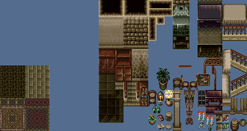
Got the forest done (except one room that I need to go back and do), and just got this tileset to work on one of my mansions. It's not bad but it's lacking heavily.
Old Map:

New Map:

Both are 40x45.
Don't mind the emptiness. All I mostly did was reskin the old map with this and added a couple things just to see how it'd look. Looks a lot better (and doesn't look like 2 other earlier dungeons), though may have to alter this tileset for each section of the dungeon (this is the front foyer, and well...what exactly goes in a front foyer?? The entire dungeon IS meant to be a homage to FFVII's Shinra Mansion, btw). Left room goes to the dining hall and kitchen, which wraps around in a hallway in the back to a storeroom in the top right, and then to a deadend hallway on the right. Upstairs on the left is the bathroom, a bedroom, and a flora/fauna room, and on the right would be the master's bedroom (complete with wall that you must inspect to move on) and a storeroom again. Not much of a mansion huh...
Tileset:
Old Map:
New Map:
Both are 40x45.
Don't mind the emptiness. All I mostly did was reskin the old map with this and added a couple things just to see how it'd look. Looks a lot better (and doesn't look like 2 other earlier dungeons), though may have to alter this tileset for each section of the dungeon (this is the front foyer, and well...what exactly goes in a front foyer?? The entire dungeon IS meant to be a homage to FFVII's Shinra Mansion, btw). Left room goes to the dining hall and kitchen, which wraps around in a hallway in the back to a storeroom in the top right, and then to a deadend hallway on the right. Upstairs on the left is the bathroom, a bedroom, and a flora/fauna room, and on the right would be the master's bedroom (complete with wall that you must inspect to move on) and a storeroom again. Not much of a mansion huh...
Tileset:

Cut it in half. It's far too large with far too much empty space. So much emptiness... it's like a black hole of empty. Sucking in my soul... dear God, the empty.
Well, I also don't know my mansions either. Are front foyers big at all? I can only guess with FFVII's Shinra Mansion and FFVIII's Ultimecia's Castle so...
(That, and it's not a complete map either. I didn't add anything else yet because again, testing the tileset and also trying to figure out how mansions work. ^^;; )
(That, and it's not a complete map either. I didn't add anything else yet because again, testing the tileset and also trying to figure out how mansions work. ^^;; )

Here, I whipped something up very fast. Just so you know, you're using the diagonal rails wrong - they're for diagonal stairs. I guess you could use them like you have... if you had diagonal walls to go underneath them, but alas, no such walls on the chipset.
(Yes there are mapping mistakes. I was just whipping a quick example. I wasn't gonna delve in to event mapping for layers' sake)
Looking at Shinra Mansion and just mansions in general they are a little empty but not like that. You have to think about how fast/big the movement of your characters are. They go by a tile-to-tile basis. FF8 and FF7 looked large but they weren't when compared to the movement of the characters. Add in that Shinra mansion was abandonned so it was missing a lot of things a normal mansion would have had.
Look at it this way: one tile equals one step, okay? So, let's dissect Shinra mansion. It would take about 4-5 steps from the front door to the stairs. The ground room of the foyer is about 10x10, if that. The rooms are about 5x5. From the front door to the door under the stairs would be about 11 steps.
Adding in the jutting out of the rooms and the roof, this would translate to a map of about 20x20 at the most. The map I showed at the top is 30x30.
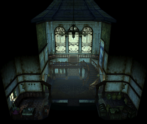
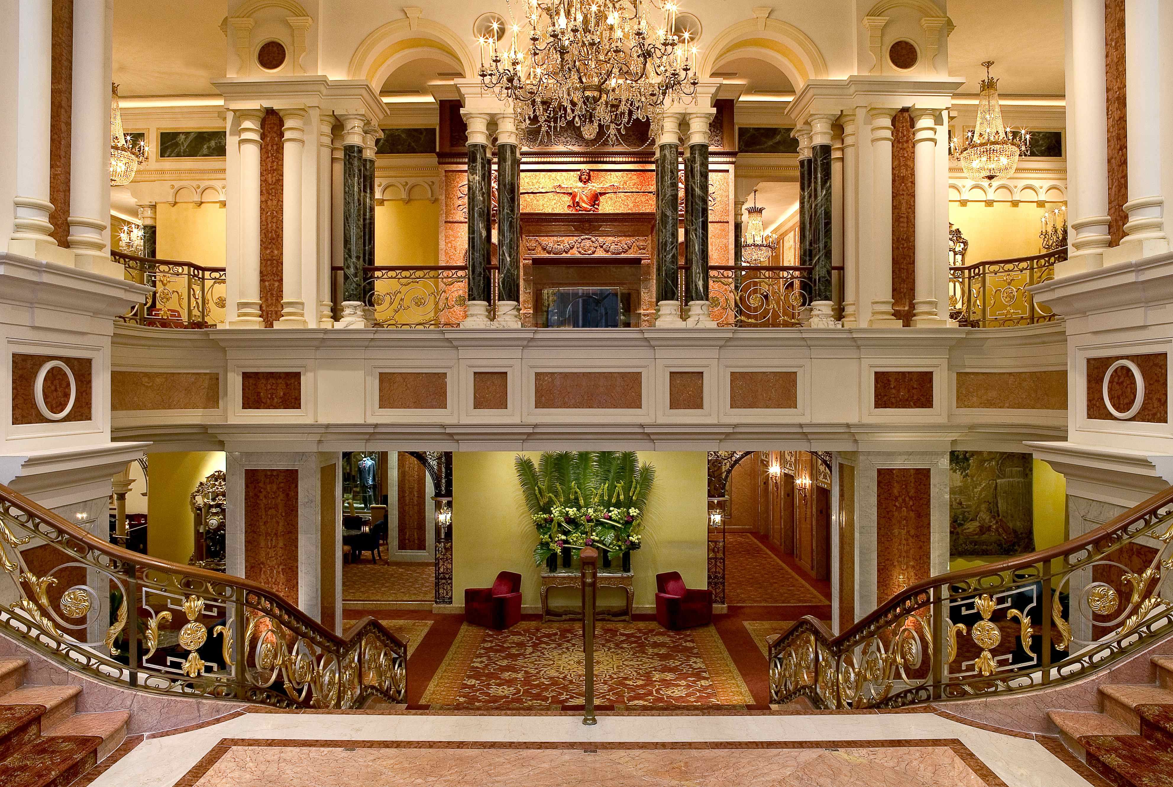
Also, if you're unsure about how to make it look, try looking through google for images. Here's a few I found:
01 02 03
As you can see, they all have something that makes them stand out different from each other without having shit tons of empty, boring space.
Whoops. I guess I did screw that up a bit. Tried to use the back wall for that effect but guess it doesn't work that well (which is something I experimented with in another area, but never used it there either...ho hum...). That and I didn't have diagonal stairs (even though you made use of the stairs here a lot better than I). And apparently I didn't realize the left door I used was for a bookcase...@_@;
Front foyer is probably the largest room in the mansion I have right now too (bare the basement area which is a bit different). The largest other room in my mansion is the dining hall area, but can probably fix that up. I didn't want to change the map too much either because I didn't want to reorganize events and whatnot too. @_@;;
Front foyer is probably the largest room in the mansion I have right now too (bare the basement area which is a bit different). The largest other room in my mansion is the dining hall area, but can probably fix that up. I didn't want to change the map too much either because I didn't want to reorganize events and whatnot too. @_@;;
Dude, please don't just leave it as is. Even if you have to mess with events, half-arsing a map is pretty sad especially when you asked for feedback and help with it.
Here's the thing - people aren't going to put effort into games that you don't put effort into creating. It's just the way it is. Besides, you have some talent. I want to see what you can do when you put your mind to it and really challenge yourself. I'd bet it will look pretty damn fine.
So, here's a recommendation. For your next dungeon, instead of doing huge-ass maps, try making a series of about 20 smaller maps that connect to each other instead - 20x20 being the biggest. Try it and see how that works out for you, because the whole huge map thing isn't helping your mapping skills.
(Of course, it's just a suggestion. If you don't feel comfortable doing so, feel free to ignore.)
Well I didn't say I wasn't going to change it more. I was more or less working the map around the events to avoid messing with them (then again there's only a couple that actually move in that room now that I think about it...).

@Xenomic
You really need to downsize your maps.
The bigger and emptier a map is the more boring to look at it is (not to mention it takes ages to walk through).
You should take every single map you've shown in this topic and make them 50% the size.
Empty space is bad space. Make your maps as big as you need them to be to fit the necessary elements (such as doors, enemies, events etc) and remove the rest.
Your maps are also all square. It doesn't matter if there is some empty space in your map, it's not like you HAVE to use every square pixel of the map.
Example: The front foyer can be divided into 3 rectangles/squares.
The incredibly big 1st floor square, with a square room inside, and the rectangle upper floor.
It's not like there aren't mostly square rooms in the real world, but it doesnt hurt to try and break the pattern.
You are on the right track, judging by the forest rework. Keep at it.

Used your screenshot as somewhat of a reference while still using my old map as a reference too. Had a bit of help on this as well (towards the very end). Yes, I did shrink it to 30x30. No, I don't like working this small. I feel claustrophobic doing so! >_<
I have the top and bottom floors to do now, and that's about all I'm going to do with the mansion (there's a basement but that's not that exciting per say). Should I post the old maps for those so that people can give suggestions or whatnot? Or should I just wait until I do rough drafts of them or what? I know ya'lls getting tired of my ugly mug by now here. ^^;
And no Craze, 2k9 doesn't have the option of making everything there with the Zoom option.

Looks a lot better - it might feel claustrophobic making it, but it looks and plays better in game.
Also, 2k9 does have the option Craze was referring to - let me go check on my laptop how to pull it up.
Here we go: switch to one of the two non-event layers, then hit Ctrl+0. Move your cursor out of the way and take a screenshot - it'll have everything the same brightness. There's no way to show the content of events that I know of, though.
Xenomic, despite your claustrophobic feelings, you should probably learn the three tile rule.
Oh...well if I knew that I could use Ctrl+0, I would lol. Now I know!
@Nightowl (almost typed Snowowl @_@;; ): Ehhh...I know what you mean, though I'd assume that the second floor would be slightly higher up than 3 tiles methinks (actually...do commercial RPGs go by 3 tiles themselves? I'm curious now...).
This'll be the last one I post for the mansion (since again, avoiding clogging this up with my stuff, even though I am anyways...)
Old Map (120x60):

New Map (82x54):

Now yes, I know there's still some errors here (c'mon, it took me a while just to cut out 38x6, believe it or not). The reason why it looks huge is because I actually took the entrances to each area from the front foyer and used those as bases for the exits here. I'll still need to trim down that left hallway, but I think it looks better than what it used to be. Yes, it's still bare, bare with me (oh god why...)!
The Es on the tables are actually me using Events for mapping since I couldn't put plates or bottles on tables due to them both being on upper layer.
@Nightowl (almost typed Snowowl @_@;; ): Ehhh...I know what you mean, though I'd assume that the second floor would be slightly higher up than 3 tiles methinks (actually...do commercial RPGs go by 3 tiles themselves? I'm curious now...).
This'll be the last one I post for the mansion (since again, avoiding clogging this up with my stuff, even though I am anyways...)
Old Map (120x60):
New Map (82x54):
Now yes, I know there's still some errors here (c'mon, it took me a while just to cut out 38x6, believe it or not). The reason why it looks huge is because I actually took the entrances to each area from the front foyer and used those as bases for the exits here. I'll still need to trim down that left hallway, but I think it looks better than what it used to be. Yes, it's still bare, bare with me (oh god why...)!
The Es on the tables are actually me using Events for mapping since I couldn't put plates or bottles on tables due to them both being on upper layer.

the fuck is 2k9
why are you using a hack of a hack of rm2k to make a project
ace 4 lief (until the next one comes along)
EDIT: oh and xemonic you can take screenshots for needing lots and lots of help and advice by uploading them to a game profile with the "send to development" box checked
http://rpgmaker.net/portal/development/
i suggest you do this instead of clogging the screenshot thread toilet with shit again thanks
2k9 is Cherry's updated front-end. It's not actually a hack in the traditional sense, but it updates the interface and makes life a lot easier (and nicer looking). I was using it for awhile while originally working on games in 2k3, simply because it fixes some of the things that bugged me about 2k3 (such as the \ showing up as the yen symbol, and the lack of 'undo' on a lot of commands, and after XP and such, the highlighting of commands was nice).

dude just remap the whole things and start with 20x15 and expand as necessary.
also go play sims 2 and try mapping this way in that game. Or sims 3 for that matter. Try building a house the same way as you're doing right here and tell me you can stand waiting for your sims to walk 2 miles to get to the bathroom only to pee themselves half way.
Map your bedroom. Map your own house. You don't need bigger spaces for fighting in, you've got off map battles.
Plus Libby's right, your 'Shinra mansion' is way too big.

This is mine, though it's missing a little of the bottom half. I can afford to make my maps slightly bigger (though I don't) because I have a fast movement speed (5).
Also mine is really friggin empty and still wip, but it's a hell of a lot smaller than yours :x
You're not making a Touhou game in the sense of a corridor bullet hell. They are long because the levels are long. The Voile Library is huge because EoSD requires the Library to be huge. If it were required to be mapped in a correct scale the hallways should be nowhere near as long ever ever ever. You are making an RPG. You know what you do on a map in an RPG? You walk. To get places. And talk to people to find out what those places are. Then you watch people talk.
They have to be aesthetically pleasing because you spend 60% of your time or more doing these things. And because nowadays people whine if they aren't.
also go play sims 2 and try mapping this way in that game. Or sims 3 for that matter. Try building a house the same way as you're doing right here and tell me you can stand waiting for your sims to walk 2 miles to get to the bathroom only to pee themselves half way.
Map your bedroom. Map your own house. You don't need bigger spaces for fighting in, you've got off map battles.
Plus Libby's right, your 'Shinra mansion' is way too big.
This is mine, though it's missing a little of the bottom half. I can afford to make my maps slightly bigger (though I don't) because I have a fast movement speed (5).
Also mine is really friggin empty and still wip, but it's a hell of a lot smaller than yours :x
You're not making a Touhou game in the sense of a corridor bullet hell. They are long because the levels are long. The Voile Library is huge because EoSD requires the Library to be huge. If it were required to be mapped in a correct scale the hallways should be nowhere near as long ever ever ever. You are making an RPG. You know what you do on a map in an RPG? You walk. To get places. And talk to people to find out what those places are. Then you watch people talk.
They have to be aesthetically pleasing because you spend 60% of your time or more doing these things. And because nowadays people whine if they aren't.
I know that. Movement speed for mine is at default (which doesn't seem that slow) and I DO have a character, once again, that does double walking speed (well, it increases it by 1 speed, but that's all that needs done). I did factor in some of the movement speed into some of the mapping (regardless again, some of them are too big anyways). My Voile right now is kinda terrible too (it's a bookmaze, but a big bookmaze regardless of being revamped. Then again, even in the manga it was big from what I saw @_@;). Maybe I'll post that up later via that Development method or whatnot.
The corridors again are as big as they are because I used the front foyer entrances as points to where to map (though they're too big anyways so they need trimmed down regardless). Trying to keep that area as realistically close to the front foyer points as possible (which is generally what I try to do for each map...which may or may not be what backfires on me).
EDIT - Also, I did shrink my front foyer down to 30x30 like how Liberty's was. That's still big?? o_O??
Your foyer is better now, it has some nice points of interest.
You don't need to match maps up completely perfectly. In cases where it would be one long stretch of the same thing, cut out the corridor and place the room on a single map instead. I like single-room maps, myself; I enjoy breaking up a space so the player can see less of it and can fill in the details themselves if needed.
You don't need to match maps up completely perfectly. In cases where it would be one long stretch of the same thing, cut out the corridor and place the room on a single map instead. I like single-room maps, myself; I enjoy breaking up a space so the player can see less of it and can fill in the details themselves if needed.
author=SorceressKyrstyI do this myself if I screw up really bad when making a map(if I don't have a set outline). If you can't figure out what to put in an empty space just shrink the map down until it's the right size you want for it.
dude just remap the whole things and start with 20x15 and expand as necessary.
author=XenomicYes, yes it is~ ;D
EDIT - Also, I did shrink my front foyer down to 30x30 like how Liberty's was. That's still big?? o_O??
Yep, as I said before, it was a fast piece to show as example. It's big, but it uses the space a bit more efficiently than yours does. For one, it's centered on the door out. Secondly, that staircase takes up a lot of room. If I'd used the front facing one like you did, I would have cut down a lot more room. Frankly I was trying to keep the scope without overdoing it.
That said, why not break up that huge map into three smaller ones? I'm also like you in that I like my areas to match up exactly from border to border, so I understand what you're trying to do but instead of one huge, try three smaller. The hallway at the top could be one that leads from left to right.
The left could be one and the right could be one. That way you don't have to wrangle exactly with how big the other room is to fit in between them. (Or at least, only have to do so in the case of the hallway.)
You could also make one or two larger, longer tables instead of a lot of smaller ones, cut the room down about 4 or 5 tiles by alluding to overlap by the walls (check out my map again. The left room you can see the top of the table but the wall blocks the rest, making it seem as though the wall is blocking your view of the tiles behind it. This adds more depth to a map.)

