


THE SCREENSHOT TOPIC RETURNS
Posts
The RTP tileset avoids this problem all together by not using stairs that go up. You could try something other than stairs.

LockeZ

I'd really like to get rid of LockeZ. His play style is way too unpredictable. He's always like this too. If he ran a country, he'd just kill and imprison people at random until crime stopped.
5958
Here's an edit with three things changed:

First, obviously, I completely averted the perspective issue by just having both stairways facing south. Player walks a little way along the top of the pipes to get to the other stairs instead. This is probably a "clearer" alternative for the sake of the user interface, at the expense of a little realism.
Second, I made the stairs pop out from the end of the pipe more. In your version they touched the ground only one pixel to the south of where the pipe touched the ground. This perspective didn't make sense unless the stairs were completely vertical and is part of what made them look like just part of the pipe. Craze did the same thing in his edit, you just didn't notice I guess.
Third, to further help sell the fact that they're stairs and not part of the pipe, I made them darker to differentiate them from the texture on the top of the pipe. This possibly wasn't necessary though, since the second thing was probably enough.

@LockeZ: I think it would be clear enough that they're stairs, since you go up a large flight to get onto the land from a dock beforehand. I already tried messing with the contrast and using a darker brown, and I thought that the stairs stood out too much.
The idea that you could walk onto the pipes, which I somehow didn't even think of, is good though. I could use it well later in the same area. I'll probably end up doing that, so thanks for the suggestion. I can't afford to be dallying around with this one thing for ages though, so it's good you said it as soon as you did.
The idea that you could walk onto the pipes, which I somehow didn't even think of, is good though. I could use it well later in the same area. I'll probably end up doing that, so thanks for the suggestion. I can't afford to be dallying around with this one thing for ages though, so it's good you said it as soon as you did.
Two of his points were the same things I mentioned >.>
Y'know, just since you were looking for a response "soon" and all~
Y'know, just since you were looking for a response "soon" and all~
Craze I like that limitation in a game if its indie because it means you have to rationalize more with what you've got. Those skills are selections from a wider range of choices you can have for battle? Or will the characters only have 4 skills to ever use?
Modified HUD
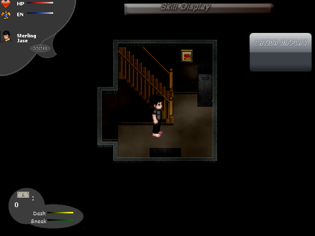
Modified HUD
Having circular and angular HUD screens (or even just three different styles of HUD windows) put together looks kinda weird.
The "Skill Dispaly" looks good though, seems to suit the overall vibe of the screeny better than soft, single-colour circles.
The "Skill Dispaly" looks good though, seems to suit the overall vibe of the screeny better than soft, single-colour circles.
@obsorber: I don't know if it was mentioned before, but the character is too big. Even his feet are twice as big as the stairway steps.
That being said I really like the atmosphere.
That being said I really like the atmosphere.

This is going to be the finished product, at least until post production. Like I said, I have to get to work on other stuff, can't be fixing that forever. Thanks for all of your suggestions.
Walking on the pipes isn't what I had in mind, but it could work. I was thinking of something maybe like a ladder or having the pipe lifted up some way.
Well, I thought of raising the pipes into an arch or something, but I don't have enough room in the tileset. I had to fit a submarine in there, which takes up most of the second layer, and I didn't want to make that a separate map. Besides, I can make use of walkable pipes in the next few maps that I have to set up.

obsorber
Craze I like that limitation in a game if its indie because it means you have to rationalize more with what you've got. Those skills are selections from a wider range of choices you can have for battle? Or will the characters only have 4 skills to ever use?
Every character has two inherent skills, and can equip a Soul for a pair of two more skills -- for example, Demonic Prince lets you use Hellscorch (a very powerful Fire spell) and Blood Mana (which lets you trade HP for SP). There are thirty Souls to collect in all, but you only have five Vessels to play as.
MrCharlesMugford, that looks great. The flowers are really cute. =3

author=LockeZ
Covering 100% of the screen with menus is pretty ugly.
So is this better ? :D

And this as well...

LockeZ
I'd really like to get rid of LockeZ. His play style is way too unpredictable. He's always like this too. If he ran a country, he'd just kill and imprison people at random until crime stopped.
5958
I liked the first one you posted best, Mr_Detective, with the skill list covering the allies.
author=obsorber
Interesting, I'd like to see this in action. What game is this off? I might have to check it out.
You can check my profile. :P
author=LockeZ
I liked the first one you posted best, Mr_Detective, with the skill list covering the allies.
Thanks. What do you think of the second one, is it okay ? :D
LockeZ
I'd really like to get rid of LockeZ. His play style is way too unpredictable. He's always like this too. If he ran a country, he'd just kill and imprison people at random until crime stopped.
5958
The second one was the default RTP one... Like I said before, I was glad that you weren't using it.
Maybe I worded it poorly. When I said I liked the first one, I didn't mean the first of the two in your most recent post, I meant I preferred the very first one from the previous page, specifically this one:
The very last one is a screenshot of a different part of the menu: there are no skills shown. So it makes sense that it's extremely small compared to the screenshots that show full skill lists. You could use that type of command list along with any of the types of skill lists, probably.
Maybe I worded it poorly. When I said I liked the first one, I didn't mean the first of the two in your most recent post, I meant I preferred the very first one from the previous page, specifically this one:

The very last one is a screenshot of a different part of the menu: there are no skills shown. So it makes sense that it's extremely small compared to the screenshots that show full skill lists. You could use that type of command list along with any of the types of skill lists, probably.
Hm... I wonder why is it good that the allies are being covered ? With the skill list in the middle, you can see both the allies' stats and the enemies. Wouldn't that be better ? :P

VS
VS
Having the whole screen covered in menus just doesn't have a good visual appeal. It doesn't matter that the characters stats are being covered because it's a menu you're not currently using anyways, and it leaves you with the monsters as just something visual left on the screen.
The second screeny (above) isn't as bad since it does leave space, and shows everything, but it's up to you whether or not you want that.
The second screeny (above) isn't as bad since it does leave space, and shows everything, but it's up to you whether or not you want that.

