


THE SCREENSHOT TOPIC RETURNS
Posts
LockeZ

I'd really like to get rid of LockeZ. His play style is way too unpredictable. He's always like this too. If he ran a country, he'd just kill and imprison people at random until crime stopped.
5958
It steps forward and slashes the enemy, obv.

author=Brady
The second screeny (above) isn't as bad since it does leave space, and shows everything, but it's up to you whether or not you want that.
Well, I think I would pull it down a bit closer to the huds. I might change my mind, though. :P

author=Craze
if sonic boom sends waves at the enemies what does sonic wave do
It simply confuses the enemies without doing any damage. :)
author=LockeZ
It steps forward and slashes the enemy, obv.
That 's Step Slash. XD
LockeZ
I'd really like to get rid of LockeZ. His play style is way too unpredictable. He's always like this too. If he ran a country, he'd just kill and imprison people at random until crime stopped.
5958
~~~\______/~~~~~O|-<~~~

@Mr_Detective: On a frontal battle system, the area designated for the monsters is like the screen of a movie theater; while the characters are the audience. Covering the monsters with menus would be like is someone obstructed the theater's screen with a "remember to visit the refreshment stand" placard every five minutes... Well, that's a silly analogy, but you get what I mean.
If you could pull it off in a more stylistic manner like that faux speech ballon for the characters commands, that would be cool.
If you could pull it off in a more stylistic manner like that faux speech ballon for the characters commands, that would be cool.

Make sonic do a tail whip

The world map I've been cooking up so far. It's not done yet. It's too big to put in this page, so click it to view it in its own tab for best results.
http://oi47.tinypic.com/6f7dpj.jpg
http://oi47.tinypic.com/6f7dpj.jpg
Yes, it reminds me of LotR

Detective, I'm not sure how I feel about the white box around the face graphics. I think a definite border might make it better? Even just a simple black box would work I think.

@Feld: I love it. The names are hard to read, but that fits the style of the map. Besides, people playing the game will have heard the names anyways so it's no problem.
Now you've gotten me into a map-making mood.
Now you've gotten me into a map-making mood.
author=alterego
Covering the monsters with menus would be like is someone obstructed the theater's screen with a "remember to visit the refreshment stand" placard every five minutes... Well, that's a silly analogy, but you get what I mean.
If you could pull it off in a more stylistic manner like that faux speech ballon for the characters commands, that would be cool.
Hehehe, I got you. I already moved the box all the way to the bottom. :)
author=Caz
Detective, I'm not sure how I feel about the white box around the face graphics. I think a definite border might make it better? Even just a simple black box would work I think.
The pictures are already small as they are, so it 's going to be hard for me to put in a black border without it looking clustered. :P
Yeah I know the HUD needs work, I should revamp it in later stages of development but for now I'm not changing it just working on a few maps here and there...
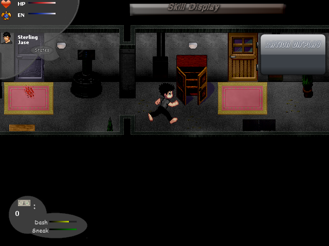
Which window do you guys think is better ? The last one is the new one I just got. :D
And I think there should be a period after the first sentence. :P


And I think there should be a period after the first sentence. :P

author=Mr_Detective
Which window do you guys think is better ? The last one is the new one I just got. :D
And I think there should be a period after the first sentence. :P
She has a period after sentences?
author=MrChearlie
I like the first one better, the stylish border of the second doesn't goes with the black color
Aw, really ? I kinda think the second one looks cuter, though. :P Anyone else ? :D
She has a period after sentences?
What ? O.O

Aw man, I am surprised. :(
It was the best I 've seen so far, so I am not sure what I should do. Guess I 'll wait for more response. :P
It was the best I 've seen so far, so I am not sure what I should do. Guess I 'll wait for more response. :P
I'm not really sure if this counts as a "screenshot" per say, but here's a map for my game's world map: Caisha. It's split into two connected continents. :)

I always have trouble reading maps like these. I feel the negative and positive spaces should switch colors to increase readability. We're trained to read black against white anyway, so the names and the little trees and mountains would "pop out" more if the land-masses were lighter in color, surrounded by the featureless, dark ocean acting as a frame... Just my two cents. ;P

