


THE SCREENSHOT TOPIC RETURNS
Posts
LockeZ

I'd really like to get rid of LockeZ. His play style is way too unpredictable. He's always like this too. If he ran a country, he'd just kill and imprison people at random until crime stopped.
5958
Also that one chick with all the hair is like nine feet tall


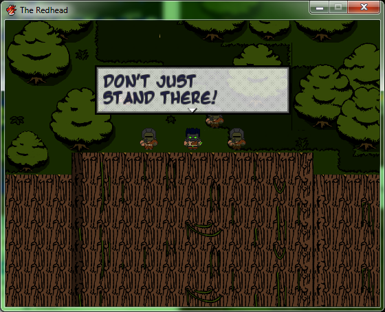
Added in a wee cutscene after the intro comic, just as you get control for the first choice.
Also finally picked a font and got dialogue sorted for the first "chapter". Pretty happy with the way the font looks on top of the cartoon tilesets~
Also finally picked a font and got dialogue sorted for the first "chapter". Pretty happy with the way the font looks on top of the cartoon tilesets~


author=LockeZ
Agree, the text is unreadable. Plz make text either black on a light color textbox or white on a dark color textbox, not technicolor on a medium color textbox.
The two tiles of black barrier on either end of the island that extend one square further south than the rest of it need walls below them. Also, it's super weird that the walls that do exist are shorter than the characters. I can only guess that everyone's heads are crashing through the ceiling.
The bar looks enough like a bar that I can at least tell what you were going for but it would be better if there were glasses and bottles lined up. I'd also recommend adding a few more tables in between the existing tables, to fill that space.
How can you not read that? On my computer, the only troublesome part is that it's scripty (this is my Mincho font, the Gothic is very blocky and readable). The text box is translucent, so white-grey-black on clear. But here, I'll give you gothic.
I like the text color gradient. What's a good background for it?
There's supposed to be a riceball, apples, and a sake bottle on the table but many of them don't show up over the heads of the people. I'm gonna need to shift the tilesets up slightly so they go on top of tables, and alter a few details.
The walls we so short because of various space issues. After moving things around (alot) this is what I came up with.

Btw, if you still can't read the dialogue, there's a reason that "girl" is six feet tall (besides her being a Secret of Mana expy).
Also, holy crap that song is good.

author=Mr_Detective
By the way, where did that faceset come from? I recognize him from Marrend's game. :-?
I sense people are more likely to see "Vance" from Three the Hard Way than anything I made, or will ever make. Nessessary screenshot reference?
*Edit: I can kinda-sorta read that text, bulma. Perhaps making that window a totally solid color would make it more readable? Not totally sure about how that would actually look!
LockeZ
I'd really like to get rid of LockeZ. His play style is way too unpredictable. He's always like this too. If he ran a country, he'd just kill and imprison people at random until crime stopped.
5958
It's still not readable. Font is a little better, but the font was never the real problem. Lose the gradient, and possibly make the textbox background not be transparent. Between the text gradient and the transparent textbox background, you're absolutely guaranteed that every single text box will include parts where the background and the text are the same darkness. And that's what makes it so hard to read - the text bleeds into the background because they share colors of the same darkness. (The text gradient actually guarantees that BY ITSELF. But if you got rid of the text gradient, the transparent background would still guarantee it for any text color except white or black.)
And she's not six feet tall, she's eight or nine feet tall. She's fully 30% taller than any adult male human. So I assume your explanation is that she's part giant, or part troll, or some other non-human species that's much larger than humans. But even then, the sprite style doesn't match... Speaking of which, the woman at the bar in the red dress with the crazy hair doesn't match either. Her hair doesn't have a border around it like it should. The woman sitting at the northwest table has the same problem, and might have other problems; I think she's also too tall and possibly the wrong sprite style, but she's facing away from the camera so I can't really tell.
And she's not six feet tall, she's eight or nine feet tall. She's fully 30% taller than any adult male human. So I assume your explanation is that she's part giant, or part troll, or some other non-human species that's much larger than humans. But even then, the sprite style doesn't match... Speaking of which, the woman at the bar in the red dress with the crazy hair doesn't match either. Her hair doesn't have a border around it like it should. The woman sitting at the northwest table has the same problem, and might have other problems; I think she's also too tall and possibly the wrong sprite style, but she's facing away from the camera so I can't really tell.
author=Marrendauthor=Mr_DetectiveI sense people are more likely to see "Vance" from Three the Hard Way than anything I made, or will ever make. Nessessary screenshot reference?
By the way, where did that faceset come from? I recognize him from Marrend's game. :-?
I got it from charas project resources (it's entitled Atelier1, though it's certainly not Atelier Iris). Probably, he did too.
Found it. (Btw, Marrend's avvie is altelier2)
I reversed the grandients by literally vertical flipping the background colors. It stands out somewhat now, since the top of letters is white on black, and the bottom is black on white. Not perfect though. In any case, if it is really critical that people see text, I have a text custom menu that lets you change from Gothic to Mincho, and among four background/texts.
Locke, I don't believe in consistent spritesetting. The northwest one was supposed to be chubby. So she was from a wider spriteset than the others. The "red dress woman" (that's a robe, that's actually a guy with curly hair) was supposed to be a drunken lush of an angel. These people are unique, they don't need to match proportions of other people. The one in southwest was supposed to a head taller than (dunno where you got nine foot from, add a head or so roughly to the height of the people standing nearby and that's more or less the height. The height of a head is about 6" so they're maybe 5'8" or some height that's average and this one would be nearly 6'5") the men near her, and that's part of the joke.

Not everyone is average, so common spritesets don't always work.
On the other hand, that guy with orange hair is actually repeated three times in this bar (third is above the chubby girl). Why? It's a stylistic thing. You always run into the same sort of guy in a bar. Big dumb showoff with a sort of military cut, who nearly always is drunk, and nearly always is hitting on someone who doesn't seem to like him back. This guy. He's a living stereotype, so I xeroxed him.
LockeZ
I'd really like to get rid of LockeZ. His play style is way too unpredictable. He's always like this too. If he ran a country, he'd just kill and imprison people at random until crime stopped.
5958
The height of a normal person's head isn't more than a foot, but RM2K3 sprites are in chibi proportions and their head is almost 40% of their body. She is 30-40% taller than anyone else.
But the style issue is seperate and unrelated to her height. It's not about being a consistent height; it's about being a consistent style of graphics. Children and adults in RM2K3 sprites are different sizes but still match each-other. You've been doing this for ten years, I know you know better.
But the style issue is seperate and unrelated to her height. It's not about being a consistent height; it's about being a consistent style of graphics. Children and adults in RM2K3 sprites are different sizes but still match each-other. You've been doing this for ten years, I know you know better.
Take any average street in the US or elsewhere, sorry, nope consistent spritesetting is neither interesting nor realistic. People have different styles, builds, etc. Sorry, I may "know better", but this one isn't changing. I've been doing this for years, yes, but I never have and never will consider it important to match spritesets. Because people don't match.
(Btw, this is wrong, I looked at the three nearest her - head is at 30%, body is at 60%. If you know of anyone with a two foot head let me know, otherwise I measured using my ruler, head and shoulders is 9" and just head is about 6". A tall woman or short man is 5'8" which is the height of most spritesets. A tall man or supertall woman is somewhere between 6'2 and 6'5 which is the difference of the head, and the hair. The only one chibi, is rightly so, the little kid with the shield.)
(Btw, this is wrong, I looked at the three nearest her - head is at 30%, body is at 60%. If you know of anyone with a two foot head let me know, otherwise I measured using my ruler, head and shoulders is 9" and just head is about 6". A tall woman or short man is 5'8" which is the height of most spritesets. A tall man or supertall woman is somewhere between 6'2 and 6'5 which is the difference of the head, and the hair. The only one chibi, is rightly so, the little kid with the shield.)
I consider having consistent sprites as a bare minimum even if the graphics aren't particularly amazing. It's one standard I use to rate professionalism. I think most people will agree with this.


So I went back to mapping after 2 months of working in the database (hey, I ran out of things to do at the current time ok!? Still need to brainstorm the rest of the ideas). So I decided to come back to this cave area to finish fixing it up. This is one of three maps that need fixed up (this is the biggest map out of the rest. 70x70 (originally 120x120). The other 2 will be much smaller.
I just feel like something is missing from here though. I do like how I got that winding path up going, but nonetheless, it feels empty still. Though I don't want to go TOO far out there with the design since it's not supposed to be super fancy or anything. It's an underground cave that's a subbranch of the main path to Old Hell. Nothing actually really special here for the most part, but most caves in my game are kinda just...not really that special lol...
Also, ramps tend to look terrible when they're not the same color, I realize that. Nothing I can really do about it here though. >_<
EDIT - And just to show one little thing that happened years ago (which I still have a screenshot of) when I was doing a testrun...

Your guess is as good as mine as to what happened here. She was dead, then stood back up for some reason. x_x; Reminds me of the time that I attacked a boss (the character has 2 weapons), and the boss attacked me after the first attack, my character took the damage, and then did the second attack. Dunno what was up with that either. @_@;
That looks pretty good. I think you could benefit from adding another ground tile(different color dirt?), adding more holes, or upping the use of lava.
Hmm...I have this gray color, the dark blue one, and a brown one which is sparingly used as my ground tiles really. Though adding more holes might help, and maybe more lava since the top-right exit goes into a teleporter maze that has lava (note, yes it is a teleporter maze, but the player doesn't have to go into the maze itself for the puzzle. There's one tile that's obviously not right (jutting out) that lets the player walk across the lava). I'm also wondering if I got all the heights right, since there was a couple that I had to fix that were incorrect. x_x;;
I also hope that I didn't add too many bats (these bats suck 50 HP each time they touch the player, and can kill the player), and that there's enough room to navigate around them...
I also hope that I didn't add too many bats (these bats suck 50 HP each time they touch the player, and can kill the player), and that there's enough room to navigate around them...
author=arcan
I consider having consistent sprites as a bare minimum even if the graphics aren't particularly amazing. It's one standard I use to rate professionalism. I think most people will agree with this.
Really... Are you sure about that?

So this game with all this mix of Disney character sprites, Final Fantasy stuff, and custom game sprites, it's done by amateurs right?
The mark of professionalism to me is the ability to beta-test, and beta-test, and beta-test until everything runs smoothly no matter what the person tries (and it still might not be enough). To go through millions of lines and copy whatever code needs to be there, so that it runs as well as a full-scale game. Also, the mark of a professional is actually being paid. Since none of us can say this, I can realistically say "Must you value what others value, avoid what others avoid? How ridiculous!"
Enough about that though, I'm getting peeved. The map looks good. What's the top center event (on top of the mountain where it doesn't seem like you can reach)?
@Bulma:
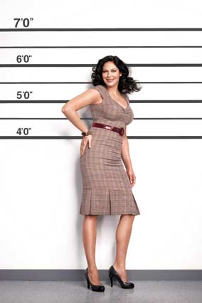
You're looking at character design, which varies greatly in that image. However, you may notice that the actual visual style remains fully consistent across every character in that picture, including the Disney characters.
Having consistent spritesheets is beyond a simple requirement for a game. Imagine playing Gears of War with the characters all as they are, except that Marcus looks like this.
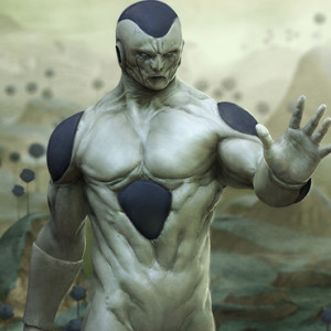
Or you watch Frieza in Dragonball Z talking about his badass Powerlevel and all his transformations and he finally reveals his final form and it looks like this.
It'd look wrong and you know it. You'd spend the whole time goin' "ytf do they have a completely different style?". There's no difference between that and having different styles for your characters in the same game.
You're looking at character design, which varies greatly in that image. However, you may notice that the actual visual style remains fully consistent across every character in that picture, including the Disney characters.
Having consistent spritesheets is beyond a simple requirement for a game. Imagine playing Gears of War with the characters all as they are, except that Marcus looks like this.
Or you watch Frieza in Dragonball Z talking about his badass Powerlevel and all his transformations and he finally reveals his final form and it looks like this.
It'd look wrong and you know it. You'd spend the whole time goin' "ytf do they have a completely different style?". There's no difference between that and having different styles for your characters in the same game.
Oh, you can reach that. You just have to wind up a path to get to it. After the other three switches are pressed, that's where the last switch and the path onwards is. Once you enter that, a cutscene happens and you can't go back afterwards (you won't be able to come back to this area after the scenario is done either), so you only see this map once the entire game really7.
That image is completely consistent in it's art style. An example of the inconsistency I am talking about would be having a cartoon character in a silent hill game. There are many factors that define consistency such as outline thickness/color, shading, color saturation, body proportions(certain parts), etc. In order for a style to be consistent these things have to be the same throughout.
It's called Medium Blending. It's not actually that shocking (I grew up with Roger Rabbit), and for the record legitimate games have done weirder stuff.
At the end of the day, you and only you are responsible for the style of your game. If you want to go off the rails, nobody has the right to call you on it, but they do with regard to bugs. Style is just that, style.
Also, seriously. 2 1/2 mm or so height diff does not even approach the difference you spoke of with Frieza or Gears of War.
I never said it was quite as jarring, I was just using it as an extreme example, since you clearly have been misunderstanding what's being said about art style.
Sure, you're more than welcome to use whatever mixtures of styles you like in a game, no one can stop you from doing that. However, this is a screenshot thread where people post specifically critical opinions, so if you want to do something weird/unusual then you're going to have to expect people to disapprove. And even then, telling them that it's a decision and you don't care is a perfectly reasonable response. Telling them that they're wrong, then using a example that misses the point is not, however.
Sure, you're more than welcome to use whatever mixtures of styles you like in a game, no one can stop you from doing that. However, this is a screenshot thread where people post specifically critical opinions, so if you want to do something weird/unusual then you're going to have to expect people to disapprove. And even then, telling them that it's a decision and you don't care is a perfectly reasonable response. Telling them that they're wrong, then using a example that misses the point is not, however.

