


THE SCREENSHOT TOPIC RETURNS
Posts

@bulma - Make a layer above your picture. Colour it solid black. Adjust the transparency of the layer. Make it over 25% at least. Viola. Usable.

@Bulmabriefs: Kudos for being an IrfanView user! (That little program can do almost everything. I swear one day it'll even make coffee.) But this time I don't think it's gonna be enough for what you want to do here. You need something with layers. Don't you have Photoshop? If not, consider getting Gimp. There's much more stuff you could accomplish with blending modes and whatnot.
@Dreaded: Besides spicing-up the maps with more stuff, try also adding some color variety. Right now it's all is the same dull shade of green. Also, that body of water looks too shallow, like if you could walk over it. If that's not the case you should consider making it at least one tile deep or something... As for the map, I like your idea, but you need graphics that match that 'old map' style.
@Dreaded: Besides spicing-up the maps with more stuff, try also adding some color variety. Right now it's all is the same dull shade of green. Also, that body of water looks too shallow, like if you could walk over it. If that's not the case you should consider making it at least one tile deep or something... As for the map, I like your idea, but you need graphics that match that 'old map' style.

Ummm, that isn't how game_clock plugin works. It's part of the panorama BG that works with the natural menu system of 2k3. This is not a custom menu, it's a plugin that adds a clock into the system along with its own internal FG and BG. If I added black to this FG it would completely block everything in the menu. Ask Pepsi for more details, but I'm pretty sure adding a picture at any point during the menu call would get swapped away because menus are a new screen.
I have other systems. They have the transparency disabled (I did a handy variable trick, where only system 1 is transparent). So if you want it backgrounded, you can switch over by going to System on that menu. I bothered making them (and the FG that matches with them), so it's kinda insulting that people rather than simple going to System on the menu and switching to whatever they want, expect me to change personal preferences to something not only butt-ugly, but based on what I know of the way Pepsi's plugin works, completely unworkable (it covers text, because it's a layer above it).
I've reached the point where I'm satisfied with how the pictures look. They're "background" BGs without being so faded that they have no color. There are no close colors like green, and the color contrast is enough that I don't worry about it.
Finally, I refuse to use photoshop ever. I can do layering effects with some clever editing using iDraw's select color feature, invert colors, and importing the result to a new thing, pasting stuff on top. Or I can layer by using multiple pictures. Hell, I can do layers on Paint. Why in God's name, should I spend from $89-995 on something that just makes pretty pictures? Especially, where combining these two programs, I can do two-thirds or more of all processes I can imagine. So like, maybe it has better blending tools. But I found the program so user-unfriendly, that I couldn't work it anyway.
I guess you never bothered to check, but you can get a version of photoshop for free and gimp is free. It's true you can do layers in any program, but it's a waste of time. A huge waste of time.
Those programs don't need to replace idraw or ifranview. No program is as easy to use as iDraw for pixel art. I use both iDraw and Gimp. iDraw most of the time, and Gimp for the special features.
Those programs don't need to replace idraw or ifranview. No program is as easy to use as iDraw for pixel art. I use both iDraw and Gimp. iDraw most of the time, and Gimp for the special features.
iDraw for for art, and irFanView for special features for me.
Not just cost either. From my experience with Photoshop, it has tons and tons of greyed out (possibly unless you do something, but it was never clear what, or if it was trying to tell you "hey, buddy trial only") options which couldn't be used. Most of the tools were hard to figure out how to use well, especially compared to even iDraw (I was seriously able to extract those menu options from my opening screen, you know, the one from pages ago by selecting a few colors and pasting it elsewhere)
The only time irFanView greys out anything is when no file is open. I use it for 256 dithering, color/brightness correction, resizing, and it has some cool special effects like greyscale/sepia/swirl/shatter. Very very user friendly. I'd probably use gimp if I knew anything about it, but considering how easy both programs are to use, I dunno, I don't really care one way or the other about it.
Layers in PhotoShop gave me nightmares btw. I'd go to save, since I believe in the "save early, save often" method. It'd decide I was done more than half the time, and merge the layers. Uhhhh, yea, I was hoping to save that until I was done, since it took me like four hours to clean up that layer and I wanted to sleep. Nope, there went my layer and I have to somehow redefine the layers (not user-friendly at all, esp if you don't understand why it's doing that). If I do it as a separate picture, I never have to worry about this, until it's time to paste on top.
And I'm quick enough that, no, it really doesn't take more than like 10 min at most to resize, etc, and paste the layer on (not that difficult).

What kind of demon possessed Photoshop do you have that merges layers without you specifically telling it to do so?
I think Bulma meant when you save and it tells you doing so will merge layers. The fix to that is to save it as a photoshop document first, then when finished save as png or other file type. The PSD/photoshop document doesn't force merge the layers when saved so you can continue to work with them.

To keep layers while saving you need to use a format that supports layers, basically. :|
I've considered adding the underwater tile throughout so long as I can get it to layer right (chipset works a little funny in that regard).
As far as more colors, ehh....I don't really plan for this to be a "bright" game and am trying to keep the color scheme sort of dulled. There will be more color when I add the animals and everything to the map. I'm trying to pay a lot of attention to small details like sound effects that will bring life to the game and give it that exploring kind of feel.
As for the worldmap, I don't know. I understand what you're saying but to be honest I kind of like the contrast. The compass spins as you move which I think was a cool little effect.
author=Liberty
I think Bulma meant when you save and it tells you doing so will merge layers. The fix to that is to save it as a photoshop document first, then when finished save as png or other file type. The PSD/photoshop document doesn't force merge the layers when saved so you can continue to work with them.
author=SorceressKyrsty
To keep layers while saving you need to use a format that supports layers, basically. :|
But, in all likelihood, I'm gonna have to clean the object in question beforehand. And resize, and possibly even recolor. So, you're gonna need to clean the picture all the way to the edges before putting it on top of another layer. And the different layer is probably an import anyway. This is your job, whether you have one layer or ten, and time-consuming regardless what program you use. For me, though, it's easier to do this looking at no background first, rather than trying to clean with the added distraction of stuff above/below.

(Not for critique, I know it needs cleaning, but I'm only so good with thin hair strands. This was my first try with layering effect. It's also sort of a joke picture, since despite being "romantic" it all too obviously stands out against the BG, making it cheese. Also 256 color limit for iDraw sucks, that's my one gripe about it, making importing annoying at times since you can't import then dither.)
Original "layer"
And then I got some random landscape to plop it on.
Actually, no, go ahead and criticize, I'll join you. It sucks and I hate it.
Anyway...
Yea, that game should probably be done in episodes, so you don't have people searching around forever for each part.
I'm gonna try to change the drop color for the black text in my newer game (still not accepted). Any suggestions on drop color? I know purple isn't working.

Light blue as drop works very well as a back for white. But I'm strongly considering nixing the transparency even for the intro scene.

Yep. Blue drop, white drop, or no drop? Mkay, light-grey drop provides shadow even on menu, but is also light enough to pass as white. Although, blue is kinda cool.
Heh, usually when you get a new program you should test it and learn to use it before you work on something for 4 hours and try and use unknown features. It's not Photoshops fault you didn't take the time to do that, but whatever you wanna do. Ifranview does those things just fine, but there are many other special features that are helpful for editing stuff. For what you're doing, I suppose you don't need them.
As for that last image, any light color will be fine. It's up to you to pick the colors. As long as the text is clear that's all that matters. Your game isn't getting denied because you are using blue where you should be using green. It's because the text is hard to read. As long as it's clearly readable, you can use any ugly colors you want.
What exactly are you referring to as 'drop'? Backdrop color of the message window? Does anybody else even call it that?
The starting town of Mayul in my Pokemon fantasy "Pokemon: Radiant Divinity": Mayul, so far
It isn't much so far, but I hope to populate it soon
It isn't much so far, but I hope to populate it soon

Corfaisus

"It's frustrating because - as much as Corf is otherwise an irredeemable person - his 2k/3 mapping is on point." ~ psy_wombats
7874
author=Milennin
Well, the second screenshot definitely has readable text on it.
I agree. Stick with the message box and everything should be okay.
author=ShineDiamond
The starting town of Mayul in my Pokemon fantasy "Pokemon: Radiant Divinity": Mayul, so far
It isn't much so far, but I hope to populate it soon
If I might be so bold as to make a suggestion, I'd recommend cutting down on the size of the buildings closer to something like this:

Follow this up with sizing down the overall town and throw in more detail like tall grass, flowers, rocks, fences and the sort to help not only bring the place to life but give the player a sense of direction.
LockeZ

I'd really like to get rid of LockeZ. His play style is way too unpredictable. He's always like this too. If he ran a country, he'd just kill and imprison people at random until crime stopped.
5958
Oh Lord, buildings being a different size outside than inside is one of my biggest pet peeves in mapping. You fuckers need to learn how scale works. (I'm not innocent either, though.)
Anyway, here's a mockup I just threw together for a skill-learning screen. Inspired by Wild ARMs's crest graph system, except more complex: to learn a magic spell you must use two magic crests. There are four types of crests, fire/water/wind/earth. Each skill requires two specific crests; Bolt requires a fire crest and a wind crest, for example. At any time, for free, you can unlearn a skill you've learned and get your two crests back.

Is this clear enough? Is it clean enough? I feel like it's a giant mess, everything is running together, but there's only so much space on the screen. Any suggestions are welcome. Element icons could be shrunk if necessary, but text can't go any smaller.
Anyway, here's a mockup I just threw together for a skill-learning screen. Inspired by Wild ARMs's crest graph system, except more complex: to learn a magic spell you must use two magic crests. There are four types of crests, fire/water/wind/earth. Each skill requires two specific crests; Bolt requires a fire crest and a wind crest, for example. At any time, for free, you can unlearn a skill you've learned and get your two crests back.
Is this clear enough? Is it clean enough? I feel like it's a giant mess, everything is running together, but there's only so much space on the screen. Any suggestions are welcome. Element icons could be shrunk if necessary, but text can't go any smaller.
if possible, I would shrink the sidebar and reduce the information there to just the element's symbol and the number of crests. if you'd like to go further, you could even just do away with it completely and put the number of crests next to the symbols in the grid itself.
in fact, between the two I think I like the latter better. the major distracting element to me is the way the symbols are repeated along the left half of the screen. it caused a brief moment where I didn't even notice the second column, and it feels redundant in general.
in fact, between the two I think I like the latter better. the major distracting element to me is the way the symbols are repeated along the left half of the screen. it caused a brief moment where I didn't even notice the second column, and it feels redundant in general.
author=Corfaisusauthor=MilenninI agree. Stick with the message box and everything should be okay.
Well, the second screenshot definitely has readable text on it.author=ShineDiamond
The starting town of Mayul in my Pokemon fantasy "Pokemon: Radiant Divinity": Mayul, so far
It isn't much so far, but I hope to populate it soon
If I might be so bold as to make a suggestion, I'd recommend cutting down on the size of the buildings closer to something like this:
Follow this up with sizing down the overall town and throw in more detail like tall grass, flowers, rocks, fences and the sort to help not only bring the place to life but give the player a sense of direction.
Okay--I may ditch the tree border (which I originally made to channel the original Pallet Town) so I have more room to work in.
LockeZ
I'd really like to get rid of LockeZ. His play style is way too unpredictable. He's always like this too. If he ran a country, he'd just kill and imprison people at random until crime stopped.
5958
I could remove the words, yeah. I guess it doesn't actually matter if some poor fool thinks that the four symbols stand for the four elements of fox ear / acid / skid mark / chocolate. As long as they can still see that combining acid + chocolate teaches you Earthmend.

Speaking of building sizes, I am having a headache with that too. If I make a building this big, then the player will have to go all the way down by the side. That could cause a bit annoyance, but cutting it down more would cause some inconsistency with the other buildings in the game. :O
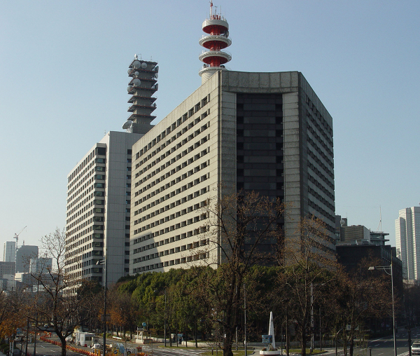
http://i1-news.softpedia-static.com/images/news2/Tokyo-Metropolitan-Police-Department-Admits-Possible-Role-in-Counter-Terrorism-Data-Leak-2.jpg

Tips? :P
http://i1-news.softpedia-static.com/images/news2/Tokyo-Metropolitan-Police-Department-Admits-Possible-Role-in-Counter-Terrorism-Data-Leak-2.jpg
Tips? :P
LockeZ
I'd really like to get rid of LockeZ. His play style is way too unpredictable. He's always like this too. If he ran a country, he'd just kill and imprison people at random until crime stopped.
5958
Show the rest of the map? There is probably a solution that involves changing the area around the building or the placement of the building rather than changing its size.
Edit: Here's a more differenter version of the magic learning screen:

I was worried I'd need actual borders between the skill names, but with the extra space I got from Mawk's suggestion, I don't actually think I do any more.
Edit: Here's a more differenter version of the magic learning screen:
I was worried I'd need actual borders between the skill names, but with the extra space I got from Mawk's suggestion, I don't actually think I do any more.

