THE SCREENSHOT TOPIC RETURNS
Posts

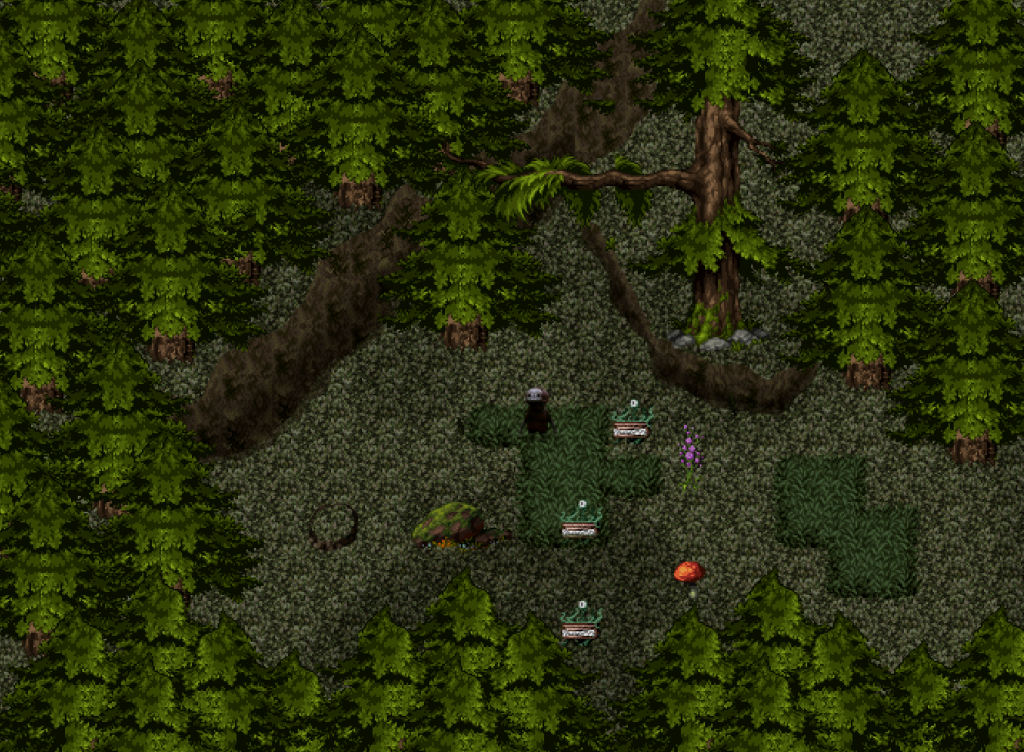
EDIT: Damn, page sniped it. Here:
@LockeZ: I'm impressed that you were able to make the lines on those tiles so smooth. It looks like an official set. My main issue with it (besides my personal bias against the XP RTP) is that the elevated path with the arches is weird looking, there's no sense of the depth of elevation around there for some reason. It looks like it comes out over the walls and hangs above them.
author=LockeZ
Lighting effects too strong, cannot see map. With a chandelier and a bunch of lamps and candles, the room should be totally visible with only some very subtle darkened areas (like 10% opacity tops in the darkest spots).
I can't really tell what's underneath the lighting effects, but it looks like it's probably pretty good?
Here is a pyramid! Made using RMXP RTP edits. A challenge, since RMXP RTP does not have any pyramid tiles.

@LockeZ: I'm impressed that you were able to make the lines on those tiles so smooth. It looks like an official set. My main issue with it (besides my personal bias against the XP RTP) is that the elevated path with the arches is weird looking, there's no sense of the depth of elevation around there for some reason. It looks like it comes out over the walls and hangs above them.
Corfaisus

"It's frustrating because - as much as Corf is otherwise an irredeemable person - his 2k/3 mapping is on point." ~ psy_wombats
7874
author=LockeZ
Here is a pyramid! Made using RMXP RTP edits. A challenge, since RMXP RTP does not have any pyramid tiles.
The only thing I could recommend if you plan to use this for a project is to make the pyramid thicker as to appear more equilateral.
LockeZ

I'd really like to get rid of LockeZ. His play style is way too unpredictable. He's always like this too. If he ran a country, he'd just kill and imprison people at random until crime stopped.
5958
Yeahhhh, it's very much trapezoid shaped instead of pyramid shaped. If it were made by actual Egyptians that would bother me, but it was made by an unknown fantasy race so I am fine with that.
I definitely see the problem with the bridge, I was kind of worried about that when making it but couldn't think of a way to fix it at the time and wondered if maybe it was just me. You mentioning the arches triggered an idea though. I think this fix should do okay?

I definitely see the problem with the bridge, I was kind of worried about that when making it but couldn't think of a way to fix it at the time and wondered if maybe it was just me. You mentioning the arches triggered an idea though. I think this fix should do okay?


@LockeZ: Yeah, that'll do fine as long as you make the arches that go underneath the same height as the columns behind them. As it is it's a lot easier to read though.
@Itaju: Your game looks super pretty, the characters remind me a lot of Golden Sun and the jigsaw motif is bringing back memories of Banjo-Kazooie and Tooie. I approve.
Is the current demo up to date? I'd like to see how the action elements play out on something as archaic as 2k3. It'd be a shame if the engine hampered such a beautiful thing.

This is from a section in Battle Royale where you can hack into the enemy computers. You have to avoid the security programs and traps to get parts of a password which unlocks those coloured doors, enabling you to deactivate the bomb collars, read student profiles etc. I've gone with the standard hacking=green and black screen template. How does it look? Stupid? OK?


I think I got the version that had that.
Can you update the downloads section? The one directly from site was missing Night2, and didn't have stuff like you've been screenshooting lately.
Fun game so far. I just solved the toad light puzzle, and rescued the horsie. Now I'm waiting until day to get the puzzle piece from that shop.
Can you update the downloads section? The one directly from site was missing Night2, and didn't have stuff like you've been screenshooting lately.
Fun game so far. I just solved the toad light puzzle, and rescued the horsie. Now I'm waiting until day to get the puzzle piece from that shop.
I will update the download when I have the full version. But if you want I can let you test inbetween. :)

Sure. How close is it to done, btw?
The Stream is talking to me... it's telling me to finish a 5000 piece puzzle.
(So far I haven't had to use a single potion, but I think it's the right mix of challenge and fun, for easy mode. Action RPGs are usually deadly on sluggish computers, but the regen abilities make it manageable)

Because, you know, most people don't have stew cooking directly next to beds.
author=Itaju
The Stream is talking to me... it's telling me to finish a 5000 piece puzzle.
(So far I haven't had to use a single potion, but I think it's the right mix of challenge and fun, for easy mode. Action RPGs are usually deadly on sluggish computers, but the regen abilities make it manageable)

Because, you know, most people don't have stew cooking directly next to beds.


A simple house.
@Bulma: Why the background image? It's a little odd. Is there a specific reason for it? The map itself looks pretty good. And the window works nicely. ^.^
It's a tent. I figure you can at least see the south portion of a tent out the entrance. And you can hear the rest, so I always make tents this way (and as general principle, I design towns Lufia style as much as possible, because having houses in complete blackness when they're built on stuff and have stuff around them is weird).
This is for Oracle of Tao, the first wasn't.

vs.

(I'm actually using both, just one is daylight, the other is for a night cutscene. Hmmmm, I'll add the lanterns in though)
Granted it's a tad more plush than most tents, but that's because it's
This is for Oracle of Tao, the first wasn't.

vs.

(I'm actually using both, just one is daylight, the other is for a night cutscene. Hmmmm, I'll add the lanterns in though)
Granted it's a tad more plush than most tents, but that's because it's
actually someone's afterlife mental construct, or part of their "heaven/hell". Also the reason some of it is impractical like fish directly next to apples, and a fire next to a bed, an entire freaking bookshelf inside a tent, they're basically dreaming it up.
because having houses in complete blackness when they're built on stuff and have stuff around them is weird
No it's not. One of the other images you posted showing ground and trees outside looks good, but it's not the only thing that doesn't look weird.
Having a real life picture of a forest is even weirder.
I have real life pictures of forests, mountains, valleys, and waterfalls.
I also have... Chinese paintings. I decided not to use them in games though.
I also have... Chinese paintings. I decided not to use them in games though.

author=Itaju
I will update the download when I have the full version. But if you want I can let you test inbetween. :)
This is an extremely pretty , amazing animation.
It's not even the only one. Although more that even the facial animations, what impressed me enough to put this on as my last game was the scene where the landscape is literally pulling out into puzzle pieces. Geez that scene is crazy awesome.

What do ya think?

I know the borders are shit, but my hand is as steady as a drunk guy.
(I'm not drunk)
I had the idea so I had to make it become real.
I know the borders are shit, but my hand is as steady as a drunk guy.
(I'm not drunk)
I had the idea so I had to make it become real.