


THE SCREENSHOT TOPIC RETURNS
Posts

The cliff looks cut off by the road, which makes it look like they are on the same elevations. Which makes no sense, as the road doesn't appear to have any indications of incline.
*Edit: Oh man, a new page with nothing to show!? Ugh.
*Edit: Oh man, a new page with nothing to show!? Ugh.

Strip tease! lol, not really. (It's a charm attack, btw)

These are about the only monster that I drew myself, mainly because it's easy to have stacked white spheres. What say you?

These are about the only monster that I drew myself, mainly because it's easy to have stacked white spheres. What say you?


Why do you keep using those real-life pictures. They dont fit at all with the sprites. It also makes the everything on the screen look like it has been shrinked 10x.

author=Marrend
The cliff looks cut off by the road, which makes it look like they are on the same elevations. Which makes no sense, as the road doesn't appear to have any indications of incline.
*Edit: Oh man, a new page with nothing to show!? Ugh.
And what should I do about that? :O

author=Itajuthis x100
finally a readable font :D
also guys don't forget about Alcarys Complex giveaway - Images Feedback challenge
There is a handy link now to it here: http://rpgmaker.net/portal/development/image_feedback/

Yes, those fonts are far better.

So hey! Guess what!? I'm actually moving on with my game and not constantly updating the current beta! So this map is the first map I've done in months, and isn't supposed to be super huge (30x35 is its dimensions). I was torn on what to use really, either to replicate what I did for the SDM Dimensional Rift or to actually use the Void's tileset that I was saving for the near endgame dungeon. I decided to go with the Void tileset despite there not being a whole lot to it from FFV (the tileset was ripped and set up by a friend of mine. How he managed to do it is a mystery even to me. I didn't even know he had the ability to do so, but he did it for this tileset and the FFIV Underworld tileset which I use for Makai).
I don't know how fancy I want to get with this first map really. There's only really one path that you need to go, and I'm not even sure if there'll be random encounters. There's a gimmick to this dungeon is why, but dunno if it's much of a gimmick (not sure how I'll code it or not). Also, the pink background there is meant to be transparent so that there's a parallax background (I don't have the proper background though that the Void uses, which would be IMMENSELY helpful if I could get that...).
From what I can see it's just flat ground with nothing sticking up and no eyecatching stuff.
The walls are nice and you've at least tried to add some elevation with the stuff at the bottom but more needs to be done to give it some oomph.
The walls are nice and you've at least tried to add some elevation with the stuff at the bottom but more needs to be done to give it some oomph.
Yeah, that's a problem with this tileset in particular.
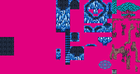
There's not much to go with for it at all from the original chipset sadly. I did add a tree to this map as I needed it for the cutscene but...other than that, not really sure on what else could be added to make it more eyecatching while not being glaring...I've even looked at a couple maps for the Void area in FFV, and while it does make good use of the tileset, dunno how to manipulate that well enough. It is floating in empty space so dunno how much THAT matters really (probably none at all for elevation).
The elevation differences for this area is going to be a pain in the arse, simply because of how the tileset is too I think. In fact, I'm not even sure HOW to use half of the stuff on this chipset at all. @_@;;

Then don't use it. Get a different tileset.
Not an option I'm going to take as this is the exact tileset I need for these kinds of areas. I guess I'll either wind up not using most of the stuff on here (mostly tree roots stuff as there's no Exdeath floating about in the Void here), or figure out how they work, or just add things onto it. *Shrugs*
Corfaisus

"It's frustrating because - as much as Corf is otherwise an irredeemable person - his 2k/3 mapping is on point." ~ psy_wombats
7874
author=Xenomic
The elevation differences for this area is going to be a pain in the arse, simply because of how the tileset is too I think. In fact, I'm not even sure HOW to use half of the stuff on this chipset at all. @_@;;
The thing is, there are so many chips on that chipset that are just duplicates of others that it may seem like more trouble than it really is. Other than that, just study how FF5 made use of them and try to emulate that. Without actually glancing back at it, I was able to whip this up pretty quickly on a first attempt.

Just make good, frequent use of naturally flowing curves and throw in some stairs to allow yourself to go wild with the elevation.
Hmm...that might be trickier than it seems seeing how bad I am at mapping lol. I guess the only thing I can do is keep at it. This is the first main "hub" area (it splits off into 3 paths, one of which is the actual path), so I can try to keep the mapping smaller and more tighter in the other maps I guess like this above.
I honestly don't know what chips aren't the same as one another as I assumed that there was a reason for them being there. ^^;;
I honestly don't know what chips aren't the same as one another as I assumed that there was a reason for them being there. ^^;;
Something that might help is to not make your maps too big. Towns or dungeons that are too spacious always end up looking stale and bland, unless you have a ton of detail in the said map. Imagine taking Corfaisus's example and increasing it's size. The layout's been changed, the object placement is different, but because of all that empty space, it looks bad. Though sometimes, the problem can be the total opposite where you have too much detail for the maps own good. In this case, having too much detail can be bad because everything's going to look redundant and repetitive.

author=Mr_Detective
Can anyone help me out? :O
As far as the road goes, you have 4 different elevated layers, two ground and two cliff. Your road spans all 4 layers, however the 'viewer' or player doesn't know what layer the road is supposed to be on. Without knowing how you want your road to be presented, my suggestion would be shading and shadows. They will help you lift up your road or push it back down, depending...
If you wanted I could fake up an example.
author=SnowOwl
Why do you keep using those real-life pictures. They dont fit at all with the sprites. It also makes the everything on the screen look like it has been shrinked 10x.
'Cause I can't draw freehand using a mouse. I either use borrowed art (which I need to credit, which is a nuisance), edit art using programs (which is bland), use RTP defaults (even more bland), or I figure out the effect I want and take a snapshot. I can draw okay (not well) by hand, but as I don't have a scanner anymore after not using it for two years, I still have to make a photo of any hand-drawn art and it doesn't look near as good as a natural scene.
Anyway, here's two arts I've drawn. See if you like one better than the other.

Smeary cray-pas pic.
OR

Dot picture scribbled during a boring party.

Hey! Listen!
Why not use the RTP backgrounds that come with the RTP, since you're using RTP monsters and RTP edited battlers? They fit best, yes? Or maybe you could look into some of the backgrounds that are made for the engine? I know there's a big lot of cool ones in the Resource Topic.
Why not use the RTP backgrounds that come with the RTP, since you're using RTP monsters and RTP edited battlers? They fit best, yes? Or maybe you could look into some of the backgrounds that are made for the engine? I know there's a big lot of cool ones in the Resource Topic.

Working on my very first game!
* Im german so please excuse possible grammar errors
* Sprites/Tilesets are all RTP for now (need better Barbarian Sprite)
* To the left goes the statweb (later)
* I wonder why I have chosen a red background when he is coming from the "icy north" (its a mystery - tell ya!)

PS: My project is a roguelike
* Im german so please excuse possible grammar errors
* Sprites/Tilesets are all RTP for now (need better Barbarian Sprite)
* To the left goes the statweb (later)
* I wonder why I have chosen a red background when he is coming from the "icy north" (its a mystery - tell ya!)
PS: My project is a roguelike
author=Malagar
I gather you can choose your character classes in this game.
What was the left window for? (Don't see anything in it.)
And something sounds off on the description "The barbarian engages combat..."
Maybe,
the barbarian engages in combat like a bull; horns aimed at the enemy,
with no concern for his own well-being.

