


THE SCREENSHOT TOPIC RETURNS
Posts
Look, I've been a 2D artist since over 10 years, I think I can tell pretty well what I have to do in order to create the Illusion of 3D or not. It's not a matter of the technique but how good you work it out.
Besides, unlike the cave, which is in a fitting perspective, maps with depth, you still could make the sprite smaller or bigger when it walks closer or moves away further.
Besides, the pictures as I've posted them are already in the perfect state with a resolution of 640x480 and 256 color depth, you could take them and load them into your rpgmaker as they are right now.
Last thing, it's always best to judge things you have seen, all we have here is some map pictures, not what I did with them after I added them into the game.
I guess it's just a matter of opinion really. It seems more people enjoy this concept. And I never doubted your abilities. I just didn't think it looked right for a 2D sprite to be moving in a 3D environment without seeing it done in action. This will be the last thing I'm posting about the matter.

The major problem I'd have with this map is all the secret paths.
I can imagine being like "where do I go now", rather than automatically figuring out to jump at some area.
I can imagine being like "where do I go now", rather than automatically figuring out to jump at some area.

Depth and control issues could be handled by just eliminating tile-based movement and handling collision detection and depth via a grayscale mask. The higher the white value of the pixel at the sprite's coordinates, the larger to render the aprite, with solid black pixels being obstructions. There are workable solutions to this "problem". Also, bulma's example image is ugly while White_Rabbit's is very handsome. He clearly has an aesthetic sense that you don't so I'd trust his instinct when he starts integrating sprite objects into it.

My god bulmabrief, stop trying to do this all the frigging time. It has been told to you over and over why it doesn't work with your 2D/3D mix.
It creates a very jarring contrast. It does not look good. You may think it's fine, but I can promise you that 99% percent of the viewers will say that it looks like shit. You example with the Looney tunes or whatever they are called is slightly better only because they have taken every possible measure to try to fit shadows and colors to the IRL picture. Even then I personally find it visually not very pleasing. If you have a team of dedicated animators and whatevers willing to do the same for you, go for it. Otherwise, don't. Just please. Don't.
It creates a very jarring contrast. It does not look good. You may think it's fine, but I can promise you that 99% percent of the viewers will say that it looks like shit. You example with the Looney tunes or whatever they are called is slightly better only because they have taken every possible measure to try to fit shadows and colors to the IRL picture. Even then I personally find it visually not very pleasing. If you have a team of dedicated animators and whatevers willing to do the same for you, go for it. Otherwise, don't. Just please. Don't.
author=Jude
Depth and control issues could be handled by just eliminating tile-based movement and handling collision detection and depth via a grayscale mask. The higher the white value of the pixel at the sprite's coordinates, the larger to render the aprite, with solid black pixels being obstructions. There are workable solutions to this "problem". Also, bulma's example image is ugly while White_Rabbit's is very handsome. He clearly has an aesthetic sense that you don't so I'd trust his instinct when he starts integrating sprite objects into it.
I remember like 10 years or so ago, I found a way to break out of the tile-move system. But I couldn't find any tutorial/patch for 2k3 in the past weeks.
author=White_Rabbit
I remember like 10 years or so ago, I found a way to break out of the tile-move system. But I couldn't find any tutorial/patch for 2k3 in the past weeks.
http://rpgmaker.net/tutorials/498/

There is a huge difference between designing a game with parallaxing in mind and taking a sprite and putting it over a photo. In the first case, there's a lot of work that goes into making sure the sprites fit with the parallax and vice versa. It can be done but only if you put effort into it.
For example, let's take two quite well-known 2k3 games: Sunset Over Imdahl and The Way. Both are quite different from each other but both achieve the same thing when it comes to parallaxed mapping - making it fit.
In the case of Sunset Over Imdahl, the creator made sure that everything fit together. They used the parallaxes in conjunction with chipsets to create a city that looked great, but they also kept in mind the type of sprites that would inhabit the city and whether or not they fit with each other. Thus we have a dichotomy that works wonderfully together:
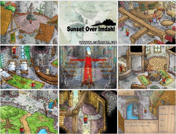
If you google Sunset Over Imdahl Download, the first link will send you to one. I recommend playing this game at least once in your life.
Then we have The Way, which uses more 3D modellled landscapes with 2k3 sprites, coupled with mapped out sections as well. However, instead of just taking a few pictures and slapping them onto the background and calling it done, the creator created each background to look like he wanted. This gave an interesting appearance to the game which was jarring, but also worked quite well with the story and characters (who were also quite jarring and jumbled.)

Does he fit 100%? No. But you gotta admit, this shit is awesome non-the-less.
The story worked with the differences because it brought more depth to the game and FIT into the atmosphere. Were there some wonky bits here and there? Hell, yes there were, but the story pulled it along so that it wasn't as jarring as it could have been in a lesser game.

I still remember seeing this for the first time.
From the looks of things, White Rabbit, you've put in some freakin' effort. I do hope you'll be using sprites that work with the graphics you've shown us because frankly, I think it looks amazing and it'd be a waste of your effort not to. As for the move issues? There are ways around that as seen above. ;P
For example, let's take two quite well-known 2k3 games: Sunset Over Imdahl and The Way. Both are quite different from each other but both achieve the same thing when it comes to parallaxed mapping - making it fit.
In the case of Sunset Over Imdahl, the creator made sure that everything fit together. They used the parallaxes in conjunction with chipsets to create a city that looked great, but they also kept in mind the type of sprites that would inhabit the city and whether or not they fit with each other. Thus we have a dichotomy that works wonderfully together:
If you google Sunset Over Imdahl Download, the first link will send you to one. I recommend playing this game at least once in your life.
Then we have The Way, which uses more 3D modellled landscapes with 2k3 sprites, coupled with mapped out sections as well. However, instead of just taking a few pictures and slapping them onto the background and calling it done, the creator created each background to look like he wanted. This gave an interesting appearance to the game which was jarring, but also worked quite well with the story and characters (who were also quite jarring and jumbled.)
Does he fit 100%? No. But you gotta admit, this shit is awesome non-the-less.
The story worked with the differences because it brought more depth to the game and FIT into the atmosphere. Were there some wonky bits here and there? Hell, yes there were, but the story pulled it along so that it wasn't as jarring as it could have been in a lesser game.
I still remember seeing this for the first time.
From the looks of things, White Rabbit, you've put in some freakin' effort. I do hope you'll be using sprites that work with the graphics you've shown us because frankly, I think it looks amazing and it'd be a waste of your effort not to. As for the move issues? There are ways around that as seen above. ;P
The issue I have with expanding/contracting the hero is that it's not always appropriate. Yes, the hero is in the forefront of the screen, so logically would be larger. But in a closed space like a cave, that ends up looking like the character is taller than the cave walls, unless you really understand perspective, it looks odd. The hills in my above picture are more or less to scale with the character so it looks outright weird if she could step across them in one step but has to actually take three steps to do it. Plus, it's kinda worthless for horizontal curved paths like the above as vanishing point only goes in slightly.
FF8 is a good example of doing perspective correctly. Characters do gradually shrink, but they shrink/grow believably with their background.
http://www.youtube.com/watch?v=IOMReDD0aaU
Just look at perspective (5:06 or so), and you get a better sense. It's much more subtle than just bloating a charset.
But that's a tad more complicated than most people can just do on the fly. I basically ignored it to concentrate in working on other aspects of realism (weather, day/night, seasons), rationalizing that being 2d munchkins, there's only so "real" you can make them anyway.
The pure 3D parallaxes in my game are like 10 maps total. Five of which are within the same area (simulating a mountain climb), one of which was basically a screenshot of a tileset I precreated (I wanted to have the screen shift), and most of the rest are scrolling parallax like sky, clouds, etc moving in the background. Aside from that, I have mostly tileset with panorama, like the the following.


Pure parallax maps are very rare. So yea, it fits in an odd way, by not asking that more than a few maps actually are parallax, and then only having either scrolling or small screen (and largely then, angled rather than straight vanish viewpoint).
I've played both games, and even edited (that stupid bat minigame) Sunset at Limahl. I have a BG chipset, but because my BG are so wildly different, I mainly just spliced random stuff I'd add on (like a bridge, ladder, some houses and some stuff to stand on). The Way I pretty much lost every battle because I suck at RPS battles, but I got the general sense of how to move stuff around in a pure parallax screen.
The top image's panorama fits well because you're on a mountain, but the bottom image doesn't do it for me because it looks like the bridge is a poster in front of waterfalls and cliffs (at least to me anyways). If that's supposed to be a bridge over water then maybe the background image could be a scrolling picture of water? These are just my opinions, feel free to ignore them if you want.
With the first image, it looks extremely odd with the mountains connecting but not overlapping. Of course that image is going to work semi-fine, though - it's a game rip, not a real-life picture. This means it was made for a backdrop in a game so it suits the style.
The second one doesn't work at all because like Mitchell says, it looks like the bridge is pasted on the top. It'd be better to actually put a bit of effort in and either make a mapped backdrop or find one that fits better. Hell you could probably add proper water tiles to the bottom part and keep the top as a picture and it would look better. Not awesome, but better than it currently does. The main issue, though, is that it's a photo, not something made for a game. There are literally thousands of different game backgrounds you could use if you'd look for them.
Suikoden II has a waterfall backdrop that might work well (it's also animated so if you rotate the frames with an event you'd have a back-drop that moves!) or the one from Final Fantasy 6. They are out there and they fit the pixelled style of 2k3 better than any photo ever will.
First, thanks for the link, I've searched hours for this and couldn't find it, and especially this forums are so slow for me, it takes like 1minute to load a page >_<
@Liberty
Thanks for the compliments.
I've prepared quite well. making paralax BG at 640x480 they fit 1:1 into a 40x30 map, which makes it a lot easier to plan everything. Not just for plaxing the above layer objects but also because I could draw with a template layer in photoshop, that showed me where the tiles are. This way I could define those things, like not having pathes between 2 tiles and such things. Certain compromises need to be made though, like the bridge, I prefered making it a bit skewed but sacrificing that ability to move over it in one line (you have to push up/down at one moment for complete crossing).
About the general discussion: Who actually said that chipset is 2D and Panorama is 3D? I implemented some chipset maps, and they're the same quality, just with less variety.
My characters should fit into the style, I drew them by myself as well and made them look as realistic as possible. Considering that they are reduced to an enormously small size, this might seem impossible, but the thing is, most things people see in your pictures are illusions of what you want to see. Seeing certain color and shadow combinations automatically makes you create a form in your head, interpretating it into something. This can be used with pixels as well. Oh, but the biggest thing, the standart charsets of rpgmaker all have outlines, and the shadows have no transitions, just like a cartoon character, this flats them out even more.
On top of everything I did for a realistic touch, I use tinted screens to make character and map color always get closer to each other. I've even added charset changes in certain spots because of light effects. Like a blue shimmering tunnel from the right will change my sprite, giving it a blue shine coming from the right.
Speaking of characters, just finished my 3rd playable character battle animation. I might be going to make a video though, because seeing the sprites alone doesn't really give you an impression of how they look animated.
author=White_Rabbit
I remember like 10 years or so ago, I found a way to break out of the tile-move system. But I couldn't find any tutorial/patch for 2k3 in the past weeks.
Since you're using 2k3, I recommend just sticking to the tile-based movement, avoiding dynamic sprite scaling since you can even use the method I suggested at all, and designed your backdrops with equal proportions akin to isometric, though your tilt can be different from area to area (which is what you appear to already be doing anyway). To add per-pixel movement is more hassle than it's worth, and any dynamic scaling would have to be done exclusively based on the sprite's vertical coordinate. These are greater obstacles than you probably grasp.
Speaking of characters, just finished my 3rd playable character battle animation. I might be going to make a video though, because seeing the sprites alone doesn't really give you an impression of how they look animated.
Just make a GIF. And what's with showing compressed jpegs for spritework anyway?
author=GamingMitchell03232013
The top image's panorama fits well because you're on a mountain, but the bottom image doesn't do it for me because it looks like the bridge is a poster in front of waterfalls and cliffs (at least to me anyways). If that's supposed to be a bridge over water then maybe the background image could be a scrolling picture of water? These are just my opinions, feel free to ignore them if you want.
It's the bridge of Niagara Falls! (No seriously, this is a shapshot of Niagara Falls). I've got a waterfall elsewhere. It doesn't work here, as you're crossing between two islands not under a fall (so there may be falls off in the distance or not but you're above the water on some sort of suspension).
Hmmmm, while I could argue that you're seeing one bridge from atop another bridge, I think I've got another shot or two that doesn't include the bridge.
http://imageshack.us/photo/my-images/401/1dcx.png/
http://imageshack.us/photo/my-images/716/yue.png/
http://imageshack.us/photo/my-images/694/tg2l.png/ (Good but very plain)
http://imageshack.us/photo/my-images/822/lv74.png/
http://imageshack.us/photo/my-images/6/j62u.png/
(Of these which works best? And don't say none of them. I could also narrow or widen the bridge)
Otherwise I'm defaulting to this.
Also, as for complaining peoples about vanishing perspective, I've figured out a method to do it (poorly). It goes from 32 height to 24 or whatever down to like 10. I should really include a fourth one. Meh. I'm doing it mainly to appease crazed perspective lunatics which probably won't like the sudden drop in size anyway.

(Bigger than normal)

(Smaller than normal.)
None of them. Yes, I said it. Why?
They will look bad. It's the graphic clash. On one you have pixels. On the other you have a photo. If you want to use the photo you'll have to make a character that isn't RTP pixels. You should make a character that fits with the graphical style.
That and the girl is the size of the grass in the first one. It doesn't stack up. At least in the case of The Way the sizes were consistent. You'd have to make her sprite about 20 times bigger to make it work in that shot. Also doesn't help that the footprints are the size of her in the second one.
@Jude I was sure photobucket cant upload pngs for a moment, but than I remembered I already did that before with the caves, so nevermind.
@bulmabriefs
For scaling I made this code:
Place a paralel process somewhere in the lowest tile row with this code:
Var Oper: Set, This Event Y Coord
Var Oper: - , Hero Y Coord.
Branch if Var is [set a number of vertical tiles from the event to the spot - at the row you want your hero to change the sprite, add another of those directly below that changes the sprite back to before, like if the number was 2 here, make 1 in another branch)
And yeah, finally, a line for changing the char sprite. This way, I'd add a lot of char sprites with different sizes, because without a smooth transition, I'd rather stay with keeping sizes or it makes things only worse.
And on a sidenote, if I may give you some tips:
Remove the outlines of your characters, make smoother transitions on the shadows. If you use Photoshop, make a layer above the sprite,, bind it as a mask and use a small smooth brush to remove outlines and make light/shadow transitions.
This is also the issue with the bridge or any other cvombination of photograph and sprite/chipset. The outlines make it look cut in, as well as the monotonous colour does. If you zoom into your BGs, you'll never find a single pixel with the same value and color next to each other.
I like the clash, I'm keeping it. The guy who made The Way is not me, neither is the other one. I must find what fits and works using my strengths and weaknesses, not copy what someone else has done. This results in a knockoff, and I'd rather have a poor game than an average (or even a good) knockoff. I lack the consistency of tilesets to follow Sunset in Limahl's example, and I lack the computer software to just spit out high end custom parallax. And I'm hardly a spriter (beyond simple edits), so I'm not fixing that. But I'm a photographer, so I take and compress snapshots. So figure out how to make that work for me, and I'd actually appreciate the advice.
Also, is there a way to alter the bridge/BG to make it look more like it stands out (or whatever) against the background?
I'll add in-between frames to create a slightly more gradual change in graphic size.
Also, is there a way to alter the bridge/BG to make it look more like it stands out (or whatever) against the background?
I'll add in-between frames to create a slightly more gradual change in graphic size.
Take a photo of a bridge. Instead of doing it halfway, if you're going to use photos use all photos. Don't half-ass it. You're a photographer - use that. Make it work for you. Take photos and use them as sprites so they fit better.
Urgh, no. I'd rather have clash than redo 426 maps just because it offends someone's sensibilities.
What I may do is take all pictures for a single chipset. That chipset I can use to make mountains, bushes, bridges, etc for BG-heavy screens. But beyond that is really overkill. There are plenty of working maps (close to 2/3) that don't use photos as BG.
I'm an amateur photographer (I'm a pro-gardener), and I happen to think Photoshop is horse-crud. I use irfanview, which is a free program that is also easier to use, and I use iDraw for certain editing features after creating the 256 color photo. And I use paint when I have to put stuff on top of each other without much fuss.

