


THE SCREENSHOT TOPIC RETURNS
Posts


I dig it. Sort of like how that ship does.
For that jumping animation, is it celebratory, or for jumping off ledges and stuff?
For that jumping animation, is it celebratory, or for jumping off ledges and stuff?

author=giaksauthor=Mr_DetectiveAs far as the road goes, you have 4 different elevated layers, two ground and two cliff. Your road spans all 4 layers, however the 'viewer' or player doesn't know what layer the road is supposed to be on. Without knowing how you want your road to be presented, my suggestion would be shading and shadows. They will help you lift up your road or push it back down, depending...
Can anyone help me out? :O
If you wanted I could fake up an example.
I don't like using shadows, and I never used it anywhere in the game so that won't do. :O


Maybe you could make it wind it's way down somehow? Or make a path leading up to the road and have the road itself at the top of the cliff? It still looks really odd.

author=Mr_Detective
I don't like using shadows, and I never used it anywhere in the game so that won't do. :O
It's looking much better. The upper cliff still does look a bit off. Maybe consider adding a road sign that would span over the road where the road and the cliff meet or maybe some type of roadway tunnel?
Something sort of like...

...it sort of does play on shadows a little though :(
It looks like you are using the road as a boundary, so depending on how much the player can see, it may look fine in game.
author=LouisCyphre
I dig it. Sort of like how that ship does.
For that jumping animation, is it celebratory, or for jumping off ledges and stuff?
Thanks, I'm hoping to figure out a way to add a little more detail to the environments that isn't too much work. This is my attempt at a short game, so I don't want to get bogged down with details.
I was thinking of different poses and actions, to test how I will draw the sprites. That is jumping jacks xD Probably won't end up in the game.
author=giaksauthor=Mr_DetectiveIt's looking much better. The upper cliff still does look a bit off. Maybe consider adding a road sign that would span over the road where the road and the cliff meet or maybe some type of roadway tunnel?
I don't like using shadows, and I never used it anywhere in the game so that won't do. :O
Something sort of like...
...it sort of does play on shadows a little though :(
It looks like you are using the road as a boundary, so depending on how much the player can see, it may look fine in game.
I couldn't do it like yours, so this is what I currently have. :P

If you want that tunnel effect, you'd need to make a gradient layer* going from solid black at the top to transparent at the bottom.
Then the tunnel entrance would need to be in your B/C/D.. tiles so you can lay it on top of the road tiles.
*in gimp/photoshop when creating your custom tiles.
Then the tunnel entrance would need to be in your B/C/D.. tiles so you can lay it on top of the road tiles.
*in gimp/photoshop when creating your custom tiles.

Revisiting this comment. Blue.
I said before I'm an amateur photographer, so people said I should quit being lazy and do the entirety of my pictures by photographing it. There are two problems with this, one we live in a nowhere town which despite having a nice stone cottage, the closest thing it has to a bridge is a 2 ft thing over a dry bed that you can literally walk over anyway, since these better pictures came from a massive US/Canada road trip. The other, is that parallax mapping is only a small part of my game, as I said. But that has nothing to do with the real issue, after staying up all night thinking about it, I realized what a photographer's (besides portrait types) sensibilities are. Contrast.
If a painter can be said to create harmony in their painting, most photos are said to create contrast. Look at any scenic shot, and there's a rule called something like the rule of thirds. Basically if you have a mountain shot, you could just go with the land you had below. But that could be taken from a plane. What proves that you are in fact on top of that mountain is if you get (1)the top of the mountain, (2) the gorge, and (3) the valley below. Likewise, pictures can be horizontally cut in thirds.

The following photo tells you alot about what's going on. The middle third for instance has contrast with the other two as there is cut grass, displacing the focus from "It's a lawn" to "Oh, bulma's cutting grass." You can also see an orange cord going from inside to the lawnmower, and know that this is in fact not a gas powered mower. Finally, this picture is cut by rule of thirds both horizontally and vertically (house/porch/lawn and lawn/cut/lawn plus mower). Not that it's a perfect picture, as these aren't perfect thirds. But you get the idea of contrast. This btw is why photography is known for collage, and paintings just look weird when you turn them into collage. Harmonious paintings aren't slapped together, but contrasting photos are.
So, back to the bridge. Contrast works if it's simply a panorama. But the scene itself doesn't work technically, and I'll explain why.

Based on all this, I changed the picture used, turned the bridge into a rope bridge, and made it extend between two chipset cliffs. Sure, the thing still isn't 100% but it fits because while it provides contrast, it is now the scenery rather than the focal point of a weird looking bridge.

So what I came up with instead. The general impression is that the ugly chipset bridge is in the foreground, and eventually connects to the rest of this mountain, and the river runs through this gorge. We don't actually know how tall this foreground mountain is but we get sense it's comparable to the background. Of course, yes it still is a clash between the charsets/chipset with the background, but it looks better than the bridge before, so it'll do for now.
author=Liberty
There is a huge difference between designing a game with parallaxing in mind and taking a sprite and putting it over a photo. In the first case, there's a lot of work that goes into making sure the sprites fit with the parallax and vice versa. It can be done but only if you put effort into it.
But I'm not "designing a game with parallaxing in mind." I've got one real set of parallax map that the character actually walks on, that covers 1-2% of the total number of maps, just that mountain climb thing. And only because I had a ton of photos lying around which I thought would be more visually interesting than making yet another boring mountain, with my dungeon chipset, when I've got picture resources available. So, as I say, I'm not making parallax maps as a general rule, it's an exception. I am however including whatever pictures I have available, for the purposes of making a decent panorama.
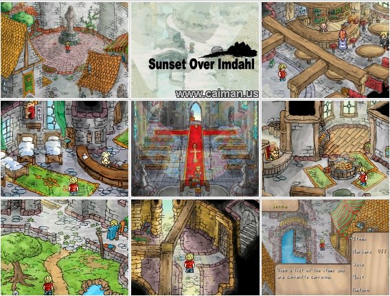
For example, let's take two quite well-known 2k3 games: Sunset Over Imdahl and The Way. Both are quite different from each other but both achieve the same thing when it comes to parallaxed mapping - making it fit.
In the case of Sunset Over Imdahl, the creator made sure that everything fit together. They used the parallaxes in conjunction with chipsets to create a city that looked great, but they also kept in mind the type of sprites that would inhabit the city and whether or not they fit with each other. Thus we have a dichotomy that works wonderfully together:
If you google Sunset Over Imdahl Download, the first link will send you to one. I recommend playing this game at least once in your life.
I've beaten it, after tweaking the bat puzzle.
Then we have The Way, which uses more 3D modelled landscapes with 2k3 sprites, coupled with mapped out sections as well. However, instead of just taking a few pictures and slapping them onto the background and calling it done, the creator created each background to look like he wanted. This gave an interesting appearance to the game which was jarring, but also worked quite well with the story and characters (who were also quite jarring and jumbled.)
Does he fit 100%? No. But you gotta admit, this shit is awesome non-the-less.
The story worked with the differences because it brought more depth to the game and FIT into the atmosphere. Were there some wonky bits here and there? Hell, yes there were, but the story pulled it along so that it wasn't as jarring as it could have been in a lesser game.
(Goes on to address White Rabbit)
...Okay, let's keep talking about these pictures. There are two different sensibilities here for parallax scenes,and unless you understand the how and why of it, it's easy to become completely lost as to where I'm coming from.
First, we have Sunset in Limahl, the creator is an painter. A painter's sensibilities are having everything match. If you look at an average painting, it's all oil or all pastel, not oil painting with a giant jet plane plastered on with wallpaper (I seriously saw a decent surrealism painting, versus a toilet with the confederate flag pasted on which won 1st, I snuck in between judging and shifted the ribbons). Look closely at the chipset and even the sprite. It's all drawn with the same method, and just demonstrates good harmony.
Next, we have The Way. You're right, the sprite and BG don't match. In fact they don't match at all, sprites tend to be hand-drawn and the background is likely vector drawn. But this is the sensibilities of a graphic designer. This scene fits because it works. As in, every rock and tree behaves like a rock and tree, and those stepping stones allow movement just like you'd suspect. I haven't played this game in awhile, but I seriously wouldn't be surprised if he cycled this picture to give the impression of the stream flowing. It's all technically correct.

I said before I'm an amateur photographer, so people said I should quit being lazy and do the entirety of my pictures by photographing it. There are two problems with this, one we live in a nowhere town which despite having a nice stone cottage, the closest thing it has to a bridge is a 2 ft thing over a dry bed that you can literally walk over anyway, since these better pictures came from a massive US/Canada road trip. The other, is that parallax mapping is only a small part of my game, as I said. But that has nothing to do with the real issue, after staying up all night thinking about it, I realized what a photographer's (besides portrait types) sensibilities are. Contrast.
If a painter can be said to create harmony in their painting, most photos are said to create contrast. Look at any scenic shot, and there's a rule called something like the rule of thirds. Basically if you have a mountain shot, you could just go with the land you had below. But that could be taken from a plane. What proves that you are in fact on top of that mountain is if you get (1)the top of the mountain, (2) the gorge, and (3) the valley below. Likewise, pictures can be horizontally cut in thirds.

The following photo tells you alot about what's going on. The middle third for instance has contrast with the other two as there is cut grass, displacing the focus from "It's a lawn" to "Oh, bulma's cutting grass." You can also see an orange cord going from inside to the lawnmower, and know that this is in fact not a gas powered mower. Finally, this picture is cut by rule of thirds both horizontally and vertically (house/porch/lawn and lawn/cut/lawn plus mower). Not that it's a perfect picture, as these aren't perfect thirds. But you get the idea of contrast. This btw is why photography is known for collage, and paintings just look weird when you turn them into collage. Harmonious paintings aren't slapped together, but contrasting photos are.
So, back to the bridge. Contrast works if it's simply a panorama. But the scene itself doesn't work technically, and I'll explain why.

- Bridge has no supports and no suspension. It's oddly free standing.
- Contrast only works if your eye still believes that these two are connected. That is, it's jarring enough that the picture is 3D and the chipset/sprites are 2D, but the bridge is sorta plopped down without any regard to the scene (there's a bridge in the background, and it's a better bridge, so why cross here?)
- Not only is the no sense of anything but a bridge handing in midair, but the other bridge is metal, rather than plank board. You get the sense despite its width, someone could step through, and yet the heavy monster guarding it is perfectly fine.
- You cannot accurately gauge how high this bridge is from the ground. Is it literally on the water and fighting to stay together, or is it atop a cliff like the other?
Based on all this, I changed the picture used, turned the bridge into a rope bridge, and made it extend between two chipset cliffs. Sure, the thing still isn't 100% but it fits because while it provides contrast, it is now the scenery rather than the focal point of a weird looking bridge.

So what I came up with instead. The general impression is that the ugly chipset bridge is in the foreground, and eventually connects to the rest of this mountain, and the river runs through this gorge. We don't actually know how tall this foreground mountain is but we get sense it's comparable to the background. Of course, yes it still is a clash between the charsets/chipset with the background, but it looks better than the bridge before, so it'll do for now.

I have no idea what you are trying to say with your bastardized "rule of thirds" but here is how it really works.
Rule of thirds:
An image is divided into 9 squares. Anything you want the player to look at should be put where the lines of the squares intersect or along these lines.
Simple example:

In the image you posted with the lawnmower, my eyes are draw to the lawnmower, which is at the lower right, and not at any of these lines.
The line of cut grass could be said to run along one line, but to me it looks more like its almost in the middle. What exactly were you trying to say with that picture?
Rule of thirds:
An image is divided into 9 squares. Anything you want the player to look at should be put where the lines of the squares intersect or along these lines.
Simple example:
In the image you posted with the lawnmower, my eyes are draw to the lawnmower, which is at the lower right, and not at any of these lines.
The line of cut grass could be said to run along one line, but to me it looks more like its almost in the middle. What exactly were you trying to say with that picture?
But I'm not "designing a game with parallaxing in mind." I've got one real set of parallax map that the character actually walks on, that covers 1-2% of the total number of maps, just that mountain climb thing. And only because I had a ton of photos lying around which I thought would be more visually interesting than making yet another boring mountain, with my dungeon chipset, when I've got picture resources available. So, as I say, I'm not making parallax maps as a general rule, it's an exception. I am however including whatever pictures I have available, for the purposes of making a decent panorama.
Which is why you shouldn't use them. Because you're not designing the game with parallaxes in mind, so you're not thinking about how they're supposed to be used to fit with your world.
When you create a game there are two things you want to avoid most of all - 1) the player ALT+F4ing (you want them to play the damn thing to the end) and 2) ruining immersion. By not taking into consideration the complete differences with locations you're ruining the immersion in your game. The Way works because it is designed around the use of the parallaxes - they're inherent through-out the game and they are specifically designed to work with the world around them. Immersion isn't broken because they FIT.
If your mountain is boring, spice it up. It is extremely easy to edit the chipsets in 2k3 - grab iDraw and just shift colours until they're different; make it an ice mountain, or a grass one or one with houses built into the sides, or caves that have greenery and water in them, or floating areas or lots of bridges or lots of ladders or mines with holes to drop down to progress or ... any number of things. You're being lazy and in doing so breaking the immersion for your poor players.
It's not a decent panorama. It's a lazy panorama.
Here's an idea - make your photos fit by editing them. Oooooh~
So I had a mess-around with your above bridge and here's what I found:
First off I started looking for rips of waterfalls. I picked the likely ones that looked decent and added them. Then I drew one (lawl at my art skills) and also mapped one (then reduced the size by 75%, adjusted the saturation and lightness).
1. Mapped
2. Suikoden II
3. (F)art
4. Final Fantasy 6
5. 2k RTP Battle background

Then I edited your photo.
1. Simple Salt and Pepper filter
2. A few filters
3. More filters

As you can see the S&P one looks like it was created for a game. Holy Batman, Batman! It fits a lot better and doesn't clash as much. The things you can do with newfangled technothingies!
And that? The first lot took me about an hour of searching for all of them (including whipping up that terrible art), while the editing took about 5 minutes (if not less!) each.
Try new things. Sometimes a simple edit or two is all it takes.
author=coelocanth
If you want that tunnel effect, you'd need to make a gradient layer* going from solid black at the top to transparent at the bottom.
Then the tunnel entrance would need to be in your B/C/D.. tiles so you can lay it on top of the road tiles.
*in gimp/photoshop when creating your custom tiles.
Eh, I tried, but couldn't get it right. :(
By "not designing the game with parallax mapping in mind" I mean that just that, I'm not by and large making parallax maps. I'm making chipset maps with panorama backgrounds, with the exception of that mountain. I've made dry sandy mountains/caves, wet cliffs, at least a few snowy, and some grassy. I've made mountains with buildings and trees, and even mountain temples leading into the clouds. I've even made greyscale mountains and caves.
It's not from not trying hard enough. Sometimes you just get bored with the idea and want a change of pace.
Moving on...
Mr Detective, this might be a good case for a parallax/picture. Make a picture at the tunnel mouth that is more transparent on bottom than top that's black (I'm not sure whether the engine you're using can do that, but 2k3 can). This should allow a general look of fading into darkness.
It's not from not trying hard enough. Sometimes you just get bored with the idea and want a change of pace.
author=Liberty
So I had a mess-around with your above bridge and here's what I found:
First off I started looking for rips of waterfalls. I picked the likely ones that looked decent and added them. Then I drew one (lawl at my art skills) and also mapped one (then reduced the size by 75%, adjusted the saturation and lightness).
1. Mapped
2. Suikoden II
3. (F)art
4. Final Fantasy 6
5. 2k RTP Battle background
I'm sorry, but even if those were okay, pretty much every single one of them miss the point. You are not crossing under a waterfall, there is a waterfall in the distance, and you are on a rope bridge between two cliffs.
Like this.
Then I edited your photo.
1. Simple Salt and Pepper filter
2. A few filters
3. More filters
As you can see the S&P one looks like it was created for a game. Holy Batman, Batman! It fits a lot better and doesn't clash as much. The things you can do with newfangled technothingies!
And that? The first lot took me about an hour of searching for all of them (including whipping up that terrible art), while the editing took about 5 minutes (if not less!) each.
That one is okay. But I'm still am unlikely to do it. Sorry, but these are my pictures, and they're my memories.
At the very most, I'm just gonna mess with saturation to make it more game-style color and blur a bit.
Yay. It's blurry and saturated enough that it looks like game pixels. I also hate it.
Try new things. Sometimes a simple edit or two is all it takes.
You mean, like keep an open mind? That only applies if you can provide proof that the effect actually improves the picture rather than degrades it (I can't go and retake the shot if I screw it up my copy, as it's taken across the country). Otherwise, there was no point in me converting using high quality methods, and I could have done this on Paint.
Moving on...
Mr Detective, this might be a good case for a parallax/picture. Make a picture at the tunnel mouth that is more transparent on bottom than top that's black (I'm not sure whether the engine you're using can do that, but 2k3 can). This should allow a general look of fading into darkness.
Corfaisus

"It's frustrating because - as much as Corf is otherwise an irredeemable person - his 2k/3 mapping is on point." ~ psy_wombats
7874
author=bulmabriefs144
It won't "work" because people are stupidly elitist in this forum about having sprites match the perspective of the screen.
This is "wrong". Nevermind, that I see nothing at all wrong with it, because it's a curved road aside a hill. But seriously, it's just a game. Nobody playing the game who isn't an art snob is gonna care if the character is too short/tall with regard to the scene. I mean, look, most of us grew up with characters big as towns on worldmap.

author=bulmabriefs144
Impenetrable wall of "artistic integrity" + waterfall.bmp
No, clearly you know best despite the fact that everyone has been telling you the contrary since you came in with Oracle of Tao. Don't bother posting anything around this topic looking for yes-men and just do what you want to do.
Also, you're more than welcome to another 2 star review which you'll just end up bitching about and threatening the review's author with a purple nurple in return before getting shut down by a mod/admin because "nobody gets me".
I mean, look, most of us grew up with characters big as towns on worldmap.
Yes, because it was consistent.
Every time you got on the world map you had consistent character sizes and graphics. There was no "On this mountain I'm as big as a bush, but on this one I'm taller than a tree!"
Con-sis-ten-cy. Meaning to be consistent or the same. As in using the same kind of graphical style through-out the whole game so the player knows what to expect right from the start and not fall out of immersion due to sudden appearance of photo images in what was usually a mix of RTP and Mack tiles previously.
You mean, like keep an open mind? That only applies if you can provide proof that the effect actually improves the picture rather than degrades it (I can't go and retake the shot if I screw it up my copy, as it's taken across the country). Otherwise, there was no point in me converting using high quality methods, and I could have done this on Paint.
No, I mean like listening to valid points because you're not making a game depending on parallaxing - you admit as such. You're popping photos in with clashing graphics and making your game look bad.
But hey, it's your game. Frankly, I'm not the one affected by your stubborness - you are. I'm just trying to drum in the idea that graphics should match in some small way especially if they're just used here and there in the game. It makes sense to make them look like they freakin match the graphical style somewhat, but if you're not inclined to listen, I'm certainly not inclined to bother helping or caring. Carry on as you were, just don't ask for opinions on things if you're not going to listen to them.
@MrD: It's not perfect, but it might work. It should be centered between 5 tiles (allows a little overlap on each side of the 1st and 5th tile) at 4 high. Remember to have the road tile underneath it. Hopefully it works okay.

LockeZ

I'd really like to get rid of LockeZ. His play style is way too unpredictable. He's always like this too. If he ran a country, he'd just kill and imprison people at random until crime stopped.
5958
Lack of consistency is one of the biggest problems with the graphics in World of Warcraft.
Hey look here is an undead castle! My human-sized character is as tall as the floor trim.
Later: Hey look here is a viking boat! The skill nailed to the front of it is a viking skull! But it's six times as big as the skulls of the actual vikings sitting in the boat.
Later: Oh god Arthas is thirty feet tall
Later: I'm pretty sure this dragon's toenail is literally six times as tall as me, and yet I just looted the dragon's head
Later: Here's a troll house! It's reasonably sized, except that this bucket of fish is bigger than me, and the two torches outside the door extend way over my head.
This seems obvious but: the fact that we grew up with something and didn't complain about it at the time doesn't make it okay. It just means we didn't know better when we were kids, and possibly got used to certain problems.
I'm not looking for a yes-man.
I'm looking for a way to improve the scenes which have parallax without:
1. Reducing the quality of the parallax themselves (pixelating or washing them out are non-options)
2. Having to convert everything to parallax to match.
3. Having to spend an inordinate amount of time making everything match in one scene only to find it's that much worse on every other screen (this is exactly what went wrong with my fonts, I had violent butt-pain due to green or yellow or whatever clashing with some other color, when I needed it to contrast to everything)
3b. In other words, if it works, it has to work, to borrow a phrase, consistently. Not that I'm a big fan of the word.
The idea of either somehow making the chipsets detailed enough that it's halfway blending with both the BG and the sprites is okay. Or even having the sprites look wonky and doing outright picture chipsets for those particular scenes that need it.
I'm (somewhat) open to ideas. But if they aren't decent ones, Corfaisis, I reject them out of hand.
This was a good idea, because it was an improvement over what I had.

This was not, as I dumbed down the color depth on my BG instead of improving my chipsets to measure up. A decent idea has to raise the standards, consistent or not, not lower them.
And it probably won't be 100% consistent. I only aim to improve bad scenes to "halfway decent." I wanna keep an amateurish feel to the game, not make it look so polished that people are weirded out by the story or other aspects.
Locke, lack of consistency comes from evolving art style. You see it in MMOs alot because they make (or in my case, find) new graphic packs. Rather than just across the board improve all maps (which is steadily more labor intensive the more maps you have, and sometimes has unforeseen problems with not everything fitting due to different scale of graphics), they just leave it as is, since the people who first played that game view it as nostalgia. It eventually becomes a mish-mash, and you have to decide what people liked (which would alienate people if you changed), and which has problems and needs to be updated. I've seen this exact thing in Maplestory too.
When childhood memories get tied to nostalgia however, that's when you run into problems. Especially when running into people who didn't grow under these customs, and the "homey" feeling to you comes across as "homely" to others. I want my game to have a sort of 1980-1990s feel to it, with some of the same cheese factor. So, it's important to me to come across as slightly off, in terms of style, so long as things work. Being technically correct by modern standards doesn't really concern me, but being technically correct as far as:
I'm looking for a way to improve the scenes which have parallax without:
1. Reducing the quality of the parallax themselves (pixelating or washing them out are non-options)
2. Having to convert everything to parallax to match.
3. Having to spend an inordinate amount of time making everything match in one scene only to find it's that much worse on every other screen (this is exactly what went wrong with my fonts, I had violent butt-pain due to green or yellow or whatever clashing with some other color, when I needed it to contrast to everything)
3b. In other words, if it works, it has to work, to borrow a phrase, consistently. Not that I'm a big fan of the word.
The idea of either somehow making the chipsets detailed enough that it's halfway blending with both the BG and the sprites is okay. Or even having the sprites look wonky and doing outright picture chipsets for those particular scenes that need it.
I'm (somewhat) open to ideas. But if they aren't decent ones, Corfaisis, I reject them out of hand.
author=PepsiOtaku
Here:
Use it or don't. I still had fun making it.

This was a good idea, because it was an improvement over what I had.
This was not, as I dumbed down the color depth on my BG instead of improving my chipsets to measure up. A decent idea has to raise the standards, consistent or not, not lower them.
And it probably won't be 100% consistent. I only aim to improve bad scenes to "halfway decent." I wanna keep an amateurish feel to the game, not make it look so polished that people are weirded out by the story or other aspects.
Locke, lack of consistency comes from evolving art style. You see it in MMOs alot because they make (or in my case, find) new graphic packs. Rather than just across the board improve all maps (which is steadily more labor intensive the more maps you have, and sometimes has unforeseen problems with not everything fitting due to different scale of graphics), they just leave it as is, since the people who first played that game view it as nostalgia. It eventually becomes a mish-mash, and you have to decide what people liked (which would alienate people if you changed), and which has problems and needs to be updated. I've seen this exact thing in Maplestory too.
When childhood memories get tied to nostalgia however, that's when you run into problems. Especially when running into people who didn't grow under these customs, and the "homey" feeling to you comes across as "homely" to others. I want my game to have a sort of 1980-1990s feel to it, with some of the same cheese factor. So, it's important to me to come across as slightly off, in terms of style, so long as things work. Being technically correct by modern standards doesn't really concern me, but being technically correct as far as:
- Does this scene work in terms of capturing attention?
- Can you generally understand what's being said (what finally made me reconsider on text)
- Is what's said or done interesting/dramatic/funny/goofy enough for the audience to enjoy it?
- Does it work without technical problems (glitches, tiling problems, text issues)?
- And lastly, does it remind you of good times you had in the past? Or does it become a trendsetter for things to do/not to do? (Too many games I put down after two minutes, because it's following some standard of modern games, rather than either following its roots, or making its own standard)
author=bulmabriefs144
I'm not looking for a yes-man.
You're not exactly very receptive to advice, either.
author=bulmabriefs144
I'm looking for a way to improve the scenes which have parallax without:
blahblahblahblah
Not gonna happen. Remove the picture already. I would rather have a black backgroudn than that. There, I improved it.
author=bulmabriefs144You can neither draw nor sprite so neither of those won't happen.
The idea of either somehow making the chipsets detailed enough that it's halfway blending with both the BG and the sprites is okay. Or even having the sprites look wonky and doing outright picture chipsets for those particular scenes that need it.
author=bulmabriefs144
I'm (somewhat) open to ideas. But if they aren't decent ones, Corfaisis, I reject them out of hand.
You're as open to ideas and criticism as a newly raped 15 year old is to another round. I'm beginning to tire of seeing this thread dominated by people giving you sound advice and you responding with 20 lines of nonsense.
LockeZ
I'd really like to get rid of LockeZ. His play style is way too unpredictable. He's always like this too. If he ran a country, he'd just kill and imprison people at random until crime stopped.
5958
I dunno if "reducing the quality" is actually what's happening there. It's really just changing the style. Calling the style "washed out" makes it SOUND worse, but it isn't actually worse.
A lot of the time, even when you aren't making pictures match each-other, "washed out" is exactly what you want because it creates a different atmosphere. And when you are making pictures match each-other, speaking as a guy who worked at a fine art gallery for four years, and spent most of that time building presentations of photos of sculpture, having one thing that's more vibrant doesn't make the presentation look more vibrant, it just draws attention to how dull everything else is. Making it more vibrant is good for some types of art depending on the style, but you can't always increase the vibrancy of some things (photos in my case; chipsets in yours), so you have to reduce the others to match the less vibrant ones. If you don't, then the one piece that's unusually good looks better, but the entire presentation you made looks worse.
Your goal isn't just to make the parallax background image look good, it's to make the game look good, right? Or at the very least, to make the screenshot look good.

