


THE SCREENSHOT TOPIC RETURNS
Posts
SpellcraftQuill, I love the old-school vibe your game gives! Although your maps look a bit empty.. especially that town shot. Maybe you could spice them up a bit?
Anyways, here's a shot from the game I tried to get into that 10 grand competition. Nowhere near complete :( That's okay though as I got more n more ideas for this project and it would have felt very barebones if I released it with my original plans.

Anyways, here's a shot from the game I tried to get into that 10 grand competition. Nowhere near complete :( That's okay though as I got more n more ideas for this project and it would have felt very barebones if I released it with my original plans.

@0range0: I really like the style of the background and the lions. It looks so cute! Like a small little painting. I love it.
Waaah, it's not supposed to be cute! o_O
They're supposed to be real scary.
This is a jungle after all, you know survival of the fittest etc.
They're supposed to be real scary.
This is a jungle after all, you know survival of the fittest etc.
LockeZ

I'd really like to get rid of LockeZ. His play style is way too unpredictable. He's always like this too. If he ran a country, he'd just kill and imprison people at random until crime stopped.
5958
They're not really standing on the ground...

author=0range00
SpellcraftQuill, I love the old-school vibe your game gives! Although your maps look a bit empty.. especially that town shot. Maybe you could spice them up a bit?
Anyways, here's a shot from the game I tried to get into that 10 grand competition. Nowhere near complete :( That's okay though as I got more n more ideas for this project and it would have felt very barebones if I released it with my original plans.
Thanks for the suggestion. I only changed up the town some as I need the empty space in the inn for a scene. The hardest map in the intro was Renier doing Assassin's Creed style stunts by jumping rooftops. I'm glad you notice the old-school style but it's just RM2K's REFMAP chipsets and Romancing Saga 2 character edits. I've never seen those sprites ripped.
author=LockeZ
They're not really standing on the ground...
ha! true.. I wasn't aware of the measures used for battlebacks in VX ACE before making the background. I had some trouble fitting it properly so...eh, that was the result. I figured I could get away with it :P
But it started bothering me more now that you mentioned it and I tried to fix it with some dodgy photoshopping:

author=0range00author=LockeZha! true.. I wasn't aware of the measures used for battlebacks in VX ACE before making the background. I had some trouble fitting it properly so...eh, that was the result. I figured I could get away with it :P
They're not really standing on the ground...
But it started bothering me more now that you mentioned it and I tried to fix it with some dodgy photoshopping:
Dodgy? It works great!

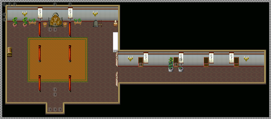
The current version of the new inside of the temple. I think this'll work nicely for it...much better than the original version which was WAY too huge, too ugly, and was using another dungeon's tileset which I need to also update later and split into several maps. This is meant to be a Buddhist temple, mind you, so I tried my best with it! There may be some more stuff I can put on the tileset, but I'm not certain on what else right now...it's even harder since again, it's a 10 floor dungeon (there'll be a teleport void gate thing in the center of this room when the time comes to go there) which uses this tileset too.
@0range00: Ahhh...so that's what you were trying to do! It looks like it could've been pretty interesting o.o

Hah cool! I love the shaking :)
it looks at one point that he's biting the club, is this intentional?
xenomic, it looks what it's supposed to, a buddhist temple. It looks good and i can imagine that big room working as a common element through-out those many floors. Your map seems to lean on realism as far as proportions and architechture go, sometimes impractical things like more compact rooms and curving corridors prove to be more interesting in these isometric graphics. Though it's a matter of style i suppose...

Corfaisus

"It's frustrating because - as much as Corf is otherwise an irredeemable person - his 2k/3 mapping is on point." ~ psy_wombats
7874
author=SnowOwl
Sigh, Xenomic. Do you ever learn?
I'll answer for him: nope. There you go, Xeno; I saved you the effort.
...you guys do know that that wasn't necessary, right? I'm not a huge fan of his maps either (has mainly to do with the style), but he improved a lot already. Give the guy some time. He will get better if you give him the time to improve. These statements of yours do not help at all.
@Xenomic: I like the hallway, but the huge room could easily be reduced by a few squares. The sides could be reduced by two or three rows of squares, that way it would look better and still give off that huge, atmospheric feeling that you want to accomplish. :)
@Xenomic: I like the hallway, but the huge room could easily be reduced by a few squares. The sides could be reduced by two or three rows of squares, that way it would look better and still give off that huge, atmospheric feeling that you want to accomplish. :)
@Begriff
The same thing you just said has been said to Xenomic probably 20 times or more at this point, hence my attitude. He seems to be unable to listen to anything that has to do with the ridicilous size of his maps. He will post a screenshot, get told to make it smaller, will make it very slightly smaller (still too big) and then proceed to post another map with exactly the same problem a week later.
The same thing you just said has been said to Xenomic probably 20 times or more at this point, hence my attitude. He seems to be unable to listen to anything that has to do with the ridicilous size of his maps. He will post a screenshot, get told to make it smaller, will make it very slightly smaller (still too big) and then proceed to post another map with exactly the same problem a week later.
author=Rebezion
He smashes his nose there. That happens if he is running and hits the wall.
Ah okay. Yea I get it now. Without the wall and movement it looked like biting :P
@SnowOwl: He improved, though. I made the same mistakes over and over again, too. I learned it after some time. If that "Let's make this map big!" is burned into your way of thinking, then it takes a good while to get rid of it. That doesn't mean that Xenomic is a bad guy or does not want to improve. It just isn't as easy as one might think - at least that is what I believe. I might be wrong, but I rather like to think that he simply falls back into his old habits.
@Begriff
I'm glad that you seem positive about it. Myself, I'm probably seeing this glass as half-empty rather than half-full.
Screenshot:

I'm glad that you seem positive about it. Myself, I'm probably seeing this glass as half-empty rather than half-full.
Screenshot:


