THE SCREENSHOT TOPIC RETURNS
Posts
author=Xenomic
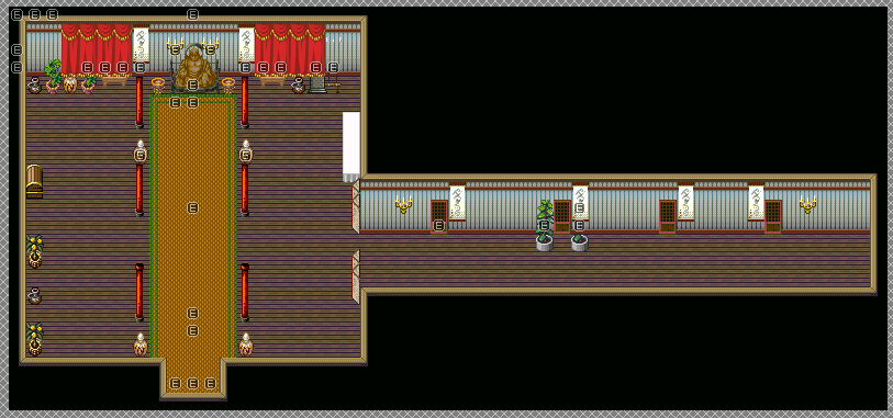
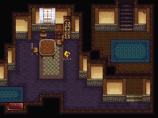
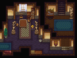
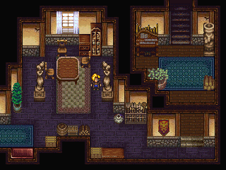
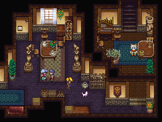
Some touch-ups on this map...
Xenomic: Although I can see you're probably going for realism with that map, the intention doesn't always translate into a pleasing aesthetic look. Especially considering you're choosing (very) overused Rm2k3 REFMAP tiles, the end result comes off a bit bland--at least in terms of a screenshot topic. If the emptiness fulfills a certain function in your game, then by all means disregard the criticism here. But consider that in a topic like this, people are going to access your work on a purely visual basis. No one's trying to personally attack you.
While my mapping style is hardly the gold standard, here's a tutorial I wrote a couple years ago about interior map design for houses/dungeons. Maybe you'll find it helpful.
And here's another random one:
LockeZ

I'd really like to get rid of LockeZ. His play style is way too unpredictable. He's always like this too. If he ran a country, he'd just kill and imprison people at random until crime stopped.
5958
Blindmind, you're really good at decorating the space you're using, but my lord, those crazy zigzag walls just make no sense to me.
author=LockeZ
Blindmind, you're really good at decorating the space you're using, but my lord, those crazy zigzag walls just make no sense to me.
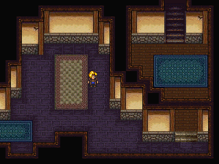
Lol. I didn't create the second one, but I just thought it was a decent example of how to better embellish the map. Maybe it's a bit extreme haha. He's free to ignore my post if he wants a more realistic approach.
I think at one point I used to do those zigzag walls myself (some of my older maps still have them...but those maps are downright terrible regardless and haven't been touched up on in years). Actually, I might still use them in some maps right now, now that I think about it...hmm...
I wouldn't know what's overused, underused, hereused, thereused, whathaveyouused heh. ^^; But with this map in particular, there's just...nothing to add to it other than what's already there really. Ain't nobody home at all so there wouldn't be any people (save for one, but she's outside only at a specific point in the game), and I can't imagine there being much more items in the main temple area itself (judging from the screenshots that Pizza gave me, it looks that way anyways).
Actually, my method of mapping is pretty similar to that tutorial you linked. I generally outline everything before filling it in (with the floor and wall tiles first) for the insides (outside is a bit more trickier...sometimes it's a pain in the arse to do outside mapping @_@;). I tend to go with realism with all my maps (or at least, make them at least close enough to their canon source while keeping them realistic), since well...it wouldn't feel right any other way methinks. ^^;
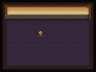
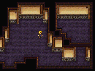
It's this goofy rule from back in the GamingWorld days that you shouldn't have the same tile more than three times in a row. This was mainly just used for floor and wall tiles to make maps seem less boring. If you took this rule completely to heart, you'd end up with some really cluttered and confusing maps, but it's still a great way to learn better mapping techniques. It allows you to really get your feet wet and try new ways of arranging tiles.
Example:
Aremen.
Example:
author=Kaempfer
The Book of the Great Mapper
Chronicle of the First Opening 1:1
And lo, did the Great Mapper set forth and he did look upon MAP0001 and upon its barren watery countenance did he see great potential. And thus he did firstly fill the map with grass autotile to make it appear as though it did have ground, and all was good. Soon the Great Mapper did tire of looking at the verdant field he had laid down and so he did set down some cliffs and trees in narrow rows. But soon the Great Mapper did tire of even these mighty stone walls, so so determined a great change must come upon the land.
Chronicle of the First Opening 1:2
Thus, the Great Mapper did forsake the very notion of the grid and did attempt to make the cliffs appear more natural, as He had intended in the first place. He first changed one tile, then another, and lo the face of MAP0001 did change. Still something did bother the Great Mapper, for he was not content to simply let the lay of the rocks remain. Again and again he changed them, until no four tiles in a row were the same. Hark! He did remain content for many sunrises with his work. The natural beauty of his creation did please him and indeed did please others, and so the Great Mapper set out to create a new map. Thus, MAP0002 was born. The Great Mapper did study his mighty work of MAP0001 to learn its secrets, and did discover that it was the lack of four tiles in a row that did make it so perfect. And so, the Great Mapper gave unto the world his mightiest secret; The Three Tile Rule. He spoke, "No more than three tiles in a row should be the same" and varily did the Lesser Mappers listen and obey, and no exceptions to this rule were allowed, and it was good.
Aremen.
Corfaisus


"It's frustrating because - as much as Corf is otherwise an irredeemable person - his 2k/3 mapping is on point." ~ psy_wombats
7874

It's getting there; after many a revision (at least three), it's getting there. I swear, it went castle - thin castle - temple, and now I think I've got the groundwork for something solid.
That looks like it's a pain to map, oi vey. Nice work on it so far o_O
I'm assuming it's a water castle?? Or the water right now around the castle is just a placeholder for now?
I'm assuming it's a water castle?? Or the water right now around the castle is just a placeholder for now?
Corfaisus


"It's frustrating because - as much as Corf is otherwise an irredeemable person - his 2k/3 mapping is on point." ~ psy_wombats
7874
It's actually a temple by a river, I just haven't gotten around to putting in the coastline and the cliffs to the east yet.
That's how you make maps appear large while not actually being large. If you just look at the space you can walk on, it's actually not that much and no 99x99 empty space either. One thing I would do is add barrels and stuff on the boat, though.
The 3 Tile Rule is best used in nature areas - most effectively with water and cliff tiles (no more straight-edge cliffs!). Look, the fact of the matter is, people underestimate how much room their players have to play with. For an older example:

This is a map with a lot going on. It's default sized but it does the job.

This is where you can walk on the map. The blue and orange are every step your character can take while on this map. There's more than enough room to run around on it, it doesn't look over full or need to be any emptier.

This is a map with a lot going on. It's default sized but it does the job.

This is where you can walk on the map. The blue and orange are every step your character can take while on this map. There's more than enough room to run around on it, it doesn't look over full or need to be any emptier.

i fixed it
offset is a fucking blessing
lol I used to hang out at GamingW quite a lot, but this is the first time I hear an actual explanation on what 3-tile rule really is. Everyone just passed it on as a joke or something.. Better late than never suppose.
author=CorfaisusThat's some amazing stuff you did with the RTP. You and Kentona are the masters of it.It's getting there; after many a revision (at least three), it's getting there. I swear, it went castle - thin castle - temple, and now I think I've got the groundwork for something solid.
author=BlindmindUnfortunately, with the size of my characters, I am stuck with REFMAP but that is a great tutorial.author=XenomicXenomic: Although I can see you're probably going for realism with that map, the intention doesn't always translate into a pleasing aesthetic look. Especially considering you're choosing (very) overused Rm2k3 REFMAP tiles, the end result comes off a bit bland--at least in terms of a screenshot topic. If the emptiness fulfills a certain function in your game, then by all means disregard the criticism here. But consider that in a topic like this, people are going to access your work on a purely visual basis. No one's trying to personally attack you.
Some touch-ups on this map...
While my mapping style is hardly the gold standard, here's a tutorial I wrote a couple years ago about interior map design for houses/dungeons. Maybe you'll find it helpful.
And here's another random one:
LockeZ

I'd really like to get rid of LockeZ. His play style is way too unpredictable. He's always like this too. If he ran a country, he'd just kill and imprison people at random until crime stopped.
5958
author=SorceressKyrstyi fixed it
offset is a fucking blessing
Oh my god you're still making the game I'm so happy
I thought you quit or somethi--- wait holy shit are you still drawing the same train rooftop you were drawing a year ago? Logically I feel like I should be annoyed but actually that's just really impressive dedication to properly illustrating Squall surfing on a locomotive. And it's not like I've gotten jack shit done on my lava shark game in the last year anyway, so I know exactly where you're at.
Technically yes and no
the Deling sequence isn't quite finished map-wise because I got very, very stuck, namely on the isometric map I'm currently working on and doing a waterwheel (which is done now, the sewers are done. =w=)b )
But in saying that, almost the entirety of the first disc's script is in event format. And almost means like two scenes (you have to evacuate Winhill, and where I'm at is the discussion for the evac plan). Not counting the isometric map, I'm missing about 8 or so for the rest of the disc?
A lot of what I was doing was stuff like...formatting the walk/run cycles into something where I can instantly export into a character sheet after applying changes. No sheeting headaches at all. Stuff to cut down future workloads and what not, and get other characters done waaaay faster.


