THE SCREENSHOT TOPIC RETURNS
Posts
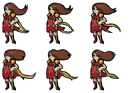
author=JosephSeraphI know everyone is jumping on this bandwagon, but that sprite is fucking beautiful ^.^

It is a mystery!
An instanced area of Galaxia.

It is not a mystery at all, but.
Stay tuned for a trailer, later this week I'm hoping.
I totes forgot I posted this, thx guys xD
But yeah, needs shadows, RM2k3 destroys it (though the gif-ying process destroyed the sprite even more) AND the animation problem with the bangs... It was rather intentional but didn't come out the way I wanted to.
But nah, I think it's not the time for I to commit to making such tiresome sprites hahaha, that took around 5 hours!
Anyway... I think this could possibly be a nice style for a game.

Except she looks like she is mentally retarded and the tiles are boring as hell but it was just a quick mockup.
An easy enough format for I to work on without a high chance of failure xD
@BizzareMonkey, your project seems really fun and engaging, I wanna play it ºwº
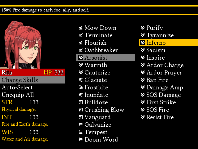
@LouisCyphre that's a beautiful GUI, though I think a little free space at the bottom would do it good.
But yeah, needs shadows, RM2k3 destroys it (though the gif-ying process destroyed the sprite even more) AND the animation problem with the bangs... It was rather intentional but didn't come out the way I wanted to.
But nah, I think it's not the time for I to commit to making such tiresome sprites hahaha, that took around 5 hours!
Anyway... I think this could possibly be a nice style for a game.

Except she looks like she is mentally retarded and the tiles are boring as hell but it was just a quick mockup.
An easy enough format for I to work on without a high chance of failure xD
@BizzareMonkey, your project seems really fun and engaging, I wanna play it ºwº
@LouisCyphre that's a beautiful GUI, though I think a little free space at the bottom would do it good.
She's really... Ugly.
I still didn't quite get it when it comes to realistic faces. They come off better when I'm pencilling.
It's godawful.
I partially like her nose, although it also looks partly like squidward's nose and i'm ARGH
Got my old notebook fixed and found a few old projects
Fun little babies

I still didn't quite get it when it comes to realistic faces. They come off better when I'm pencilling.
It's godawful.
I partially like her nose, although it also looks partly like squidward's nose and i'm ARGH
Got my old notebook fixed and found a few old projects
Fun little babies

Hm... maybe make her eyes a little bigger, add some jawline to that jaw (as it stands it's basically just the bottom part of an oval) and the lips are a little... manly? The rest looks fine, but it's just the details of the face that make her look a bit...odd. >.<;
I love her sprite to bits though. Goddamn, that's cute as.
I love her sprite to bits though. Goddamn, that's cute as.
Yeah, and her eyes are placed a little bit high. Yours eyes should end where the nose does, not start. I think that would already do a lot. And perhaps make them a little bit bigger to make them more visible
If I get room to make another small game in VX Ace, I'll use the combat engine I did for this gem.
Can't remember if I embedded this before.
If I did, I know this hasn't been shown in its version yet. This is that thing from a while ago, shortened, sharpened and resounded.
The music is also now from the games OST instead of being from something else entirely.
Can't remember if I embedded this before.
If I did, I know this hasn't been shown in its version yet. This is that thing from a while ago, shortened, sharpened and resounded.
The music is also now from the games OST instead of being from something else entirely.
I'm working on my face busts and finally finished some. I haven't really had any time to work on a lot of things lately but this is just new.


author=AquaXranoXYou've probably noticed by now, but check out the edges of where you've made that character transparent. 'specially round the hair and mantle.
I'm working on my face busts and finally finished some. I haven't really had any time to work on a lot of things lately but this is just new.
The art is good, but those fragments of the white background need to go. They look dreadful.
@Liberty: Looking pretty good! The wall tiles might hardly be visible in darker tints though!
Here's a map I threw together pretty quickly:

The map itself might not be that good, I mainly want to hear your opinions on the XP trees. Do they fit in with the regular sized trees?
Here's a map I threw together pretty quickly:

The map itself might not be that good, I mainly want to hear your opinions on the XP trees. Do they fit in with the regular sized trees?
They stand out a bit due to the very dark outlines. You should find a way to make them a lighter colour (see the Ace versions and how their outlines aren't as dark?)
Another thing - there is no break for your eyes in this screenshot. It's a bit too much, your focus is dragged in every direction. You need to add some white space (that is blank tiles here and there) to balance it out a bit more. you could probably get rid of some of the more decorative features like stuff on roofs, the dead trees... it's a little much. ^.^;
(As for my screen, I won't be adding much in the way of tinting except subtle ones, so I'm not worried about it being too dark in that case. ^.^)b )
You mean the standard XP coloring? They would probably fit in a bit better.
Yeah, I know and one of the reasons is because the bigger trees take up a lot of space + I cramped the place with NPCs and characters from one of my games^^ I know what you mean though!
Yeah, I know and one of the reasons is because the bigger trees take up a lot of space + I cramped the place with NPCs and characters from one of my games^^ I know what you mean though!
LockeZ

I'd really like to get rid of LockeZ. His play style is way too unpredictable. He's always like this too. If he ran a country, he'd just kill and imprison people at random until crime stopped.
5958
It's not the trees or characters making it feel cluttered. It's the smaller things.
This is what happens when you take the 3-tile rule too literally. In fact, I think this map would actually pass the 1-tile rule for all but about 5 tiles.
This is what happens when you take the 3-tile rule too literally. In fact, I think this map would actually pass the 1-tile rule for all but about 5 tiles.
Also the shadows on the big trees dont match the angle or transparency of the wall shadows.
That being said I still like the big trees, I would consider ditching the skinny trees (with the white flowers) altogether and maybe editing a variation of the XP trees, smaller design but smaller to replace those other ones. This way you still have size variation, but with a more consistent look.
My thoughts on the clutter:
I think the main reason all those small details are standing out as clutter is because nothing overlaps. All your one tile flourishes clearly are tiles, and they are accentuating that fact. Like if that log was editied to be in front of the rock a little bit etc it would break the griddish look.
These little details can be great, but when they clearly appear as tiles, rather than details of the map they are working against you.
LockeZ

I'd really like to get rid of LockeZ. His play style is way too unpredictable. He's always like this too. If he ran a country, he'd just kill and imprison people at random until crime stopped.
5958
Oh, yeah. If you use RMXP tiles alongside tiles from VX/Ace (or if you use them by themselves, for that matter), do yourself a favor and recolor the shadows from gray to black.
You can make them like (254,254,254) instead of solid black, if you need to be able to select the color when importing them. Personally I make the shadows transparent in Photoshop instead of in RPG Maker, but either way works.
To fix what Liberty mentioned about them being darker, you could reduce the contrast, and then increase the saturation by an equal number. Reducing the contrast alone will make them the correct darkness but too dull. Something like -20 contrast and +20 saturation would probably be pretty close in Photoshop; in Gimp the numbers might be different.
It's not so much the colours being darker as it is the borders. If you look at the Ace trees you'll see that the borders aren't dark. Take a close look at them and compare. The borders for the XP trees in that screenshot look like they have almost black outlines. They stand out a lot due to that.
I changed the trees to the XP ones(I think they are from XP) and I removed some detail.

I personally think these trees fit in a lot more than the old ones.
I've heard of this 3 tile rule, but I can't quite remember ATM, so I guess I'll look that up a bit later.
I believe that the flower auto-tiles are making the maps pretty detail-heavy on their on and not just the objects placed above.
Change the shadow of those XP trees (if you want to do it in an editing program it's easy enough. Ace shadows are black set to 50% transparency, so if you take the shape of the XP shadow, colour it black then set to 50% transparency, it should work fine.) That said, if you send the trees my way I can take a shot at making them fit a bit more with both the shadow and shading (they're still a tad odd - mainly the trunk).
The 3 tile rule is a mapping guideline that basically boils down to having a different tiles every three tiles. It was supposed to be more aimed at water edges and cliffing, or very nature-heavy areas but got misused a lot. In your screen there's really no break in the ground tiles - that is, almost every tile is different in some way and that makes it look overly busy. My rule of thumb is not having decoration tiles along the x/y axis of each other for about 5-7 tiles unless sufficiently different in colour/type (for example, a small flower and tree stump next to each other once on a map would be fine, but two flowers would be odd or a brown rock and trunk next to each other is too similar but a grey rock and pink flower would be okay)
(Oh, just something to point out - see the dead tree in the lower right, behind the house? It'd be growing through that wall. Remember to leave as much space before placing overlapping tiles as there is roof heights. In this case the roof is two tiles but that tree makes the house seem one tile thick instead. Keep an eye out for those little things.)

I'll put these tiles in the resource section soon.

The 3 tile rule is a mapping guideline that basically boils down to having a different tiles every three tiles. It was supposed to be more aimed at water edges and cliffing, or very nature-heavy areas but got misused a lot. In your screen there's really no break in the ground tiles - that is, almost every tile is different in some way and that makes it look overly busy. My rule of thumb is not having decoration tiles along the x/y axis of each other for about 5-7 tiles unless sufficiently different in colour/type (for example, a small flower and tree stump next to each other once on a map would be fine, but two flowers would be odd or a brown rock and trunk next to each other is too similar but a grey rock and pink flower would be okay)
(Oh, just something to point out - see the dead tree in the lower right, behind the house? It'd be growing through that wall. Remember to leave as much space before placing overlapping tiles as there is roof heights. In this case the roof is two tiles but that tree makes the house seem one tile thick instead. Keep an eye out for those little things.)

I'll put these tiles in the resource section soon.


