


 Add Review
 Subscribe
 Nominate
 Submit Media
 RSS
RSS

 Marrend
- Added: 01/31/2014 12:25 AM
- Last updated: 04/26/2024 09:21 PM
- 4676 views
Posts 

Pages:
1


 | Oh, is THAT all? |
 | I was more worried about elevation weirdness! |
*Edit:
 | Though, to be perfectly honest, I don't really see a huge problem with this. |
 | Which could, it itself, be a problem. |
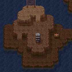
If you want, I could find more things to be nitpicky about. Like for instance, this is a MINE, an inside area. Which means that those shadows really shouldn't be there. Also, now that mention it, the elevation for the ramp DOES look rather strange, though I'm not completely sure how to fix that...
| I'm okay with changing the walls to match the floors. That's not a big issue. |
 | On the issue with shadows, what, exactly, am I supposed to do? I mean, might want to throw in some posts for lanterns anyway, but to not have them doesn't seem like the right move AT ALL. |
| I MAY have a possible solution to the east-west elevation weirdness with that ramp. Not sure about a north-south solution yet. |

It's probably crazy of me to say so, but I actually like the current flooring you have better than what you "should" have used because it subverts what you usually expect from the RTP.
On the other hand, I might be in the minority here and one could retort with "You call it artistic, I call it 'not using RTP correctly.'"
On the other hand, I might be in the minority here and one could retort with "You call it artistic, I call it 'not using RTP correctly.'"
| Image updated! |
| I'm actually more worried about the east-west height differential in respect to that ramp than the north-south one. |
| As I may have mentioned, I'm not terribly concerned about the wall and floor tiles matching, but I made them match in this ideation. I also had the half-idea to extend the height of the map overall to give a down-ramp effect to the north exit. |
| Then again, this has enough elevation weirdness as-is! |

 | Why do you do this? It's weird. |
Anyway. If your walls are four tiles tall near the south entrance, I think they should be four tiles tall everywhere else. This may help with that "elevation weirdness" feeling. Also, you could edit the ground tiles so they look like this. Notice how the levels gradually become darker? This creates a nice effect of depth that could help players 'read' your map better.
| Image updated! |
| Having a four-tile wall along the entire south didn't look right to me either. Though, having the darker tile on the lower level seemed pretty slick. Thus, this hack result. |
 | I'm... pretty happy with this, actually. |
Haha! Yeah, that's better. But you went a bit overboard with it. You see, the problem now is that the color of the bottom level blends a lot with the ceiling tiles. So, you should either pick a lighter shade for the ground or make the ceiling/walls darker. =P ...Also, I'd really like to advice in favor of the four tile wall issue, but hey, it's your call.
Pages:
1

