


 Add Review
 Subscribe
 Nominate
 Submit Media
 RSS
RSS
- Summary
- Blog
- Images
- Reviews
- Media
- Survival Tips
- Characters
- Videos
- You might also like...
- Downloads
- Play Lists
 NicoB
NicoB- Added: 12/30/2010 06:03 AM
- Last updated: 01/26/2026 09:01 PM
- 16739 views
Posts 


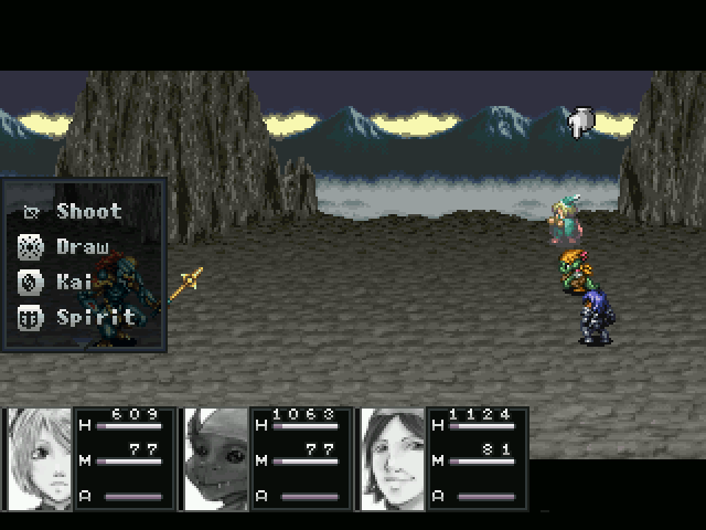
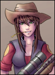
You should try to give Sork's sprite a hat. Looks a little odd to have one in the art, then not have one anywhere else.

The way the faces are covered by text, the harshness of anti-aliased pretty art against all sprites and the worthless border kind of ruin the decent art.
Also, yeah. Sork needs a hat.
Also, yeah. Sork needs a hat.
He wears a hat outside of battle. He takes it off when he battles (I have a scene where it show him doing this, so it isn't some random thing I decided).
Try using a border around the face sets that's twice as thick, and goes on all 4 sides(if this one does then it's too faint to see it up the top). Also, the HP goes over the little HP writing. Nice otherwise.
in that case why does his in-battle portrait show his hat. If it changed on its own it would be a great bit of polish! Just add it in to your pre-battle common event.
...You have one of those, right?
E: god nico is getting ripped apart
E2: getting ripped apart builds character!
...You have one of those, right?
E: god nico is getting ripped apart
E2: getting ripped apart builds character!
gauge design is limiting in rm2k3. You have to learn to cut corners to get a decent UI with it.. The advice here is good stuff.
Also, why do two icons in the selection menu have that border design, while the other two do not? Get some consistency!
Also, why do two icons in the selection menu have that border design, while the other two do not? Get some consistency!
Alright, one at a time:
Eh, I didn't really want to cover the art anymore than I already had with the border. I added the light border because there was a bad transition between the black menu and the faceset when paused in the main menu. Yeah, that HP thing is annoying, but it's not easily fixable without shrinking the faceset even more.
I would agree. However, I don't want to make booble draw his face twice. She's busy enough as it is.
Yeah, I may want to try shrinking those numbers some. They are a little bit too big.
I ran out of room for my icons awhile ago. I think each one is being used in some way already, so I couldn't get the battle menu to look perfect. I'll see if I can't narrow it done some more though.
Placeholder. I didn't mean to have the arrow on Cyrus when I took this screenshot.
I don't mind sweating the small stuff guys, but if I keep going back and changing this stuff over and over, I'm never going to finish this game. Polish is good, but progress is probably more important right now. So don't expect this stuff to change by the demo (unless I can somehow find more time).
author=Pokemaniac
Try using a border around the face sets that's twice as thick, and goes on all 4 sides(if this one does then it's too faint to see it up the top). Also, the HP goes over the little HP writing. Nice otherwise.
Eh, I didn't really want to cover the art anymore than I already had with the border. I added the light border because there was a bad transition between the black menu and the faceset when paused in the main menu. Yeah, that HP thing is annoying, but it's not easily fixable without shrinking the faceset even more.
author=ChaosProductions
in that case why does his in-battle portrait show his hat. If it changed on its own it would be a great bit of polish! Just add it in to your pre-battle common event.
I would agree. However, I don't want to make booble draw his face twice. She's busy enough as it is.
author=Craze
I like how you can't see the HP bars or Lolo's MP bar because of how thick the numbers are.
Yeah, I may want to try shrinking those numbers some. They are a little bit too big.
author=Neophyte
gauge design is limiting in rm2k3. You have to learn to cut corners to get a decent UI with it.. The advice here is good stuff.
Also, why do two icons in the selection menu have that border design, while the other two do not? Get some consistency!
I ran out of room for my icons awhile ago. I think each one is being used in some way already, so I couldn't get the battle menu to look perfect. I'll see if I can't narrow it done some more though.
author=Lennon
Wait, on the note of icons, why is Skills a boot?.
Placeholder. I didn't mean to have the arrow on Cyrus when I took this screenshot.
I don't mind sweating the small stuff guys, but if I keep going back and changing this stuff over and over, I'm never going to finish this game. Polish is good, but progress is probably more important right now. So don't expect this stuff to change by the demo (unless I can somehow find more time).
I think that if NicoB got over "look at my pretties" and simply displayed them better then it'd be cleaner (I mean, showing less of the faceset). Yes yes, booble's a good artist, but aren't you going to see those in the menu/during dialogue all the time anyway?
In general, I think that there needs to be (in general, not just by NicoB) less thinking as a "look at my pretties" guy and more as a game designer who wants a solid interface. When I LT this (and I will), I will be an absolute bitch about shitty battle HUD design. Nothing against NicoB personally as I'm interested in the game and I respect that he's working toward completion (or at least +1 major release), but I'm all about the small things.
...not that you'd know it from my failed and annoying projects.
Alright, made some changes.

Got rid of the HP, MP, ATB because they were in the way and I think people know what it is by this point. Also decreased size of numbers. Better or worse?
Got rid of the HP, MP, ATB because they were in the way and I think people know what it is by this point. Also decreased size of numbers. Better or worse?
Is there any way to bump the numbers up a little and make it so they don't overlap the bar at all? Still, it's a step closer to being much better. (If 2k3 was VX you could make the distance between the info shorter and have a more consolidated/sexy display, but :< .)

F-G: Design goes into presentation; presentation and gameplay are a married couple. You want the married couple to stay together, not bicker. They might not necessarily be parking their car in such a way that they're blocking the other trying to leave for work, but they might buy the wrong kind of milk or forgot to put the toilet seat down.
...what an odd metaphor.

I don't like how the thousands digit rests on the upper right corner of the character portrait. I'd recommend moving the numbers so that they are flush against the right side of the bars. Maybe you would have to lengthen the bars by a pixel or two in order to fix both at once.
Otherwise, this game is totally RUINED!
Otherwise, this game is totally RUINED!

