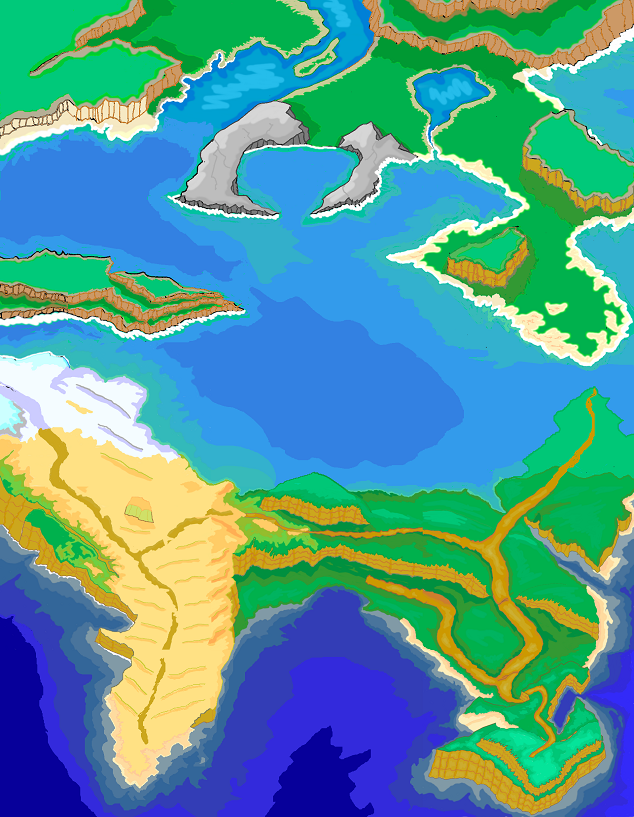
If there's a word I can use to characterize what my appreciation of this large map is, it is inconsistency. It does feel as though you tried to put together different maps, so it seems to lack some continuity. This is my feedback based on my appreciation of what I'm seeing (correct me if I'm wrong):
For starters, the things that look most out of place to me are the two gray pieces of rock that are shaped like crab claws, mostly because you gave them, for the most part, a very defined black edge, at least for the top surface and gave their surface some defined details (are those cracks I'm seeing?) by using 3 shades of gray. The water that is running into right piece is the only detail marring the otherwise fine-looking pieces of rock.
In the other pieces of land that are elevated, most of which seem to have grass on top, you did not mark the top edge as clearly. In some cases the colors for those edges were inconsistent, with some black and gray mixed in. In the cases where you used a light color for the visible side edge, you used a slightly darker version of the same color. I suggest that you use darker tones of the same color to provide better contrast. Why, because some of the pieces of land that are above sea level don't feel that way.
Another detail that I agree with is how beaches blend into the sea or lake and the water levels gradually gets deeper as indicated by the darker tone of blue.
The other major detail that seems odd is the presence of an icy/snowy area right next to a beachy area/desert. That extreme would make sense if the icy/snowy where at a quite a high altitude, which doesn't feel to me it's the case.

 Add Review
 Subscribe
 Nominate
 Submit Media
 RSS
RSS VideoWizard