LIGHTING BY LOTUS GAMES
Create atmospheric maps using lighting effects for your game!
 Lotus_Games
- 02/17/2012 06:07 AM
- 29104 views


Objective: To provide knowledge on the fundamentals of adding atmospheric lighting effects to your game maps in order to achieve a greater sense of atmosphere and to give individual maps a more distinct and aesthetically pleasing visuals.
Effect:
Pre-Requisites:
-You must have Photoshop or an image editing tool.
-You must have your map made before you can add lighting effects on top.
-Be creative!
How to Get the Effect:
Step 1: You must import a map you have already created OR you can create one from scratch using Adobe Photoshop or another image editing tool. For this example I opened up Photoshop, pressed Control + N for "New" and entered in the dimensions:
320X240 which is the standard resolution for Rpg Maker 2003. I set the resolution to 250.
Note: A higher resolution will result in a higher file size.
I then went on to create my map using various chipsets pieces(Rpg Maker mapping graphics) as well as various textures that I applied to the floor and ceiling.
Step 2: Create Your Shadows. I took each individual object that I used (Note: Each object is placed in it's own Photoshop layer), and made a duplicate by pressing Control + J, then I went to "Edit" then "Transform" and finally "Flip Vertical."
Next I pressed Control + U and changed the "Lightness" all the way to the left or black. Next I changed the transparency of that layer...or object to anywhere from 25-50% depending on where I imagined the light source to be.

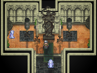
Step 3: Add an SFX. After the shadows were added I took a special effects image from my rpg game folder and applied it to it's own layer. I reduced the transparency to something similar to what I may use in the engine itself. This is to give you an idea of what your map will look like while you are playing it.


Step 4: Add a Tint. Next I added a tint to the map on a layer on top of the SFX image. This is to further test the ambiance you want to go for. In order to do this create a new layer, click on the Paint Bucket Tool OR hit "G" then select a color of your choice, I choose black. Paint over the entire image and afterwards reduce your transparency to whatever your like (A deep dungeon will have a higher opacity while a forest might have less)I set my transparency to about 15% for this layer.


Step 5: Adding Lighting Effects. This step is the "Holy Grail" of the Lighting Tutorial. What you need to do is select a Brush by pressing "B" and make sure it is on the Brush tool and not the Pencil tool. Next you want to choose a brush type. You want one with a fading opacity, one that starts visible in the middle and than fades as the size increases. Choose any of the "Soft Round" brushes from the brush drop down selection at the top left of your Photoshop window (It is located right under "Edit" next to a paint brush icon). Now what you want to do is start off with a SMALL brush and a HIGH opacity. This will indicate the light source when you apply it to a NEW LAYER. You than want to increase your Brush Size while DECREASING your Opacity and each time adding/applying the brush to a NEW layer. This will give you a lighting effect that fades as it moves away from the source.


Step 6: Continue to build your lighting layers on top of your map. With each layer you make, adjust your Blend Mode for that layer with either: "Overlay" "Soft Light" or "Color Dodge". Play around with it and use trial and error to see what works best for your map.


Step 7: After your light sources have been placed. Look to see what more you can add to adjust the effect. Play around with Brush Size and Opacity and touch up on the lighting effect, once again adding a new layer every time you use the brush on your map.
Note:The reason you want a new layer every time you click on your map with your brush is so that if you need to adjust something later on, you can adjust that individual layer. If instead you do everything on just one layer, you may have to delete all your work and start over if even one bit of the effect is off.


Step 8: Final Touch Ups. For this step I added more shadows by duplicating an individual lamp shadow layer (This is why multiple layers are helpful) and than rotating it to the left and right. I than changed the rotated shadows to a lower opacity and placed them so they come off of the light source. I also updated the positioning of the shadows to better match the light source. I also added some light on the bottom of the lamps using a brush with color: white and low opacity. Finally I adjusted the tint to make the room darker and finished off by adding "Movie-esq" borders to my screenshot giving the map a cinematic feel.


For RPG Maker Users: If you are using 2003 or below you do not have access to alpha channels for your image. Therefore you need to merge all of your lighting layers with a colored background...if you want your map to be tinted, the color can be pretty much anything (Yes even black, all you have to do is copy your image and put it into your "Picture" folder instead of importing it from RPG Maker, that way the black tint will show and it won't appear transparent) Or if you want say a blue tint you can merge all of your lighting effects layers on top of a blueish background and import it. If you don't want a background but just want the lighting effects, make sure you merge your lighting layers onto a black background and import it in RPG Maker 2003. Also make sure your picture is indexed by by going to "Image" on your tool bar in Photoshop and then "Mode" and finally "Index Color". And you are all set!
For RPG Maker XP or VX users, alpha channels are supported so you don't need to worry about transparencies, just import your lighting effects picture like any other resource.
Final Results:
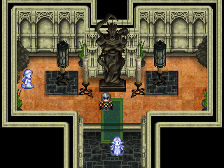
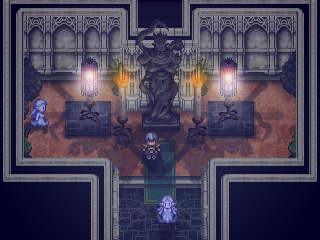
We went from this-

to this-

You can always adjust each shadow and each tint depending on what you want your map to look like, that is why I always recommend using multiple layers. If you feel the effect is too strong, you can dim it down by decreasing the opacity...if it is hardly noticeable you can always increase your opacity for each layer.
This Lighting Tutorial gives you the foundation of what you need in order to achieve a unique and interesting look for your game using lighting techniques to enhance your already stellar maps.
-Lotus Games
About the Author:
Hello, I'm Kannes a budding entrepreneur. I am an avid designer of many things creative. I am an enthusiast of game design, music, performance art, and even martial arts. I find a great freedom of expression and self through my work and find pleasure in learning and it's a pleasure to have "met" you.
Posts 

That is true they don't, looking back now, the positioning relative to the light source is what is off. I should have focused equally on the shadows as I did the lighting and tutorial but thanks for the feedback.
Thanks to Large and Avee for the comments, keep em coming guys and gals.
-Lotus
Edit: I have updated the final images with proper shadows. I dislike imperfection and feel it to be a negative reflection on myself and the Lotus brand. The new final images display shadows that are positioned better according to the light source. I hope this extra bit of effort will help those who are looking for a high quality guide, make this tutorial/guide just that for them.
Personally I think the map looks better without the extra tint at the end. Still a stellar tutorial though. <3
I actually think the original map looks better. The lighting is garish and its softness clashes with the rest of the graphics. I also agree with Yellow Magic, the tint washes out the color and makes it look less interesting.
Right so this was made with rpg maker 2003 users in mind and so unless the lighting effect uses just a few colors instead of several hundred the tint becomes unavoidable. I know where you guys are coming from though. Thanks for the feedback guys, I appreciate it!
i can appreciate the effort that youve put into this but this sort of cluttered special effects rave goes against almost everything i believe about aesthetics in 2d
these modifications drown out volume&texture with a fuzzy opacity soup that stops having any meaningful conveyance or artistic value by the fourth consecutive overlap and suggests a lack of confidence in visual decisions. the blanket lighting suppresses natural color and adds stronger indiscriminately radial sources that a) make no sense (i too have observed that candlelight burns with a bright saturated orange) b) has no effect on its surroundings save an interplay of shadows so cluttered as to be unidentifiable and c) isnt much better than the original in terms of style either because--forgive me--it seems that you have no idea what youre doing with color
sorry. i do understand that not everyone is an artsy elitist but if atmosphere is the goal then that is more easily and effectively achieved with proper use of audio (music/ambience tracks/sound effects). in fact music is like 80% of the immersion in any media so there is little need to subject your games environment to this sort of wishy washy tint haze. dont get me wrong lighting *can* be used well and ive seen it done so but this is not the example to strive for
solution: don't use a "several hundred" colors. please..... that is an appeal to dazed prats
as an aside i also want to mention that a focus on garnishing still images of the game encourages users to work on ~*pretty screenshots*~ (ie: instant gratification for devs) over things that should take higher priority like writing or gameplay or pretty much any other meaningful aspect that sees neglect because theyre mostly invisible during development. i believe that a game should look better in motion than it does in still images and not the other way around. id go on but my pr manager is motioning me to shut the fuck up now
tl;dr: fine work but i disagree with these methods
these modifications drown out volume&texture with a fuzzy opacity soup that stops having any meaningful conveyance or artistic value by the fourth consecutive overlap and suggests a lack of confidence in visual decisions. the blanket lighting suppresses natural color and adds stronger indiscriminately radial sources that a) make no sense (i too have observed that candlelight burns with a bright saturated orange) b) has no effect on its surroundings save an interplay of shadows so cluttered as to be unidentifiable and c) isnt much better than the original in terms of style either because--forgive me--it seems that you have no idea what youre doing with color
sorry. i do understand that not everyone is an artsy elitist but if atmosphere is the goal then that is more easily and effectively achieved with proper use of audio (music/ambience tracks/sound effects). in fact music is like 80% of the immersion in any media so there is little need to subject your games environment to this sort of wishy washy tint haze. dont get me wrong lighting *can* be used well and ive seen it done so but this is not the example to strive for
author=Lotus_Games
so unless the lighting effect uses just a few colors instead of several hundred
solution: don't use a "several hundred" colors. please..... that is an appeal to dazed prats
as an aside i also want to mention that a focus on garnishing still images of the game encourages users to work on ~*pretty screenshots*~ (ie: instant gratification for devs) over things that should take higher priority like writing or gameplay or pretty much any other meaningful aspect that sees neglect because theyre mostly invisible during development. i believe that a game should look better in motion than it does in still images and not the other way around. id go on but my pr manager is motioning me to shut the fuck up now
tl;dr: fine work but i disagree with these methods
Well that was certainly brutal but I'll thank you for taking the time to write all of that. You're criticism is valid and while I do not agree with you 100% as there will always be differences in opinion, I do think I have a ways to go with lighting before it meets professional standards. Regardless this tutorial as I have stated before was meant mostly for rpgmaker 2003 users and for that level I think it does a reasonable job.
Well, I actually think that this is a good tutorial for some kind of horror game, with the constant fogs etc.
Good work!
Good work!
as an aside i also want to mention that a focus on garnishing still images of the game encourages users to work on ~*pretty screenshots*~ (ie: instant gratification for devs) over things that should take higher priority like writing or gameplay or pretty much any other meaningful aspect that sees neglect because theyre mostly invisible during development. i believe that a game should look better in motion than it does in still images and not the other way around. id go on but my pr manager is motioning me to shut the fuck up now
sixe is right...about this...but in my opinion the screenshot WITH the omfg liteing fx is certainly much prettier and more impressive than the one without.
Personally I don't like or use this sort of fancy lightshow, since it tends to distract me from the actual map navigation and taking in the details by confusing me with shadow overlays and such. The only real use of light effects I ever use is to LIGHT dark areas, and little else :I (also there's the fact that, orz, too much damn work for a single map, and a game has a tone of those).
As a tutorial for those who are interested in using the method, thought, it's not bad.
As a tutorial for those who are interested in using the method, thought, it's not bad.
@Milos: Thanks Milos, as long as I have helped even just one person I'm happy =]
@Max: Sixe is right about that but I don't think it's an appropriate discussion in a lighting tutorial topic, perhaps a topic about good game ethics or good game design would be better suited for those type of comments. I'm glad to hear that you found it to be impressive. I know there will always be differences in opinions...those that think its art/it isn't art....think it looks great/looks terrible. But I hope a majority of the people that read through it found it to be helpful on some level. That'd just make my day =]
@Indra: It certainly is a lot of work, but I think it can be worth the effort in that it allows a game to stand out as most people for-go lighting effects in 2d games. As for navigation, I think anything that adds layers such as lighting or dynamic clouds or overlays can take away from navigation. It can be risky but if toned down just enough while still remaining visible and serving a purpose, I believe it can only add to immersion without detracting from navigation.
Thanks for the comments everyone.
Also, Thank you to RMN for the Spotlight!
Someone will make me regret saying this, but I think that maps and games look a lot better before all the atmospheric effects.
Great tutorial and very useful. Thanks a bunch. Is there a maximum size restraint for the size of the picture? Some maps in my game are over a 100 x 100.
author=Lotus_Games
Regardless this tutorial as I have stated before was meant mostly for rpgmaker 2003 users and for that level I think it does a reasonable job.
I don't think rm2k3 is a low "level". I mean, you can't lower standarts just because it's a lesser powerful engine. All those beautiful SNES era effects were achieved with an infinitely weaker engine, even so they're far above what most indie game makers can grasp. (most. I said most.) Putting that aside I have another, neat tip:
You can use the shades from the original image to prevent sharpness from rotting away, whilst still managing to get that hazy feel. You just need to get a grasp on lightsources and stuff.

I added the middle layer over the top layer with a "multiply" filter. The bottom was the result. (I also corrected the flames btw)
This would work even better with a more textured picture, such as fog, etc.
Since this allows the map to retain its original sharpness, just being "tinted" and blurred where it needs to be. (such as the light pedestals wich I erased in the middle layer, as you can see.
Nonetheless this is a nice tut!
That's a neat effect, I mostly see it in the statue. You can't compare rpg maker to SNES games, mostly because of the user-base but also because rpg maker has a ton of limitations (not even graphically, but just being useful for rpg type games). SNES games were all made by professionals who knew what they were doing but rpg maker is usually used by people getting into game design. Also having played around with different engines, even setting aside graphics it has become very clear that rpg maker is full of limitations..atleast 2003...I'm sure with ruby some of those are lifted in later versions. But creating a dynamic and realistic lighting effect in rpg maker is a lot harder to do right than it would be in an engine that could handle a proper lighting system. You can use tricks and techniques to help but those only get you so far and you really need to know what you are doing to implement them. As far as lowering your standards, you have to know what kind of game you are making. If you want to make an SNES type rpg game than no you can't lower your standards...because if you really know how to make them you can in rpg maker. But if you want a game utilizing proper artificial intelligence, dynamic systems, and HD graphics with high res textures and shaders than you really are lowering your standards if you try to use rpg maker.
This tutorial was for people looking into lighting and how it could be implemented. Yes for a professional in the industry it is completely useless but for someone who is getting into game design using rpg maker I think it's a very useful tutorial.
This tutorial was for people looking into lighting and how it could be implemented. Yes for a professional in the industry it is completely useless but for someone who is getting into game design using rpg maker I think it's a very useful tutorial.
Yep, but I disregard everything you said about RM2k's engine being poorer than the SNES. The userbase? They do it for hobby, not for profit. Of course there'll be My Rtp Adventures.
But it's quite obvious that SNES is more limited in a lot of stuff than 2k, starting straight down with the resolution, wich is a big, big deal.
I just said that you can pay a little more atention and not blame it on the engine hahaha
But it's quite obvious that SNES is more limited in a lot of stuff than 2k, starting straight down with the resolution, wich is a big, big deal.
I just said that you can pay a little more atention and not blame it on the engine hahaha


