STATUS
Posts 

Pages:
1
It's very frustrating. I've put a lot of work into the game, and there are a few places (like the beginning) that aren't supposed to have... stuff.. in them. It's meant to be barren and minimal to give a sense of unending. Even the crumbling walls, I thought, were too much. I didn't like them, but the site called them bland and unworthy, so I added things I didn't want to add to the game to appease the almighty forum god. It's supposed to be a tween, devoid of matter and home only to spirits. I don't know how else I'm supposed to show it other than how I had it. The policeman's house is unfinished, but for the most part, how many people have a fully furnished house the moment they move in?
I'm at a loss of how to add enough to the game to live up to the 'mapping standards' without just adding random things to the game to make the room feel more interesting, which it's not meant to be. In fact, the living world is supposed to be distinctly UNinteresting and the dream worlds are supposed to have all the substance.
Sorry if I'm ranting, but It's just so frustrating. The first time I understood, you know, all I had was a title screen, so I was like "Oh right, I just sort of wanted it up so I would have a place to put it. That makes sense" the second time I was like "Well I guess the room I have isn't finished... I'll add more later." But now, It's like I've put SO much time in it just to have it be 'not quite good enough' and it's very discouraging.
A lot of my hard work has been behind the scenes stuff though, and doesn't really translate into screenshots.
Hm, Bland and Unworthy? That's questionable for a admin to say that. Did you add multiple screenshots? You need more than 1. I'm sorry about what happened.
EDIT: Don't double post please, if you got more to say, edit your other post, or wait till someone replies.
EDIT: Don't double post please, if you got more to say, edit your other post, or wait till someone replies.
Denied
Reason: Mapping is just below site standards due to wrongly used tiles and bland, empty maps. Check out a few tutorials, make use of the screenshot thread for feedback and resubmit after you've made the maps a little better. Check the topic linked below for a handful of links to good mapping tutorials (found under the Show button): http://rpgmaker.net/forums/topics/5673/
08/05/2015 01:39 AM
This is the post that I got about being denied.
Yeah, I have several screenshots. One of the title screen, and I think 6 or 7 of the actual game. Admittedly, one is just the character selection area (the barren tween at the beginning of the game) but there are at least two that more accurately show the feel of the game.
So show off images that aren't bare, barren and empty. Players aren't going to want to play your game if all they see are empty maps with bad tile use. Show interesting stuff instead. It doesn't take much.
We have standards so that those who play the games here don't have to sort through the bad games and if you're only showing bad maps then that's all we can judge your game on. You get links to threads and tutorials that can help, you also get pointed towards the screenshot thread so you can get feedback.
I'm afraid that until a game shows decent maps, they won't get past the queue - that's been the case for years now and we're not likely to change it.
Everyone is judged by the same standards. If you need help figuring it out, check out the screenshot thread and the tutorials you were linked to.
Also Cinderspark if you say the dream worlds are the ones with all the interesting features, then show the potential players shots of those worlds. I'm not a dev, I'm a player and if your world looks bland it will make me less likely to play. Not unlikely depending on your description, but less likely. You want to showcase the best you have.
Take a look at CashmereCat's screenshot on the first page. It has absolutely nothing! It's a white room with a black figure pushing a box, and it looks simply fascinating. You don't have to clutter a map to make it look interesting, it just has to be able to grab people's attention.
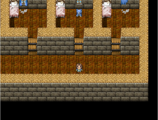
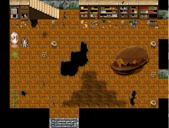
Yes but the thing with that is that it's highly stylized. I'm not sure if you guys can actually see the page since it's been denied, but what is wrong with a screenshot like this ?
They can't. Also, piano, CashmereCat's game already had 3 images that weren't that screen - I don't care if you later put up images that are bland (well, I do if you lied about what you game has in it and it will receive bad reception if you do so) but the initial images are all I can judge from and, like I said, we have standards to keep bad games out. If all we see are bland, boring, empty, over-large maps, it's Denyville, population: your game.
Show a few better ones, resubmit and see if that gets you places. You could have already done so instead of complaining about it.


Show a few better ones, resubmit and see if that gets you places. You could have already done so instead of complaining about it.
author=Liberty
Show a few better ones, resubmit and see if that gets you places. You could have already done so instead of complaining about it.
First of all, I admitted that I had a few bland ones in there, simply because they were the first ones I put up.
As for resubmitting, I've been working on the maps AND complaining. I'm a tricky multitasker like that.
Anyway, the point was never to get the Admin to reconsider the submission I already had up. It was simply to express my frustration. I didn't expect them to go "oh well she put a bunch of work we can't see into it, so clearly, she deserves to slip through".
I'd start by making those maps at least 5x smaller so there won't be a huge spaces of nothingness like shown in the screenshots above (especially the first one).
author=Milennin
I'd start by making those maps at least 5x smaller so there won't be a huge spaces of nothingness like shown in the screenshots above (especially the first one).
Yeah, I might do that. I mean, I wanted it to be something that would fill with stuff later which was why it has so much free area. Also, the male path isn't fully developed. I'm scripting mostly the female thread, so I just put that in there to show "Hey, there are different characters that can happen." And since I didn't have anything new for him yet (been doing female, like I said) I never updated it.
As I explained, there are reasons for the denial, and we do point towards resources that can help. I'm glad to hear you're fixing things up. I do recommend using the screenshot thread, though. They can help if you mention that you need it to get your game accepted.
As for those two images above, I'd recommend increasing the size of the walls a bit - the cabinets are two tiles high and the walls are only one. The cabinets would be sticking out of the roof of the house. XD I'd also recommend, like Milennin, making the rooms more compact. It does help with making the maps look a lot less empty and bare.
A good rule of thumb with games is showing off interesting, polished bits - it's more likely to draw interest towards your game and the more people who see it, the more feedback you can get.
I look forward to seeing your game accepted in the near future. Good luck!
Yeah, I wish I didn't have to alter the tileset to do that (for some reason the particular wall I used was only 1 high and didn't tile correctly) but I'll figure it out.
Anyways, to the photoshops!
Anyways, to the photoshops!
It should work fine, automatically. You need to use the tiles here:

Drag the tiles down or up - they'll automatically grow bigger as you put them next to each other. The ones you used, which are below those tiles, are for under-floor/cut-away areas like so:

Not my best map but I'm sure you get the idea.

Drag the tiles down or up - they'll automatically grow bigger as you put them next to each other. The ones you used, which are below those tiles, are for under-floor/cut-away areas like so:

Not my best map but I'm sure you get the idea.
Yeah, I know, I just thought they looked better. I'll figure it out, thanks. I've been messing with the tilesets for a while, the A and B files included.
EDIT: I realize how that sounded, sorry -.- My tone translates SO badly into text. My vocabulary consists of 90% sarcasm and 10% bad wording...
EDIT: I realize how that sounded, sorry -.- My tone translates SO badly into text. My vocabulary consists of 90% sarcasm and 10% bad wording...
Haha, yeah, I got them from the closet. I will probably change them before the final release though, once I have the time and/or ability to make my own face sets. As long as I keep them in the same slots on the image file it should transfer them all over correctly without having to do ALL of the face files individually through all my dialogues.
Pages:
1


