


DEZZ'S PROFILE
Dezz

1252
Hey.
I'm Dezz.
Yeah.
But seriously; I'm Dezz. I've been using RPG Maker since 2007, starting with XP but quickly changing to VX. If you want a map making, send me a PM and I'll try and help.
Thanks!
I'm Dezz.
Yeah.
But seriously; I'm Dezz. I've been using RPG Maker since 2007, starting with XP but quickly changing to VX. If you want a map making, send me a PM and I'll try and help.
Thanks!

Search
Filter
 Map_11.png
There looks like an error with the crates at the top-right house, as if they're going into the walls.
Also, you can see half of a fence piece on top of the crate in the bottom-left. In fact, the crates don't seem to look right there either.
The screen looks awesome nonetheless though.
Also, you can see half of a fence piece on top of the crate in the bottom-left. In fact, the crates don't seem to look right there either.
The screen looks awesome nonetheless though.
 BLOG 4: My items are weird
This seems like a really good idea, and very unique too!
Can't wait to see how this actually looks and works in-game.
And for shops to be accessible through the Menu seems like a good idea too, as it would make it easier for the player to get what they need before a boss instead of having to trek back to a shop where they may die anyway from enemies.
I really like this, so I can't wait for a demo.
Good luck!
Alfred12.png
I'm probably wrong, but I believe there is a spelling error in the third paragraph.
It says 'Yet, the life Alfred would led was solitary and harsh,' though I think 'led' should be 'lead' to suit the sentence. That is, unless I'm reading this wrong and there's a way in which it is meant to be read. (A style of writing, etc.)
It says 'Yet, the life Alfred would led was solitary and harsh,' though I think 'led' should be 'lead' to suit the sentence. That is, unless I'm reading this wrong and there's a way in which it is meant to be read. (A style of writing, etc.)
shieldsandwhytheyrock.png
Hmm, I think the window would look a bit better if it was colour-coordinated.
Like, the names of the characters were to be Blue or something, whereas the items would be another colour and the key words would be another colour.
Just my opinion though.
Like, the names of the characters were to be Blue or something, whereas the items would be another colour and the key words would be another colour.
Just my opinion though.
ashenport.png
The house in the bottom-left doesn't seem to look right.
Maybe if you decreased the wall tile by 1 or 2, or increased the house width by 2 or 3 tiles it would look better, in my opinion.
Maybe if you decreased the wall tile by 1 or 2, or increased the house width by 2 or 3 tiles it would look better, in my opinion.
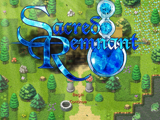
Title.png
Hmm, is this an animated title? It looks like one to me (Just stopped, as in it looks like one with the logo 'popping out' compared to the background.)
Anyway, this looks pretty good. I like the background a lot.
Anyway, this looks pretty good. I like the background a lot.
 Garden
When I first saw the screenshots I figured it was one of your games...
This looks really good, Rhyme. Downloading now. (And subscribing)
This looks really good, Rhyme. Downloading now. (And subscribing)
surrounded.png
The wall tile next to the stair looks a bit weird with the darkness at the bottom. I believe in TileA5/A3 there's a wall-looking tile which suits the stair tile well.

