


MADURAI'S PROFILE


Search
Filter
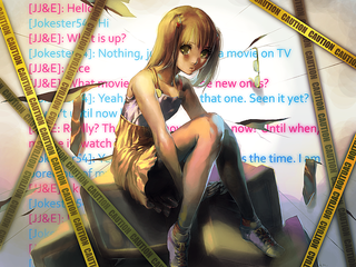
 NS1.PNG
author=Wyvernjack
Her portrait is a lot more attractive.
This picture actually shows an old version of Fiona's sprite that won't be in-game.
04_Caelum.png
04_Caelum.png
430763_10151253052878209_1629649667_n.jpg
author=Clareain_ChristopherGlad you like it!
I love his smile and the sprites are pretty cool, but what's up with the white pixels under her blouse?
Those naughty little things.
And oh yeah...I missed that! You're really good at pointing out things!
I'll fix that up.
Clara.PNG
author=Clareain_ChristopherOh... I see it! Haha, I'll get rid of that.
I don't like that white line on her shoulder. The artwork itself is pretty awesome.
ERIS2.PNG
author=SauceWe're already planning on modifying that! So no worries there!
And lips.
But I do not like that the sprite hair color does not match. Wildly different blondes.
author=Clareain_Christopher
In a way, I wish the char-picture wasn't so bright. It kinda hurts my eyes looking at her =3
I noticed this too, but some of the team objected, thanks for your opinion!
I think I'll opt to have her portrait darkened.
LILI.PNG
We actually were planning to add NPCS, we just are still making them.
Alas, thanks for the suggestion you two!
Alas, thanks for the suggestion you two!
Title.png
author=AveeIt (As well as the others) were done specifically for our project. She's credited as Amy Makuto in our credits.
I believe credit goes to Magical_RuNE_Knight200 for this art (and a few other pics).
For future reference, you can keep updated with the full credits here - http://www.codedemotion.com/anonymous-agony#!__anonymous-agony/credits
SCRNS1.jpg
They are indeed used quite a bit, and I would have loved original sprites... but they created as Actors... and this is a start up for me so getting alot of original content would have been hard, I had to work my butt off to get all the original content I already did xD
But alot of love and care has been put into this project =) please at least try the demo.
But alot of love and care has been put into this project =) please at least try the demo.
Title2.png
author=Craze
Pretty neat idea, but I'd suggest making the broken text actually connect - not as in touching, but in that if you did put the two pieces together they'd make one whole. Right now, it'd look odd if you stacked those two parts on top of each other.
Ohhh, very good point, I think it would indeed look better like that.
Thank you for pointing that out I'll discuss it with my graphics designer =)

