I think the logo looks fine, Marrend, but I'm wondering what led to the decision to have the discolored blog background color? It looks kinda strange and inconsistent with the rest of the text on the page. Also I'd add more Okiku faces to the background. She's pretty expressive in the game, so I feel the page should reflect that a bit more.
On my end,
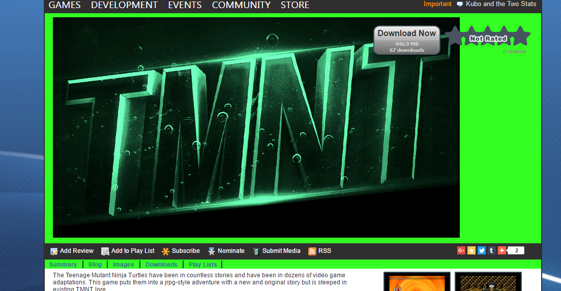
PotF's page has gotten a minor update. The blog length has been extended to line up with the Twitter feed, the Download Now button has been modified to be more thematic as well as relocated along with the review average so the title isn't obstructed. I'd like to make some review star graphics of my own, but I think that's touching on RMN's algorithms, so I probably shouldn't mess with it unless Liberty or someone in charge gives the okay.
There's still some work to do, though. I don't like the dead space the new buttons leave on the banner, so I might just create a new logo that fills in the gaps. Maybe show the red outlines of all the party member or something. I'm also thinking about shortening the description to be more punchy, maybe add in some visuals. I don't want to go too crazy for fear of slower computers, but that's where I'm at now.
EDIT: Side note: I remember seeing a picture in LouisCyphre's tutorial that shows the short description on the game page. Can I ask why that was removed? That seems like a neat thing to stick somewhere on the page, especially if there's no custom logo added.