


WHICH TO USE?
Posts
Pages:
1
Ugh, you guys are gonna be hearing a lot of me for a while, sorry about that, anyway!
As a few of you know, I want to go into making commercial games, meaning I gotta up my game and make my own resources. Now, for the character sprites I have two templates that I have made, but I'm not sure which one to use.
(Note: My upcoming project is going to be a somewhat mature game, so I'm trying to lean away from using cutesy RPT style) So...
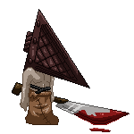
Do I use this one?

Or this one?

Oh, and if any of you have any ideas on how I can change these templates, please, let me know, Imma need all the help I can get -_-
(Looking at it... I could do with making a few modifications on the arms of template #2)
As a few of you know, I want to go into making commercial games, meaning I gotta up my game and make my own resources. Now, for the character sprites I have two templates that I have made, but I'm not sure which one to use.
(Note: My upcoming project is going to be a somewhat mature game, so I'm trying to lean away from using cutesy RPT style) So...
Do I use this one?
Or this one?
Oh, and if any of you have any ideas on how I can change these templates, please, let me know, Imma need all the help I can get -_-
(Looking at it... I could do with making a few modifications on the arms of template #2)

I don't personally subscribe to the 'cutesy' being bad for mature games. You can pull off some serious, dark games using what people might call cutesy - and it's all the more potentially disturbing (or what the fuck inducing) with the graphics style. A lot of the choices should be a) to create a solid art direction between your sprites and backdrop and b) to emphasize the theme and mood of the story. In the end, which template style you choose is going to be somewhere in those two. It's hard to say which is better without seeing the overall art direction.
For an example of some more serious and potentially mature games with cutesy graphics, look at almost any serious effort on the SNES and early PlayStation era (but not just on those systems). Lunar is a good example (oh god, I will forever be haunted by those words, "No, not Ghaleon, dear Quark. Magic Emperor Ghaleon!" - ok, the voice acting sucked but I was like 12), as is Lufia (and don't just rely on the English translations of the game for the seriousness of the story; the English versions suffered from a lot of technical limitations in translations at the time). Breath of Fire II is also a good example (I can't recall BoF's story, but I've recently replayed BoF2 with a proper translation and it's a hell of a dark game).
Basically, don't just pick a sprite style by itself; think of your entire art direction and the type of pallet you're going to use.
That's... you make a really good point there, I forgot to take that into consideration.
However, as I'm building my project from the ground up, I'm trying to make everything myself (graphic and music wise... maybe script if I can get my head around RGSS) My main question was, out of the two templates I have made, which one should I use? Which one would potential players og my game like to see in the finished product?
However, as I'm building my project from the ground up, I'm trying to make everything myself (graphic and music wise... maybe script if I can get my head around RGSS) My main question was, out of the two templates I have made, which one should I use? Which one would potential players og my game like to see in the finished product?
Well, again, that's a response I really personally couldn't give without more details and some idea of your direction. Again, I'm of the thought your theme and mood should be reflected, even in your graphics choices. Either could fit into a number of game types, but both could be a total flop if chosen solely on the premise of which players would prefer without seeing anything.
The only comment I can give, as is, is that with the second one, seeing it just as I am now, I would expect a more detailed chipset with a more 'grim' pallette choice (more washed out, less bright colours).
The only comment I can give, as is, is that with the second one, seeing it just as I am now, I would expect a more detailed chipset with a more 'grim' pallette choice (more washed out, less bright colours).
The "cutesy" style mainly exists because it comes from a time when possibilities where quite limited, and these where the best solution to fill the small amount of pixels existing. It survived for one reason - tradition. Honestly, decide a style that fits your scenes. FF7 had a mixture of mature-characters and SD-chracters, which would be an option too.
If you go for a realistic style, I'd suggest you to reconsider the appearance. First, remove the eyes as they are right now. Showing the eye's white makes them seem big, as well as making them round/vertical rather than horizonally shaped (based on the amount of pixels, but horizonal formed shape still seems more realistic). Also the proportions of the arms are a bit off.
As an example, I'm trying to fill the little space given in rpg2k3 with something mature looking. This is an example of generic male/female figures I made:
http://i637.photobucket.com/albums/uu97/Moongrape/selectiveB2_zps7f206e0e.png
http://i637.photobucket.com/albums/uu97/Moongrape/selectiveC1_zps4d524f05.png
Maybe it helps you, maybe not.

I'd personally work with the second option, most gamers would probably agree that the second template is more detailed and realistic-looking, which would help an RPG's immersion factor, unless you're going for an SD style.
My opinion is that graphics should lean more towards realism so that the person playing forgets that what he's playing is a game and believes it more attune to reality. Immersion, in my opinion, is the single-greatest factor to the game's presentation, a combination of music, graphical style, and graphical quality in that order.
My opinion is that graphics should lean more towards realism so that the person playing forgets that what he's playing is a game and believes it more attune to reality. Immersion, in my opinion, is the single-greatest factor to the game's presentation, a combination of music, graphical style, and graphical quality in that order.
author=White_Rabbit
The "cutesy" style mainly exists because it comes from a time when possibilities where quite limited, and these where the best solution to fill the small amount of pixels existing. It survived for one reason - tradition.
I refute that statement. There're a fair number of games that exist in that period that don't use the smaller 'cutesy' styled sprites.
Shadowrun is a big one. Chrono Trigger (could arguably be called cutesy, I suppose, but they aren't smaller pixel sizes). Secret of Mana, Seiken Densetsu 3, Secret of Evermore, Illusion of Gaia (could potentially fall into the same category as Chrono Trigger). Super Mario RPG (yes, potentially cutesy, but not the smaller graphics). Ogre Battle might be considered in the group, but it does use smaller sprites for the battles.
And these're just off the top of my head without looking anything up.
But yes - I said it before, base the style of everything the game's going to include.
Almost none of the games you mentioned has anything close to a realistic proportion-styled character sheet. Compare the head-body proportion relation in almost all of the titles you listed before using them as argument (if you don't see the SD factor naturally). And no idea why you even mention Super Mario.
Also check the last sentence you quoted off me.
Besides, the spritecheets I posted can be considered non-SD as well, even though the heads are still way bigger than for real human proportions. Meaning, of course it's possible to make sprites look more "realistic" in a certain pixel limitation, the question merely is how much you're willing to sacrifice of the silhouette (showing legs, perspective on figure etc.) and detail (for example because human proportions mean small heads = barely any space to show at least even something that could be recognized as the eyes).
Pages:
1

