


Forums :: Videogames
FINAL FANTASY 6 REMAKE!
Posts
these larger sprites look so... insubstantial. it's as though they made sprites at a slightly higher resolution at first, then decided that wasn't enough, upscaled them, and ran them through a poor HQ2X filter. the way everything draws to a fuzzy edge and the way small high-contrast dots are just squares drives the impression home. I really hope that isn't actually what they did, but either way, they pretty much look like shit.
the contrast is poor, too. I'm colourblind, so this might not be a problem the rest of you have, but in Tau's screenshot I have trouble distinguishing Terra's hair from her skin due to the similar tones and lack of any real shading. the only shading the sprites do have is a lazy and underdone dodge/burn deal, too. it gives them this really unappealing doughy look.
can't say I'm surprised they didn't go 100% on a mobile port, though. not given their history.
e: and yo, don't bring the word 'spirit' into this. the question isn't whether this is a credible copy of the original, but what it's like on its own. nostalgia is a terrible, terrible metric to judge anything by.
I'm colourblind too but don't quite have the same issue with Terra's hair, though I can see where you're coming from with it. They should've darkened the line I've murdered with bright yellow:

I'm not surprised with the sprite quality. It's the same style they started with in Dimensions, and now every mobile port/remake they throw at us has to use this shitty style. They look like crappy "watercolour" sprites with no personality or soul. I couldn't connect with even a single character in Dimensions because their sprites all looked so bland. Players of the original will be able to relate to the characters no problem because we're familiar with them already, but I'm worried that those playing FF6 for the first time won't be able to connect much with the cast because of the Dimensions style spriting.
I'm not surprised with the sprite quality. It's the same style they started with in Dimensions, and now every mobile port/remake they throw at us has to use this shitty style. They look like crappy "watercolour" sprites with no personality or soul. I couldn't connect with even a single character in Dimensions because their sprites all looked so bland. Players of the original will be able to relate to the characters no problem because we're familiar with them already, but I'm worried that those playing FF6 for the first time won't be able to connect much with the cast because of the Dimensions style spriting.
weird, we must be different sorts -- I don't think my case is particularly severe. my main problem with how they handled Terra's hair from a spriting perspective is that there isn't any darker shading along her forehead or the lip of her bangs to suggest that there's actually a shape there -- it's like the hair just abruptly becomes skin, rather than being a set of long bangs that stick out a good bit.
e: I should mention that it's fairly common practice in art to make sure that your pieces 'read' even in greyscale -- people should be able to tell what's what to an extent based on the values of the colours you use alone. so this isn't some kind of weird nitpick but actually a good-sized graphical mistake.
and yeah, it's completely ridiculous that a company that places such emphasis on the graphical side of things (remember Agni's Philosophy?) phones things in so badly when it comes to their character art. the maps look fine, if a little bland, but even if these sprites had been made for an rpg maker game over here they wouldn't be okay. people would say 'oh, it's nice that you have custom graphics, but these aren't very appealing and don't communicate much'. so yeah, the port quality is officially sub-rpg-maker-tier, based on my not at all arbitrary and very scientific metric.

e: I should mention that it's fairly common practice in art to make sure that your pieces 'read' even in greyscale -- people should be able to tell what's what to an extent based on the values of the colours you use alone. so this isn't some kind of weird nitpick but actually a good-sized graphical mistake.I did not know this. This is a good idea.

author=UPRCDifferent expectations for different eras. The soulless, low-res sprite style of the SNES FFs also kept me from connecting with a single character in any of them (or maybe it's the subpar writing).
I'm colourblind too but don't quite have the same issue with Terra's hair, though I can see where you're coming from with it. They should've darkened the line I've murdered with bright yellow:
I'm not surprised with the sprite quality. It's the same style they started with in Dimensions, and now every mobile port/remake they throw at us has to use this shitty style. They look like crappy "watercolour" sprites with no personality or soul. I couldn't connect with even a single character in Dimensions because their sprites all looked so bland. Players of the original will be able to relate to the characters no problem because we're familiar with them already, but I'm worried that those playing FF6 for the first time won't be able to connect much with the cast because of the Dimensions style spriting.
The new sprites also look bad, but no more bad than the originals. They're trying too hard to emulate a style that's just not good anymore.
the originals at least made decent use of contrast. the actual form of the sprites was awkward, but the colouration was head and shoulders above what's on display here.
anyway, this isn't about how new compares to old so much as how this is in and of itself. so far, it's not looking good!
anyway, this isn't about how new compares to old so much as how this is in and of itself. so far, it's not looking good!


I remember the Dimensions sprites looking like a SE version of B^U.gif, did they ever do anything about that for FF5? I'd consider FFD a decent if completely uninspired game visually (plus that Vector shot is nice) if the characters didn't look like the poor coffee intern whipped up at the wee hours one morning.

The Final Fantasy Dimensions style is here to stay. The sprites and style were made by Kazuko Shibuya personally, who was also the original sprite artist and designer for FF1, FF3, FF5, FF6, and probably others. Basically, these sprites are probably how she would've made them originally, had the higher resolution been available.

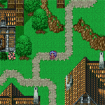
Hm. I'm not sure what to think. I hope they make better contrast of it, though. The mountain needs more blue.
I own the Final Fantasy Anthology version, PS1. As much as I loved FFVII, I have always thought VI to be a superior game. What idiot would think it needed
"improvement"?
"improvement"?
they're poorly made, and I don't care who by. people from history? esteemed names? give 'em this to read:
author=mawk
this isn't about how new compares to old so much as how this is in and of itself. so far, it's not looking good!

it looks like one of those rpg maker game threads that looks so bad it's actually mystifying how the kid managed to fuck up the graphics that much
did they apply a smoothing filter and then put it in graphicsgale and move the adjust color sliders around randomly and then put it in photoshop and add 400% contrast then add a bloom filter or something
like remember around 2005ish when some people started to use those 2xsai or whatever filters on rpg maker sprites and most 13 year olds around at the time knew enough to laugh at them... but evidently the professional team at this global scale game developer isn't at that level of artistic sophistication
this isn't some nuanced issue about values and color saturation and composition and perspective... like if you have any sort of basic human sensory perception you should be able to look at this and see pure digital refuse
setting aside for a moment the question of what the fAK is happening in their brains at SE, there's these ostensibly conscious lifeforms commenting that it actually looks better now??? idk what planet i am on anymore
also i don't even grind 1 extra battle when i play ff6 difficulty patches like eviltype or brave new world so somehow needing to grind on the original game is just incomprehensible lol ?? i don't know.


they went through all that trouble to remake the graphics but they left these in. good thing, because i pine for the mid-nineties trend of guardrails abruptly ending as if they were placed by an rpg maker user who hasn't found the "above layer" yet
author=SaileriusIt was probably your inability to appreciate a great game.author=UPRCDifferent expectations for different eras. The soulless, low-res sprite style of the SNES FFs also kept me from connecting with a single character in any of them (or maybe it's the subpar writing).
I'm colourblind too but don't quite have the same issue with Terra's hair, though I can see where you're coming from with it. They should've darkened the line I've murdered with bright yellow:
I'm not surprised with the sprite quality. It's the same style they started with in Dimensions, and now every mobile port/remake they throw at us has to use this shitty style. They look like crappy "watercolour" sprites with no personality or soul. I couldn't connect with even a single character in Dimensions because their sprites all looked so bland. Players of the original will be able to relate to the characters no problem because we're familiar with them already, but I'm worried that those playing FF6 for the first time won't be able to connect much with the cast because of the Dimensions style spriting.
I'd have to agree with kentona. FF6 has some of the most memorable visuals of any SNES game in my opinion.

LockeZ

I'd really like to get rid of LockeZ. His play style is way too unpredictable. He's always like this too. If he ran a country, he'd just kill and imprison people at random until crime stopped.
5958
author=Pastythey went through all that trouble to remake the graphics but they left these in. good thing, because i pine for the mid-nineties trend of guardrails abruptly ending as if they were placed by an rpg maker user who hasn't found the "above layer" yet
oh my god
Forums :: Videogames

