


SCREENSHOT SURVIVAL 20XX
Posts


author=Punkitt
Also, wow, loving the idea the inside garden you've got there. I can't wait to see if/when you expand on that!
Thank you! Quite fond of the idea myself, I must say :P
author=Liberty
The thing that does need changing in that garden is the fade between grass and cobble.
Yeah I realized that I forgot to do that :P I was gonna make the wall mossy and stuff too but forgot to do it >.<
author=Liberty
Try to make green between the cracks and don't make it fade off like that because it doesn't make sense.
Blueperiod recommended on slack that I make the water darker, and the water was in the same layer as all the ground and stuff along with the floating stuff in it, so I couldn't do it else way. I will change it in the real map though, even though I did like it :P It's away from the lights after all.
author=Liberty
Also, the flowers are a little too much, since there's so many of them. Not your fault - those flowers in particular are a bit too bright to be used so much. Actually, if you want to go advanced, maybe make various shades of red among them, and some budding ones, too?
Oh! Great idea actually! I'll definetly do that, even though I'll probably have to spend way more time on mapping since there are supposed to be loads of flowers around the garden in big batches.
author=Liberty
I do love the little path though - that looks great.
Thanks ^^
author=Liberty
(Also, for a place so dark you wouldn't have trees and flowers growing so much, though that's easily explained away by magic or rules of your world, but in case it's set in the real world, you might want to make the light brighter (this is why greenhouses and sunhouses - indoor plant housing - are usually quite well lit).)
Nah, it's not the real world. I mean, yeah it is in real earth but the place isn't real. It's supposed to be an illusion symbolising the MC's love for flowers.
Blue also recommended that I should have a hole that brings light to the garden at the top which is what keeps it alive. I did like that idea too, so I might do that ^^


Trying out a new tint for some natural areas. I felt the older tints were washing out my pixel art. Oh, and the shrub wasn't crafted from scratch like the tree. Hence the big difference in quality. >< I still have to work on defining leaves.

Old tint.

Instead of using black for dark shadows, use navy or purples instead. Also, try not to make the shadows quite so dark. That should help a bit.

The new tint is a huge improvement! It really makes the colors of the map pop and creates a much warmer, more inviting feel.

Hmm, I actually prefer the colors in the original tint. It has a more mystical and alluring kind of tone to it. XD
Trees (and overall composition) are looking great though. The shrubs suffer from the same issue your old trees had. They aren't clearly shaded or distinguishable from the grass textures.
Trees (and overall composition) are looking great though. The shrubs suffer from the same issue your old trees had. They aren't clearly shaded or distinguishable from the grass textures.

Gah, Luchino, I don't want to make you rethink it but I agree with Blindmind. I liked the old tint.
The new one is great and as mentioned by dethmetal, it has a nice warm feel to it.
The new one is great and as mentioned by dethmetal, it has a nice warm feel to it.
Both are good, but it really depends on what atmosphere you're going for for the area. Is it a warm summer evening kind of thing or a mystic forest kind of thing?


Ara Fell's new leveling menu, implemented via popular demand (INCESSANT NAGGING) of the beta testers.
Looks great, BadLuck! Very slick and visually appealing
Really cool BadLuck.
It makes me think of a system I had for a different game. Do you have something similar to choose skills like a skilltree? The victorious sprite under the level up text is a nice added touch.
Still WIP but part of the town I was working on earlier in this thread.
I feel a greater control over the chipset which is a little hard to use. (And has bugs with some of the autotiles :( )
Corfaisus

"It's frustrating because - as much as Corf is otherwise an irredeemable person - his 2k/3 mapping is on point." ~ psy_wombats
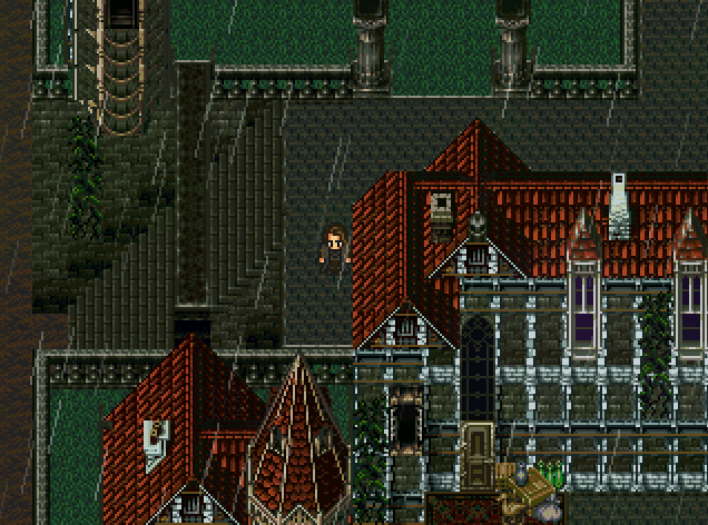
7874
I would seriously consider doing something to remove the shadows behind the stairs. Also, the lower diagonal staircase is missing its end piece at the bottom, and the carpet in front of that building (which doesn't seem like a smart place to put such a thing, especially in the rain) is cutting into where the base of the building would be along its edge. You're also missing a roof tile at the joint, and it appears you missed a couple of tiles while you were shift-mapping.
Here's an example of my own take on the tileset, just so that this doesn't come across as me tearing into you without experience.

Ignore the barrel tiles on the rooftops; they're there to enable me a way to set proper passability without the use of an event.
Here's an example of my own take on the tileset, just so that this doesn't come across as me tearing into you without experience.
Ignore the barrel tiles on the rooftops; they're there to enable me a way to set proper passability without the use of an event.
No offense taken haha, I think people should come here for criticism not for praises.
Your map example is helpful but could you highlight which roof tile im missing (im suspecting the tip of the roof right from the hero but just to be sure in case you saw something else)
Your map example is helpful but could you highlight which roof tile im missing (im suspecting the tip of the roof right from the hero but just to be sure in case you saw something else)
author=Superstroke
Really cool BadLuck.
It makes me think of a system I had for a different game. Do you have something similar to choose skills like a skilltree? The victorious sprite under the level up text is a nice added touch.
It works similarly to Seiken Densetsu 3's level up system up. Every time you level, your HP increases, but no other stat.
These are some pretty cool advances! Corf, your town looks great but the single-tile-wide stairs look kinda strange because the side stairs look two tiles wide in comparison.

Meanwhile, have a vertically scrolling area I'm working on.
Meanwhile, have a vertically scrolling area I'm working on.

author=BadLuckLooks fantastic, happy to see youre still at it. I was AlucardXDemon back in some old ass RPGmaker siteAra Fell's new leveling menu, implemented via popular demand (INCESSANT NAGGING) of the beta testers.

@Ramshackin: thanks for the feedback many, many pages ago ^_^
I tried making the underwater cliffs shorter. How does this look? Too shallow, perhaps? I can make it slightly deeper.
I tried making the underwater cliffs shorter. How does this look? Too shallow, perhaps? I can make it slightly deeper.


