


SCREENSHOT SURVIVAL 20XX
Posts
author=Dookie
Erave I've been following SoA for a while now, syked you guys are kickstarting. Everything looks so tight, great job.(I still HAaAatE the battle UI, but everything else is great.)
Haha fair enough!

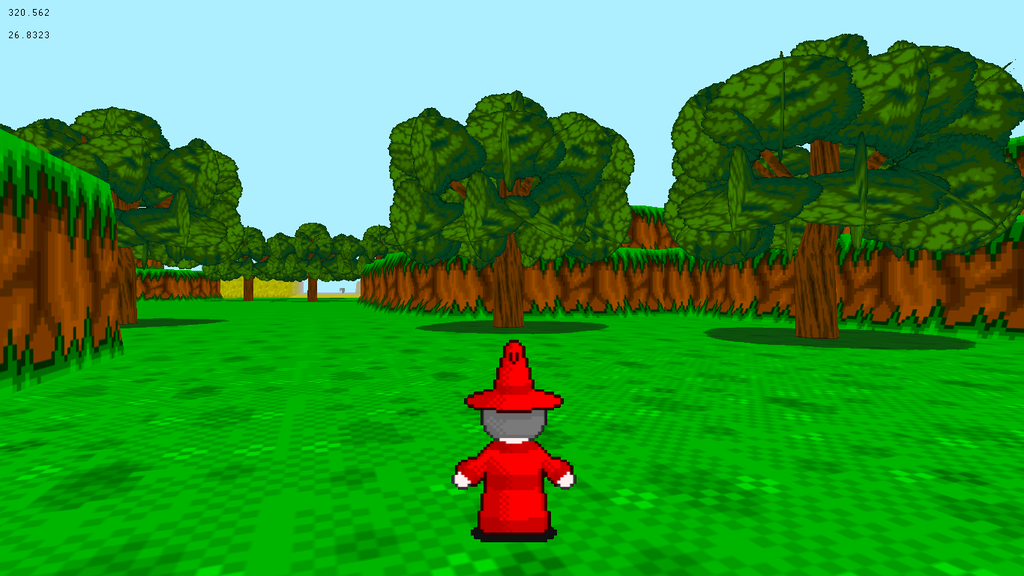

grindalf: I really like these retro-3D sceneries. What software are you using? Or is it a custom editor?
Thanks Gretgor. I was originally going for a snes style(but in 3D) but I think it feels more like the original Playstation(which is not a bad thing)
Im using Blitz3D for the programming. Paint for the sprites and textures(But im sticking to a retro 15bit color palette) and Deled for the 3D design.
Im using Blitz3D for the programming. Paint for the sprites and textures(But im sticking to a retro 15bit color palette) and Deled for the 3D design.


Love both your screenshots, Grindalf and pun!
Punkitt: I'm loving your screenies, they're endearing and they look like the game they'll be contained in will be rich in adventure.
Thanks Punkitt, Thanks Frogge.
Loving how simple and perfect your graphics are Punkitt. Ive never seen such simplicity done so well.
Loving how simple and perfect your graphics are Punkitt. Ive never seen such simplicity done so well.
We want da gaem :3


Yeah, I was gonna say, you need a LOT more trees for that to be a forest - it's fairly empty of them. Two Nine trees does not a forest make, after all. The graphics are neat, though.
Now that I read the caption (I tend to skip those things, terrible habit), I have to agree. The graphical style is adorable and sweet, but you do need more trees to make a forest.
It's not actually a forest, don't worry. :P
I just call it that as a convenience!
Adding some stuff to the Monument Valley-inspired area. The trees will get some shading to match the rest of the map, don't worry!


EDIT: Making the weird blocks connect better!

I just call it that as a convenience!
Adding some stuff to the Monument Valley-inspired area. The trees will get some shading to match the rest of the map, don't worry!
EDIT: Making the weird blocks connect better!

That looks extremely awesome, Punkitt. I love the color pallet. The blocks are really unique and intriguing.
My only gripe is that the map is a bit empty. I understand that it's supposed to be minimalist, and that's fine. But try to balance it out a bit more. In the last two screenshots, you seem to have more little details near the top of the map but the bottom is almost complete barren; just a single solid color. Obviously you don't have to abide by the three tile rule, but try to make it so that the composition of the player's screen is always somewhat balanced, even when he/she is moving around and the screen is scrolling. I probably explained that badly, and I apologize.
But seriously, I really like the style. You've probably explained it a bunch of times by now, but what kind of game is this going to be? What's it about?
author=dethmetal
That looks extremely awesome, Punkitt. I love the color pallet. The blocks are really unique and intriguing.
Wow, thanks! I'm glad they have that effect.
author=dethmetal
My only gripe is that the map is a bit empty. I understand that it's supposed to be minimalist, and that's fine. But try to balance it out a bit more. In the last two screenshots, you seem to have more little details near the top of the map but the bottom is almost complete barren; just a single solid color. Obviously you don't have to abide by the three tile rule, but try to make it so that the composition of the player's screen is always somewhat balanced, even when he/she is moving around and the screen is scrolling. I probably explained that badly, and I apologize.
Nah, I totally get what you meant! I've got what you described in mind when I do maps, don't worry! It's got more to it, it just happens to be unfinished, hehe. That's why the bottom looks so barren.
author=dethmetal
But seriously, I really like the style. You've probably explained it a bunch of times by now, but what kind of game is this going to be? What's it about?
Oh! well, it's a puzzle game focused on exploration inspired by Yume Nikki and Monument Valley! (Two games I absolutely adore.) The premise of the game is that you're just a dog with a scarf and you go around obscure worlds and try to make the creatures around you happy. It's hopefully going to be a relaxing, feel-good kinda puzzle game!
Sounds great Punkitt
So I started working on the enemies today. They still have no AI but Im sure I will get that sorted tomorrow.
If you find this game interesting go check out my facebook page
https://www.facebook.com/grimoireofworlds

So I started working on the enemies today. They still have no AI but Im sure I will get that sorted tomorrow.
If you find this game interesting go check out my facebook page
https://www.facebook.com/grimoireofworlds


I don't particularly like the hardwood flooring under the camp. Only because it looks flat on the map. And what about bumping one of those bottom tents up one so it isn't a straight line?

