


SCREENSHOT SURVIVAL 20XX
Posts

Don't... don't do that. Don't advertise your game like that.
Also, you've a fair few errors in that screenshot. For one the cliffs are all jacked up. You want them to be all the same height around. If the cliff top is at the same level all the way around, the walls of the cliffs should be the same height all the way around. This means the far left two walls need to be edited.
Secondly, the stairs leading to the door are weird (also, the door is two doors on top of each other, not one single door. That needs an edit in order to be fixed.) The fact that the walls are 2 tiles high on that castle means that the door would be at the same height as the cliff top area - there'd be no need for steps leading up to it because it's on the same level as the bottom of the rest of the building.
Also, use shift-mapping to get rid of the edging of the cliff-tops around the castle itself. It looks really weird, as though the castle isn't sitting on top of the ground. To do this, just hold shift when placing the autotiles around the building and it will show just the base ground tile.
Lastly, you need to separate the top and bottom cliff tops on the right - the tree border is neat and all, but you have a fallacy in that the top and bottom ground areas are still attached to each other. Put a cliff all the way across the screen, then have it just fade into darkness like the tree edges, then remove the edge of the trees where the cliff should be.
A very quick, sloppy example:

@Marcus: It's a lot better. That said, why not just make four tiles for the middle-pasting tiles and put them on A5 to use when needed for longer stretches of the middle tiles? It would get rid of that little indent and they're not hard to use, just hold shift when placing them.
Also, you've a fair few errors in that screenshot. For one the cliffs are all jacked up. You want them to be all the same height around. If the cliff top is at the same level all the way around, the walls of the cliffs should be the same height all the way around. This means the far left two walls need to be edited.
Secondly, the stairs leading to the door are weird (also, the door is two doors on top of each other, not one single door. That needs an edit in order to be fixed.) The fact that the walls are 2 tiles high on that castle means that the door would be at the same height as the cliff top area - there'd be no need for steps leading up to it because it's on the same level as the bottom of the rest of the building.
Also, use shift-mapping to get rid of the edging of the cliff-tops around the castle itself. It looks really weird, as though the castle isn't sitting on top of the ground. To do this, just hold shift when placing the autotiles around the building and it will show just the base ground tile.
Lastly, you need to separate the top and bottom cliff tops on the right - the tree border is neat and all, but you have a fallacy in that the top and bottom ground areas are still attached to each other. Put a cliff all the way across the screen, then have it just fade into darkness like the tree edges, then remove the edge of the trees where the cliff should be.
A very quick, sloppy example:
@Marcus: It's a lot better. That said, why not just make four tiles for the middle-pasting tiles and put them on A5 to use when needed for longer stretches of the middle tiles? It would get rid of that little indent and they're not hard to use, just hold shift when placing them.

@MarkusT I know that feeling dude, but that frustarion could eventually get in the way of your project if you don't overcome it. It also frustrating to me to make extra stuff for my maps, but in the end, if it comes out well, you'll feel more satisfied.
Then again, I tend to be a perfectionist sometimes.
Then again, I tend to be a perfectionist sometimes.
Ugh.. I hate explaining why I get so frustrated.
But the main 2 reasons is I have ADD and an anxiety disorder.
It gets in the way, and I have hell overcoming it.
I would not mind doing what folks have suggested for the tiles and using A5 if Kadokawa had just allowed the A5 sheet to be as many tiles as I want, as I would not be so worried about running out of tiles on that Sheet.
I am however considering replacing the water and using one of those layer plugins out there to create a more detailed and animated ocean.
I wish someone would make some plugins for auto tile manipulation, like the rate in which it goes between each frame.
Maybe a way to during gameplay, call a different auto tile on a separate sheet with more frames?
These are the sort of plugin ideas I have all the time, and if I could wrap my brain around making plugins, I would for sure make them myself.
I still can't find a mode 7 map plugin for MV yet.
Anyhow, I'm going to try and implement something different for the ocean, and then I will report back, and see what folks think.
-update-
Aaaaand, I got it!

The ocean auto tile is pretty much blank where there would be water..
Using Galv's Layer Graphics plugin, I made a basic panorama for the bed of the ocean, sand mainly, and above that is the actual panorama that I have over it, moving left (I kinda wish his plugin had effects options, like wave like effects and other distortions).
And those are both under everything else, while the cloud shadows are above everything, and the clouds themselves are above everything.
It adds depth IMO.
I get the feeling though, someone will state that the clouds and shadows are distracting, as it's a comment I have gotten before.
But the main 2 reasons is I have ADD and an anxiety disorder.
It gets in the way, and I have hell overcoming it.
I would not mind doing what folks have suggested for the tiles and using A5 if Kadokawa had just allowed the A5 sheet to be as many tiles as I want, as I would not be so worried about running out of tiles on that Sheet.
I am however considering replacing the water and using one of those layer plugins out there to create a more detailed and animated ocean.
I wish someone would make some plugins for auto tile manipulation, like the rate in which it goes between each frame.
Maybe a way to during gameplay, call a different auto tile on a separate sheet with more frames?
These are the sort of plugin ideas I have all the time, and if I could wrap my brain around making plugins, I would for sure make them myself.
I still can't find a mode 7 map plugin for MV yet.
Anyhow, I'm going to try and implement something different for the ocean, and then I will report back, and see what folks think.
-update-
Aaaaand, I got it!
The ocean auto tile is pretty much blank where there would be water..
Using Galv's Layer Graphics plugin, I made a basic panorama for the bed of the ocean, sand mainly, and above that is the actual panorama that I have over it, moving left (I kinda wish his plugin had effects options, like wave like effects and other distortions).
And those are both under everything else, while the cloud shadows are above everything, and the clouds themselves are above everything.
It adds depth IMO.
I get the feeling though, someone will state that the clouds and shadows are distracting, as it's a comment I have gotten before.


creepy eyeball things are fun ^-^
I like the clouds and shadows, also agree with making those more transparent
I like the clouds and shadows, also agree with making those more transparent

@MarkusT, the lighting on your sprites suggests the sunlight is coming from the left side of the screen, but the cloud shadows are reversed with the light source from the right.
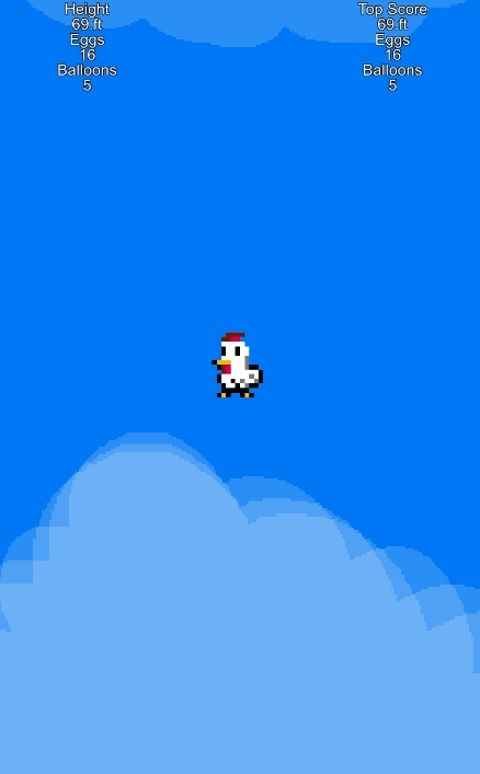
Super Bomb Jump!
@Momeka I like where you're going. The spaghetti monsters look freaky cool. That menu style is really trendy, but what's up with the empty message box? I'm assuming that's where some other stats will end up?
@Momeka I like where you're going. The spaghetti monsters look freaky cool. That menu style is really trendy, but what's up with the empty message box? I'm assuming that's where some other stats will end up?

@Momeka:
Those monster sprites are delectably creepy. So, so creepy.
@Infinite:
I could ever do like... two, three bomb jumps at most in Metroid. I feel like I would be bad at your game.
edit: Momeka, the whole "remains idle" thing seems a bit dry. Why not something like "wriggles moistly" or something equally gross and fitting? Or are you planning on using the "remains idle" as a default message?
author=RamshackinI did not even realize that until you said something.
@MarkusT, the lighting on your sprites suggests the sunlight is coming from the left side of the screen, but the cloud shadows are reversed with the light source from the right.
TY.
I did a video rather than a screen shot.
Also, I apologize for comment about people nitpicking, was not my intent to insult if it DOES insult anyone.
I might do short videos updating folks on things from now on.. takes a bit more time..but I can express myself more easily in a video than typing things.
author=Kaempfer
edit: Momeka, the whole "remains idle" thing seems a bit dry. Why not something like "wriggles moistly" or something equally gross and fitting? Or are you planning on using the "remains idle" as a default message?
Thanks for the feedback. Yeah, the texts messages are kinda temp so far. I do like wriggles moistly, might use that one.

Cross posting this with on my game page. I tried on this map to emulate T(o)roia Castle from FFIV. Turned out alright, but I realize how much my style differs from that of the original games. Not a bad exercise though, since I tend to be sprawling and disorganized while maps from the games are neater and more compact, excellent watchwords always.

author=Kaempfer
@Infinite:
I could ever do like... two, three bomb jumps at most in Metroid. I feel like I would be bad at your game.
My game is a lot more forgiving, and easier than you may think. There actually isn't a limit on bombs, so you could just spam bombs chaotically.
author=Sated
@MarkusTYou should make your character's sprites smaller whilst they're on the world map.
I will consider that when I start to work on my characters.
I have no intention of using the god awful chibi sprites that come with MV.
Don't you hate when you wake up in the middle of the night and your closet have turned into a hell portal

Momeka, you joke about these things but that's a real problem for many Americans. Looks really nice!

