


SCREENSHOT SURVIVAL 20XX
Posts
Here are some bits and pieces of the Sonic fangame I've started. This level is called "The Coastside Hill Zone":
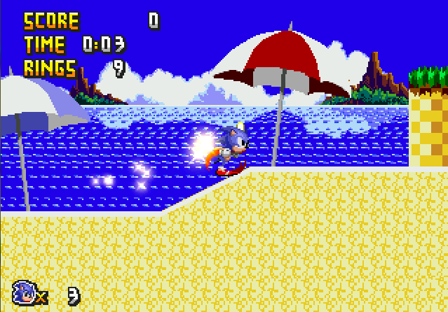
The level starts off along the beach shores, then transitions into a Green Hill-type setting.


The water ripples in the background auto-scroll, by the way.
The level starts off along the beach shores, then transitions into a Green Hill-type setting.
The water ripples in the background auto-scroll, by the way.

I cannot hope to respond to all of this, but i will give a nod to some things i liked or was intrigued by...
@Pizza: That is a nice tileset, good luck making the next one even better, heh!
@Christamoose: It needs work, but I support making your own graphics, be they tilesets or other inventive solutions for a lack thereof.
SPEAKING OF WHICH! Guess what I've been working on the last four days where I had no internet?
Why, Perseverance: Adherence, obviously. Now I actually have some really cool shit to show.


Keep in mind some graphics will still be placeholders.
Now, here's the first bit of combat, serving as a self-reliant of tutorial. All your keys for combat are in the HUD, yo.
Did you guys want a boss battle, awesome that! because as it turns out here is a boss battle!
Oh... you didn't want that, oh... okay. WAIT! That's too bad! Because Bossfite is now, and to make it even sweeter, I'll drive this voracious candy-colored nuclear filth right down that cringe-inducing monster of a throat which is disturbingly loud.
The boss serves as an introduction to danger zones, if you get hit in the first phase it does 20 damage (a fifth of your HP, not a big deal.), phase 2 it ramps up, providing something closer to what awaits.
@Pizza: That is a nice tileset, good luck making the next one even better, heh!
@Christamoose: It needs work, but I support making your own graphics, be they tilesets or other inventive solutions for a lack thereof.
SPEAKING OF WHICH! Guess what I've been working on the last four days where I had no internet?
Why, Perseverance: Adherence, obviously. Now I actually have some really cool shit to show.
Keep in mind some graphics will still be placeholders.
Now, here's the first bit of combat, serving as a self-reliant of tutorial. All your keys for combat are in the HUD, yo.
Did you guys want a boss battle, awesome that! because as it turns out here is a boss battle!
Oh... you didn't want that, oh... okay. WAIT! That's too bad! Because Bossfite is now, and to make it even sweeter, I'll drive this voracious candy-colored nuclear filth right down that cringe-inducing monster of a throat which is disturbingly loud.
The boss serves as an introduction to danger zones, if you get hit in the first phase it does 20 damage (a fifth of your HP, not a big deal.), phase 2 it ramps up, providing something closer to what awaits.


Finally managed to churn out more custom gfx.


It's going painfully slow, but I'm liking it a lot so far.
It's going painfully slow, but I'm liking it a lot so far.

@Bizarre I think those buildings look bad. The windows in particular. They register more as big blocks of color than windows imo.
I think something like this would look better:

That that took literally 2 seconds. Slow down on the details a little bit and I think it would drastically improve the overall look.
I think something like this would look better:
That that took literally 2 seconds. Slow down on the details a little bit and I think it would drastically improve the overall look.
LockeZ

I'd really like to get rid of LockeZ. His play style is way too unpredictable. He's always like this too. If he ran a country, he'd just kill and imprison people at random until crime stopped.
5958
Yuna, I wasn't crazy about that grass earlier, because the contrast on it is kind of sharp, but with the fog effect it actually looks really good.
Is that still the RTP water? I hope it is, becaue I never really understood what all the oval-shaped blobs in the water were really supposed to represent, and it would displease me if your custom graphics did the same thing.
Is that still the RTP water? I hope it is, becaue I never really understood what all the oval-shaped blobs in the water were really supposed to represent, and it would displease me if your custom graphics did the same thing.

author=yuna21
Finally managed to churn out more custom gfx.
Yasssss! I was concerned with the original color-tinted/filtered shots you posted because it muddied up your palette and made everything take a step toward flat gray. The new tint/filter is much better - it allows the vibrancy of your color to remain intact while giving it a subtle change in mood. It feels like a rainy day in an otherwise vibrant place which is great. However- a very tiny tiny issue- you may want to change those 'tiers' of cliffs to have a more natural-looking bottom edge; less blunt and squared. Perhaps using the same technique you used elsewhere, like this:


dat pool of blood doe
I like how scary it is.Although the way those pipes are placed is giving me headaches trying to figure out how it all fits.
But yeah I would not want to go anywhere near where that blood begins
I like how scary it is.Although the way those pipes are placed is giving me headaches trying to figure out how it all fits.
But yeah I would not want to go anywhere near where that blood begins
LockeZ
I'd really like to get rid of LockeZ. His play style is way too unpredictable. He's always like this too. If he ran a country, he'd just kill and imprison people at random until crime stopped.
5958
atolmasoff, that first screenshot is probably way too dark for a town map. Also most those buildings in most of those maps are ABSURDLY TINY. Like, the smallest ones are barely the size of a handicapped toilet stall.
also that's just way too many screenshots at once to comment meaningfully on, sorry, I don't want to spend the next two hours evaluating and responding to your post
also that's just way too many screenshots at once to comment meaningfully on, sorry, I don't want to spend the next two hours evaluating and responding to your post

atolmasoff - Quest Log is pretty difficult to read against some of the tiles, a dark semi transparent background might help it pop out a little. I'd suggest sticking to one tileset, Pixel Myth can be used with XP with a little editing but Celianna's tiles are in a completely different style.


author=DookieYou're probably right, I have to have a demo ready of this game by 3/14, though. So we'll see how it goes.
@Bizarre I think those buildings look bad. The windows in particular. They register more as big blocks of color than windows imo.
I think something like this would look better:
That that took literally 2 seconds. Slow down on the details a little bit and I think it would drastically improve the overall look.
I did want to avoid doing that so it wouldn't make the player focus on the background, having windows like that may draw the players attention, when it's probably 5 or so enemies are on the screen at once, that's something I'd like to avoid.
Also some cool news, M:R on desura was in the top 100 yesterday, capping out at 80th most popular game on the site, 65 places behind airmech.
So that was rad.
@Bizarre The background as it is is already very distracting, but if the windows are all square like in Dookie's version, then it won't draw as much attention because the pattern is regular almost like a texture rather than having irregular splotches of windows.


Taking advice from people about my last few projects, I'm doing more custom menu elements. This is the dialogue box I'm messing with. Is it good to read?
Also, I did a little studying of ground tiles today. I think I've improved them a lot, from what I used to make before.
LockeZ
I'd really like to get rid of LockeZ. His play style is way too unpredictable. He's always like this too. If he ran a country, he'd just kill and imprison people at random until crime stopped.
5958
You misspelled 33% of those generics!!!
The message box itself is fine. Not sure how I feel about it not being centered, but if you're not gonna center it then I would get rid of that arrow at the bottom. Since I know for a fact it's not possible to move the arrow to the left, getting rid of it is the next best thing - and is easily done by just deleting it out of the system graphic file. You may also want a less anti-aliased font.
The message box itself is fine. Not sure how I feel about it not being centered, but if you're not gonna center it then I would get rid of that arrow at the bottom. Since I know for a fact it's not possible to move the arrow to the left, getting rid of it is the next best thing - and is easily done by just deleting it out of the system graphic file. You may also want a less anti-aliased font.
author=LockeZ
You misspelled 33% of those generics!!!
Ah, so I did.
I'll be dropping the arrow, yeah. I'm not actually even started on making a regular window skin yet so that will come in time. I should have probably mentioned that the off-centered aspect is because faces appear in the bottom right hand corner.

@ESBY: I am digging the look of those screens! Careful not to make them too dark, though, lest you start to lose details.
Pizza I'm gonna be brutally honest,
I love pretty much everything about that screen
a whole lot.
The art style is very calming somehow.
I love pretty much everything about that screen
a whole lot.
The art style is very calming somehow.

