


SCREENSHOT SURVIVAL 20XX
Posts


While I'm taking a break with Hanging On i've been helping out a friend brush up their project they submitted for IGMC and testing my hand at luna for the first time in depth.

Oh my god where can I get that menu system?! It looks so wonderful! The graphics are amazing! You sir, are the official trans-awesome user of RMN.
*Edit*
Alright decided to do another exercise map(like I don't do enough of those already :P). I wanted to try working with overlay to make it look similar to this and this. (Raven Noah & Linus)
I think I failed.... Any advice on how I can improve my next maps?(This isn't game footage. Tha character lantern and all that stuff are also added from GIMP so yeah this isn't a real game, sorry if I got your hopes up :P I can't go back and edit this now since I saved it as png and all layers are combined together).

I've been working on my first village. Here's a screenshot of the interior of one of the huts, a herb shop. Does it look serviceable? Am I missing stuff? (yes, it's supposed to be very small)

Yeah that looks pretty good, and actually I prefer small maps to giant spacious maps.
I feel like sharing the other practice map I did because why the hell not?

I feel like sharing the other practice map I did because why the hell not?

author=Milennin
I've been working on my first village. Here's a screenshot of the interior of one of the huts, a herb shop. Does it look serviceable? Am I missing stuff? (yes, it's supposed to be very small)
It looks like those Eye puzzles,I got confused when i saw the wall with door
but looks pretty good,it remind me of the saturn village...

Xtreme, both of those maps look fantastic. The UI for the first game is great, along with the lantern effect.
So does yours, Milennin. Even though the layout is strange, it's rather cute.
So does yours, Milennin. Even though the layout is strange, it's rather cute.

Looks good, Extremey, but some more details would be nice. Tint and structure is pretty good so far.
@Milennin: Looks pretty nice. Is that an edited RTP? Looks kind of familiar to me...
@Milennin: Looks pretty nice. Is that an edited RTP? Looks kind of familiar to me...
Thanks. :)
What is it that makes the lay-out strange?
It's part RTP and part self-made assets in the style of the RTP.
author=CashmereCat
So does yours, Milennin. Even though the layout is strange, it's rather cute.
What is it that makes the lay-out strange?
author=luiishu535
@Milennin: Looks pretty nice. Is that an edited RTP? Looks kind of familiar to me...
It's part RTP and part self-made assets in the style of the RTP.
author=CashmereCat
Xtreme, both of those maps look fantastic. The UI for the first game is great, along with the lantern effect.
Awww thanks cash you're too kind :3 Also it's not a game the UI is added from GIMP and so is the character, so it's not rpg maker footage, it's literally image footage :D
Yeah but I would like to have a UI like that sometime in the future too. Who knows, maybe someone will make it :3
author=luiishu535
Looks good, Extremey, but some more details would be nice. Tint and structure is pretty good so far.
Hmm I agree I didn't pay much attention to the little details, especially in the second one.

@Milennin:
That's a pretty good attempt, but there's a few things I'd suggest: First, reuse some more of the previous angles shades in each new segment of wall. Right now, each new angle (flat, slightly curved, really curved) contrasts too sharply with the angle before it. Secondly, you might want to add a few pixels to the top side of the wall, like most autotiles use, to show a little bit of depth. Lastly, and this is a bit minor, but the table and ground are almost the exact same colour. It's still easy to tell them apart, but it's a minor nitpick. I really like the vibe of the area though!
That's a pretty good attempt, but there's a few things I'd suggest: First, reuse some more of the previous angles shades in each new segment of wall. Right now, each new angle (flat, slightly curved, really curved) contrasts too sharply with the angle before it. Secondly, you might want to add a few pixels to the top side of the wall, like most autotiles use, to show a little bit of depth. Lastly, and this is a bit minor, but the table and ground are almost the exact same colour. It's still easy to tell them apart, but it's a minor nitpick. I really like the vibe of the area though!

@ED: That 2nd screen looks nice, but please ditch the sunbeam effect. Please.
Started on a town. It's actually one of the hardest areas to map in an RPG.


No NPCs yet. Still busy with the sprite-work.
Started on a town. It's actually one of the hardest areas to map in an RPG.
No NPCs yet. Still busy with the sprite-work.

author=Milennin
I've been working on my first village. Here's a screenshot of the interior of one of the huts, a herb shop. Does it look serviceable? Am I missing stuff? (yes, it's supposed to be very small)
Nice rtp style going on here, but I think you should add some depth to the wall. It's creating this weird illusion that it's paper thin. Maybe half to one tile deep?

I like your style Luchino, but I can't help feeling the characters would feel less stiff with a better stance....

Thanks for the feedback. Gave the walls some depth at the top. Smoothened the shading on the angles a bit. Made the table slightly darker, but it's hard with the limited amount of browns I have, lol.


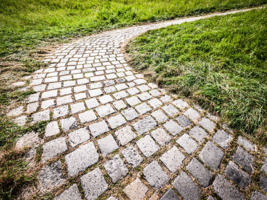
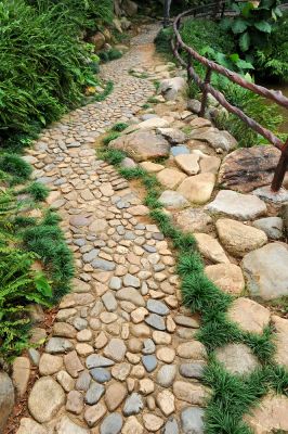
@ExtremeDevelopment
The cobblestone paths in your second pic have a curvy, organic look to them, but they're man-made paths. Since someone came along and laid those stones, they'd mostly be nearly straight, turn purposefully, or curve around naturally obstacles likes trees/rocks. Nice map though :)
@Sated
Your tunnel actually looks like a tunnel, which is hard given the perspective. I like it.
author=Luchino
@ED:That 2nd screen looks nice, but please ditch the sunbeam effect. Please.
Actually, many people on twitter said they loved the sunlight effect, so I might keep using it :P
author=Luchino
Started on a town. It's actually one of the hardest areas to map in an RPG.
No NPCs yet. Still busy with the sprite-work.
Looks good so far Luchi! But those boxes from the first screenshot are aligned in a weird way, and also what is a pool doing on the top of a wall?
author=Milennin
Thanks for the feedback. Gave the walls some depth at the top. Smoothened the shading on the angles a bit. Made the table slightly darker, but it's hard with the limited amount of browns I have, lol.
Yeah it somehow looks more appealing now
author=Ramshackin
@ExtremeDevelopment
The cobblestone paths in your second pic have a curvy, organic look to them, but they're man-made paths. Since someone came along and laid those stones, they'd mostly be nearly straight, turn purposefully, or curve around naturally obstacles likes trees/rocks. Nice map though :)
Actually it is not man made :P Thanks for the feedback
author=charblarCool, Reminds me of Metal Gear's codec!While I'm taking a break with Hanging On i've been helping out a friend brush up their project they submitted for IGMC and testing my hand at luna for the first time in depth.
Obligatory RPG castle....

@Dookie: I'll have a look at Tristian's sprite then. She is supposed to be a rigid character with a poker-straight stance though. But thanks for the example anyway. =)
@Ed: Well, boxes don't necessarily have to be neatly stacked on top of each other, now do they? And that 'pool' is a water reserve for the towns canals. Need to find some way of distributing fresh water, right? =)
@Ed: Well, boxes don't necessarily have to be neatly stacked on top of each other, now do they? And that 'pool' is a water reserve for the towns canals. Need to find some way of distributing fresh water, right? =)

