SCREENSHOT SURVIVAL 20XX
Posts
author=Sated
@Milennin:In the first one, I have a massive problem with the piano being on that raised platform. Because the piano is two tiles high, and the walls are two tiles high, but the piano is stood on a one tile high platform, it looks like the piano would be sticking through the roof of that room. I also think that it still feels empty. The bottom left seems like an entrance hall, but it's bigger than any of the actual rooms. Make the kitchen bigger, add a dining area, make the entrance area smaller. Entrances to houses usually aren't that big.
The piano would (nearly) touch the ceiling, but not actually stick through it. If it were up 1 tile higher, then it would be sticking through.
How would the kitchen be made bigger when it's already up against the entrance? Can't move it a tile up because then it would block the area to the piano (**** MV for not having square passage). Same for the dining area, how is it supposed to be bigger without obstructing the walking area?
author=Milennin
The piano would (nearly) touch the ceiling, but not actually stick through it. If it were up 1 tile higher, then it would be sticking through.
How would the kitchen be made bigger when it's already up against the entrance? Can't move it a tile up because then it would block the area to the piano (**** MV for not having square passage). Same for the dining area, how is it supposed to be bigger without obstructing the walking area?
Maybe make the map one or two tiles higher and one or two tiles wider; it really depends.
I personally feel that the space regarding the dining area might be less empty if the whole kitchen is shoved 1 tile to the left; but that might be my personal preference;
Maybe an example of how it might work, but I'm not entirely sure, (probably looks nicer with all the furniture and that half-roof thingy you did with the kitchen);

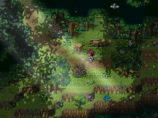
Also, regarding my own project; still trying to figure out the best way to make a forest with RPG Maker MV, without using the giant tree tiles. So I guess this is something for a start.
author=FroggeThanks, I'll go see what i can do about that. Also get ready this game, unlike it's past interpretation from 2010, is full of funnies.
@BM-Hate to admit this but, that actually made me laugh, but that open crack on the wall seems too repeatative, maybe use some different kinds of cracks?(Also why is that hole on the ground continuing on the wall?
I love your avatar, by the way!
The Hole on the ground continuing on the wall is because that how bad it's broken, is that actually a bad practice or was that something you just wanted to ask about?
I could easily change it just not sure if your saying it's a problem.
Alright, since it's a new page here's another one. This one actually inspired by one of RMN's taglines-- you know the one!

I need to go italicize that 'okay', though.
My self made pixel drawn tileset for 2000/2003 influenced by some known SNES game titles. Mainly the looping of the grass tiles are tested on this screenshot and some plants.
Tell me what you think.

Tell me what you think.

Those are nice grass tiles! The tiling is a bit obvious and jarring now, but once you get some more assets in there it should look very nice.
My only criticism is that the flowers could stand out a bit more. Perhaps make them brighter, or bigger, or animated maybe?
My only criticism is that the flowers could stand out a bit more. Perhaps make them brighter, or bigger, or animated maybe?
All right. I am drawing this one for a rainy day, hence the color palette, but will keep that in mind once I'm converting it to a bright version..
Just gonna drop this here

I've got to a point where I cannot improve on that parallax any more. (The spacey bit isn't mine.)

I've got to a point where I cannot improve on that parallax any more. (The spacey bit isn't mine.)
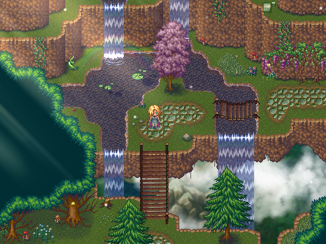
author=SkyrockerableThat's a nice lay-out, but I'm limited to 13 height maps since I aim to make this game only with maps that fit on one screen, without scrolling :(
Maybe make the map one or two tiles higher and one or two tiles wider; it really depends.
I personally feel that the space regarding the dining area might be less empty if the whole kitchen is shoved 1 tile to the left; but that might be my personal preference;
Maybe an example of how it might work, but I'm not entirely sure, (probably looks nicer with all the furniture and that half-roof thingy you did with the kitchen);
-image-
Also, regarding my own project; still trying to figure out the best way to make a forest with RPG Maker MV, without using the giant tree tiles. So I guess this is something for a start.
-image-
For your map, I would avoid letting the tree go over the dirt road, like it does in the top left corner. Rest looks nice. :)
author=Pyramid_HeadThe perspective looks strange since the tiles are completely topdown view, but the oval looks angled.
Just gonna drop this here
-image-
I've got to a point where I cannot improve on that parallax any more. (The spacey bit isn't mine.)
author=Luchino
@Blind: It's a nice map, but I think you're right about something. Going from your detailed mapping style in 2K3 and transitioning into MV while using the same high level of detail actually makes the map a little harsh on my eyes. Unless of course, you desaturate the tiles ( since MV's palette is blinding >< ). Then it could work. Or use a tint that drops the brightness.
Yeah, that's a good point. Looking back at that screenshot, I'm not sure what I was thinking. XD
One thing I can actually agree with Craze on, is there's a very fine line to walk in achieving an effectively detailed, or "ambient" map. Too many steps over the line (with clutter, overlays etc), and you risk distracting from the design itself, or the raw strength of the tiles.
Honestly, it's a trap a lot of newbies (or even experienced RMers) succumb to, when trying to overcompensate for an empty/lifeless game. Having a higher resolution only exacerbates the problem, unfortunately. A "less is more" approach is probably the best middle ground.
Ara Fell (2k3) versus AFXP, for example:
^^ Still highly detailed, but clearly there's more restraint and nuance in the HD screens.
I can see the evolution even in your own screens, too. XD (Not that the first screen is bad.)


I agree with luiishu about the cliffs and auto-shadow, but those are minor issues. The "sand tile" is a bit bland though, maybe the terrain could use more rocks, texture variance, etc?
Ex:
@Pyramid_Head:
Is that a platform, with the surface an image of deep space, or a portal? Or is it a screen or window?
Is that a platform, with the surface an image of deep space, or a portal? Or is it a screen or window?
@mil-way better
@sky-that's an awesome map, but i don't think the double bridge works that well.
@bm-''Alright, since it's a new page here's another one. This one actually inspired by one of RMN's taglines-- you know the one!'' you mean ''never have furniture on walls'' tagline?
@farkas-lookin good so far
@pyra- that's really a climatic map. i quite likes!
author=Kaempfer
@Pyramid_Head:
Is that a platform, with the surface an image of deep space, or a portal? Or is it a screen or window?
It's more a screen or window. It's a typical unexplained magic place thingy.


