


SCREENSHOT SURVIVAL 20XX
Posts
Red_Nova

Sir Redd of Novus: He who made Prayer of the Faithless that one time, and that was pretty dang rad! :D
9192
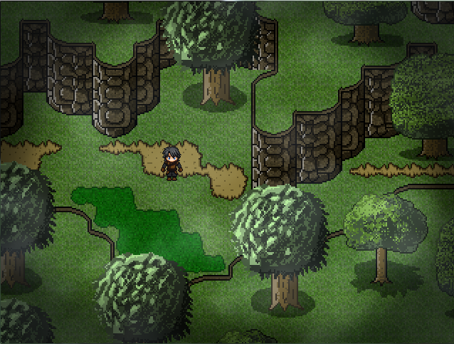
Working on tiles for the great outdoors. Here's a remake of an earlier map with a new style:
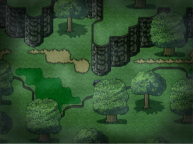
The RTP trees caused all sorts of proportion and perspective issues, so I scrapped them as well as the tree canopy in favor of something that looks a bit more natural and less... square.
I'm not the biggest fan of how the trees turned out, at least when it comes to the leaves. Anyone have any tips how how to make better looking trees? I'm gonna fill out the ground with more stuff that I haven't made yet.
For comparison's sake, here's the same map with the RTP tiles:
EDIT: Wow I just noticed how plastic those cliffs look compared to the rest of the woods. Gonna texture those really quick...
EDIT2: Done. Simple texture. Man, why do I only notice these things after I put them online? Sheesh...
The RTP trees caused all sorts of proportion and perspective issues, so I scrapped them as well as the tree canopy in favor of something that looks a bit more natural and less... square.
I'm not the biggest fan of how the trees turned out, at least when it comes to the leaves. Anyone have any tips how how to make better looking trees? I'm gonna fill out the ground with more stuff that I haven't made yet.
For comparison's sake, here's the same map with the RTP tiles:
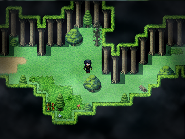
EDIT: Wow I just noticed how plastic those cliffs look compared to the rest of the woods. Gonna texture those really quick...
EDIT2: Done. Simple texture. Man, why do I only notice these things after I put them online? Sheesh...

@Red-Nova- Because you get into the mindset of everyone else looking at your work so you really start to notice flaws! :P
I do it too.
Your screenshot looks exceptionally better than the RTP. I can't comment specifically on anything about it because I like seeing people do their custom artwork and I'm proud for them so I don't really see anything wrong with it.
It has it's own style!
Also, those dark images are even harder to see against this white background! so it's probably very visible in game.
They should make the screenshot topic's background black so all images are easier to see!
I do it too.
Your screenshot looks exceptionally better than the RTP. I can't comment specifically on anything about it because I like seeing people do their custom artwork and I'm proud for them so I don't really see anything wrong with it.
It has it's own style!
author=FroggeWhat's funny about this is I wondered if it was something you couldn't fix and worked with it which is great. :Pauthor=InfectionFilesTy :) Tbh the flashing is a bug, I just decided to use it as a feature :D
I love the concept of this. I know there is going to be that moment where it's flashing when a monster is coming at you. Very nice idea!
Also, those dark images are even harder to see against this white background! so it's probably very visible in game.
They should make the screenshot topic's background black so all images are easier to see!


Thought I could show a WiP Titlescreen for something that I am working on right now. There is a bit of space left between the text and the options because I still need to add a drawing there. The major idea behind the game is that, yes, you play a deaf boy. This affects gameplay and limits the game in one certain, major way - you will not encounter a single sound effect in the entire game. I am looking for suggestions regarding the pink background colour and the text. Any ideas for improvement there?

This is Enfys, btw, also a WiP:
This is Enfys, btw, also a WiP:


I think your font choice is completely wrong, that's to sharp and jagged. Maybe something similar to Nord would work a lot better, I'm not a fan on the black bars either, I don't think it works here. As for the background, what about a really subtle bokeh texture?
I've got a couple titles and sample screens for two ideas in the pipeline. The first is for a Film Noir/Harvest Moon type thing I'm trying to figure out and the second is the planned sequel to aubade.


I've got a couple titles and sample screens for two ideas in the pipeline. The first is for a Film Noir/Harvest Moon type thing I'm trying to figure out and the second is the planned sequel to aubade.

@Schwer: I'd change the tagline to just the middle line: "The world is ending, but Enfys cannot hear it." I'd do this because the last line removes the subtext and the first line doesn't give enough information to point towards the hook.
@ESBY: Thank you for your input! This is a first mash-together thing that I did within ten minutes to get the basics down, but any type of input helps a lot! I wasn't sure about the font, either. I just know that the logo will stay that way and I wasn't able to find a font that I really liked to go with it. Nord looks pretty nice, though, I will definitely try that out! The tip for the background is also really nice. Do you have an idea what could work instead of those black boxes?
I like your first title a lot! The lamppost on the right side especially adds a lot of atmosphere to the whole thing. I'm not a fan of the 'open' and 'continue', though. I think it could work well if you made it into some sort of newspaper with those text brackets on there.
The second title screen looks really nice, colour-wise! Maybe you could put the 'Serenade' a little higher and add an underline. That way it takes up a little more of the picture as a whole.
@Housekeeping: Thanks, will do that! =)

ESBY, those screenshots look amazing. I'm assuming they are mobile games. What are you making them in?
I'm a big fan of film noir and hardboiled/mystery novels (Raymond Chandler is my favorite author) so the first one appeals to me quite a bit.
I'm a big fan of film noir and hardboiled/mystery novels (Raymond Chandler is my favorite author) so the first one appeals to me quite a bit.

Redid a little bit of the walk cycle animations and such. The grass won't be this weird color in the final product! There'll be a better contrast when I actually start making chipsets and producing maps.
Red_Nova
Sir Redd of Novus: He who made Prayer of the Faithless that one time, and that was pretty dang rad! :D
9192
author=InfectionFiles
@Red-Nova- Because you get into the mindset of everyone else looking at your work so you really start to notice flaws! :P
I do it too.
Heh yeah. I just wish I could notice those flaws before I post them online so I don't embarrass myself.
Your screenshot looks exceptionally better than the RTP. I can't comment specifically on anything about it because I like seeing people do their custom artwork and I'm proud for them so I don't really see anything wrong with it.
It has it's own style!
Thanks! It's a debate I've been having for the longest time since tiles might be one of the most painstaking assets to make (for me, at least). I'm not sure if it's surpassed the RTP in terms of quality, but I'm glad it's not causing any eyes to bleed. Though really, there's always something I can do better, so if there's something that bothers you, don't hesitate to speak up.
At the risk of sounding stuck up, this is a bit easier than I first thought. Thanks to Jo's tip a few pages back, I'm only working with half a tile, which means less pixels to mess with, which means tiles are that much easier to make.
author=CashmereCat
Yeah, Red, your tiles look super hot. That's a really beautiful tileset. Neat and simple.
Appreciate it!

@Red: I'm pleased to see how your custom stuff is turning out so far. I know making trees is a pain in the behind, but I can 'leave' you a hint. Draw individual leaves, then after making your tree 'skeleton', just paste them in a haphazard way until you get something you like. Then shade the leaves appropriately according to the light source.

It's how I made my trees. XD Not the best method, but it works for someone whose tablet was stolen. Actually, all my tiles are done with the mouse so--

I also did a B/W test to check the textures. One of those basic rules of pixel art is: If you can't recognise a texture in black and white/grayscale, you need to redo it.
Or you could follow this example:

Aka the long way, but ultimately better if you do have a tablet.
I may do a tutorial on how I create my pixel tiles later down the line.
It's how I made my trees. XD Not the best method, but it works for someone whose tablet was stolen. Actually, all my tiles are done with the mouse so--
I also did a B/W test to check the textures. One of those basic rules of pixel art is: If you can't recognise a texture in black and white/grayscale, you need to redo it.
Or you could follow this example:
Aka the long way, but ultimately better if you do have a tablet.
I may do a tutorial on how I create my pixel tiles later down the line.

Do the Hide-tagged version, instead of being lazy about it. Otherwise your trees will feel flat and boring or over-detailed and too similar (it depends on how much you do, really).
Might as well train yourself right from the start, after all. Shortcuts are for those who already know the way (else you end up places that are not where you should be.)
I highly recommend checking out games like Secret of Mana/Seiken Densetsu III/Terranigma/Chrono Trigger and other games from the snes. Here's a bunch of examples to look at:
Also, here are some great tutorials (the ones on the site are missing images thanks to imageshack, else I'd link ocean's ones too):
http://www.andysowards.com/blog/2012/80-epic-pixel-art-tutorials/
https://www.pinterest.com/pin/301459768776837861/
http://www.hongkiat.com/blog/pixel-art-tutorials/
Honestly, luchi, your trees aren't great examples. They're a far cry above what they used to be but they shouldn't be used as examples for new people to learn off - I've been hoping that you'd realise that and keep pushing your skills since they're far from perfect.
Please keep pushing luchino - you have a lot of promise that is being wasted by sitting pretty instead of being refined and getting better.
Might as well train yourself right from the start, after all. Shortcuts are for those who already know the way (else you end up places that are not where you should be.)
I highly recommend checking out games like Secret of Mana/Seiken Densetsu III/Terranigma/Chrono Trigger and other games from the snes. Here's a bunch of examples to look at:

Also, here are some great tutorials (the ones on the site are missing images thanks to imageshack, else I'd link ocean's ones too):
http://www.andysowards.com/blog/2012/80-epic-pixel-art-tutorials/
https://www.pinterest.com/pin/301459768776837861/
http://www.hongkiat.com/blog/pixel-art-tutorials/
Honestly, luchi, your trees aren't great examples. They're a far cry above what they used to be but they shouldn't be used as examples for new people to learn off - I've been hoping that you'd realise that and keep pushing your skills since they're far from perfect.
Please keep pushing luchino - you have a lot of promise that is being wasted by sitting pretty instead of being refined and getting better.
I am trying to push them. >< Okay, so it was a bad example, trees are awfully hard to get right.
Sorry Red/Libby. ;_;
Sorry Red/Libby. ;_;
Nah, it's good to be proud of your work, and yes, trees are hard to get right. It very much depends on the kind of style you're going for in graphics - is it simplistic? detailed? one-line? how many colours? how big?
Can be a lot harder to do them in comparison to buildings and the like. Just keep pushing and improving. ^.^)b
Can be a lot harder to do them in comparison to buildings and the like. Just keep pushing and improving. ^.^)b
Okay, so I took another stab at making trees ( maybe I should put this in the 'What are you working on thread' instead ).

Could maybe use a bit more detail, but it's better than the previous one, right?
Could maybe use a bit more detail, but it's better than the previous one, right?
Red_Nova
Sir Redd of Novus: He who made Prayer of the Faithless that one time, and that was pretty dang rad! :D
9192
You know, Luchi, I didn't see anything wrong with your old trees, but those new ones are great!
Thanks for the links, Liberty, though many of the tree tuts have been removed for some reason.
Okay, I gave it another shot using Luchi's hidden example. I like it better than the last couple of trees, mainly because I didn't channel Jackson Pollock for the leaves. Though I'm still not thrilled about the leaf shape. There's quite a bit of a jump between step 7 and 8 in Luchi's tutorial, so I'm sorta flailing around there:

