


SCREENSHOT SURVIVAL 20XX
Posts

Finally got around to making those clouds to occult parts of the map. They are supposed to stay there until a puzzle is solved.
http://recordit.co/Aq9aPzBqK2.gif
I basically resized and resampled some clouds from Zelda 3's world map. Does it look good? I promise the lag observed here is a gif artifact, it doesn't lag like that in game.
EDIT: Damn, the gif won't upload.
http://recordit.co/Aq9aPzBqK2.gif
I basically resized and resampled some clouds from Zelda 3's world map. Does it look good? I promise the lag observed here is a gif artifact, it doesn't lag like that in game.
EDIT: Damn, the gif won't upload.

Image is broked.
I've been world mapping.


Also, just a heads up Maps Weekly is up and running again if any of you are interested :]
I've been world mapping.
Also, just a heads up Maps Weekly is up and running again if any of you are interested :]

Both are so awesome. What tileset did you use in the first one btw?
Also for the second one there are too tiny errors with the trees.

Edit: Just spotted another one to the right of the little hill near the tower.
Edit 2: Spotted yet another one. This time it's next to the big mountain in the middle of the left batch. Or an easier way to describe it would be where the area below the tower ends at the left.
Edit 3: Apparently one of the errors I pointed isn't actually an error. It looked like an error to me from the rain. It's the one I labeled red at the top.
Also for the second one there are too tiny errors with the trees.
Edit: Just spotted another one to the right of the little hill near the tower.
Edit 2: Spotted yet another one. This time it's next to the big mountain in the middle of the left batch. Or an easier way to describe it would be where the area below the tower ends at the left.
Edit 3: Apparently one of the errors I pointed isn't actually an error. It looked like an error to me from the rain. It's the one I labeled red at the top.


@Gretgor: I just removed the image tags. At least this way people can click the link and see the image that way.

Yay, managed to upload! What do you guys think? Sorry for posting twice about the same thing, I was afraid the first post would be ignored due to the broken gif :\ (and the link is giving a 403 for whatever reason, so yeah :( )

@Esby: I really like both of those screenshots! I prefer the art style in the first one, but they're both great.
@Gretgor: That looks like a neat effect! But don't record your mouse in your gifs. I thought a ghost was in my computer for a second.
@Pizza: Sorry if it sounded like I meant that you should scrap the lighting in that screen entirely; I reread my post and I didn't really mention that I liked the way the image was shaping up. Strong lighting in select scenes can turn out really well, and I'm sure that it'll look great in situ as well as in still images. Although it's hard to discern from my poorly worded post, I more meant "strong shadows don't ever make sense so... do whatever looks best with no regard to logic, so long as you like it", not "so... don't use them!". And then I suggested subtly, even though I meant laziness, because the fewer effects you use here the fewer effects you'll need to use later in any similar scenes you might have. I always try to sneakily get people to limit their work loads so they actually complete promising projects. ;D

Damn Gretgor, that looks amazing! Props and kudos for simple yet mesmerizing
@ESBY- I like that second screen a lot
@ESBY- I like that second screen a lot
Yay! :D
Also, ESBY, those look amazing. The first one looks like an epic SNES RPG, and the second one looks like a pretty awesome RPG as well, but with a higher graphical quality than the SNES.
Also, ESBY, those look amazing. The first one looks like an epic SNES RPG, and the second one looks like a pretty awesome RPG as well, but with a higher graphical quality than the SNES.
@Gretgor
Lovely effect with the clouds! Not sure how I feel with the...green stuff under the trees. What is that?
@ESBY my goodness that's goooorgeous
Working on a cave tileset myself

Lovely effect with the clouds! Not sure how I feel with the...green stuff under the trees. What is that?
@ESBY my goodness that's goooorgeous
Working on a cave tileset myself

Kaempfer
@Pizza: Sorry if it sounded like I meant that you should scrap the lighting in that screen entirely; I reread my post and I didn't really mention that I liked the way the image was shaping up. Strong lighting in select scenes can turn out really well, and I'm sure that it'll look great in situ as well as in still images. Although it's hard to discern from my poorly worded post, I more meant "strong shadows don't ever make sense so... do whatever looks best with no regard to logic, so long as you like it", not "so... don't use them!". And then I suggested subtly, even though I meant laziness, because the fewer effects you use here the fewer effects you'll need to use later in any similar scenes you might have. I always try to sneakily get people to limit their work loads so they actually complete promising projects. ;D
Ah, I understand. Good talk then.
@Punkitt: It looks a lot cleaner than the grass tileset at first glance, although that's most likely because there's less going on. All I can say is watch out for those broken outlines again, and perhaps bump up the highlights on the rocks and stalagmites a bit?
I made a mockup of the HUD I plan to use

The top left shows the available characters, and the golden ring indicates the character that's currently being controlled. The golden leaves are kind of a "currency" that will have to be gathered in order to accomplish objectives, and the pigeon is a "kindness" meter which will be used to open new paths.
Any ideas, opinions, etcetera?
It seems a little large/distracting and hard to read against the backdrop. Perhaps go for something smaller, simpler, and more stand-out?
Threw together a little WIP to show my take on it, I guess:

Basically having the characters who aren't selected being circled by bright white rings (which are easier to see/more vibrant and dominant than the gold) confuses the issue of who the player has selected, especially when the characters are in full colour too. Having the whole body there also seems like a waste of space- since their sprite is already on the screen.
EDIT: The arrow on the gold also seems pretty redundant.
Which brings up why you want this as a part of UI, assuming the player can always see who they're playing as anyways. The character designs are visually distinct enough to not get confused. But if you want/need it in your UI then go for it I guess.
The icons for the leaves and doves are also too big for UI IMO. They look more like something you might see in a separate menu system, if at all. Making smaller sprites, maybe some along the lines of 16x16 or smaller, would be a huge space saver and make everything look cleaner/more professional.
Threw together a little WIP to show my take on it, I guess:
Basically having the characters who aren't selected being circled by bright white rings (which are easier to see/more vibrant and dominant than the gold) confuses the issue of who the player has selected, especially when the characters are in full colour too. Having the whole body there also seems like a waste of space- since their sprite is already on the screen.
EDIT: The arrow on the gold also seems pretty redundant.
Which brings up why you want this as a part of UI, assuming the player can always see who they're playing as anyways. The character designs are visually distinct enough to not get confused. But if you want/need it in your UI then go for it I guess.
The icons for the leaves and doves are also too big for UI IMO. They look more like something you might see in a separate menu system, if at all. Making smaller sprites, maybe some along the lines of 16x16 or smaller, would be a huge space saver and make everything look cleaner/more professional.
author=Pizza
It seems a little large/distracting and hard to read against the backdrop. Perhaps go for something smaller, simpler, and more stand-out?
Threw together a little WIP to show my take on it, I guess:
Basically having the characters who aren't selected being circled by bright white rings (which are easier to see/more vibrant and dominant than the gold) confuses the issue of who the player has selected, especially when the characters are in full colour too. Having the whole body there also seems like a waste of space- since their sprite is already on the screen.
EDIT: The arrow on the gold also seems pretty redundant.
Which brings up why you want this as a part of UI, assuming the player can always see who they're playing as anyways. The character designs are visually distinct enough to not get confused. But if you want/need it in your UI then go for it I guess.
The icons for the leaves and doves are also too big for UI IMO. They look more like something you might see in a separate menu system, if at all. Making smaller sprites, maybe some along the lines of 16x16 or smaller, would be a huge space saver and make everything look cleaner/more professional.
This looks beautiful. I think I'll be using something like this. Thank you! :D
I think that looks pretty good! I'd go with that, it's much cleaner and simpler.

Got some cave stuff going. Cleaned up the stalagmites and made the overworld sprites for a raccoon!
Got some cave stuff going. Cleaned up the stalagmites and made the overworld sprites for a raccoon!
Punkitt, the raccoon looks nice, and I'm liking the cave a lot.
Also, I think I need to clarify why I need the current character to be highlighted on the HUD: the thing is the characters are not always going to be walking around "caterpillar" style. There will be certain instances where they'll be able to "split" and move individually in order to solve certain puzzles.
Also, I think I need to clarify why I need the current character to be highlighted on the HUD: the thing is the characters are not always going to be walking around "caterpillar" style. There will be certain instances where they'll be able to "split" and move individually in order to solve certain puzzles.

The raccoon is cute, but the rest of the cave is pretty rigid.
Since you're already making custom tiles, make a corner piece at least, so its not jaggsville. This look is minimalist and cute but try to stylize it a bit more. : )
Edit: Here's an in game gif of the battle in motion. The gif make it look a little faster than it really is.

Since you're already making custom tiles, make a corner piece at least, so its not jaggsville. This look is minimalist and cute but try to stylize it a bit more. : )
Edit: Here's an in game gif of the battle in motion. The gif make it look a little faster than it really is.

That's faster than it actually is? I feel like it'd be painfully slow then... my only other issue is that the cheecks and upper body on the bunny look really beveled, more than just the style on the other two combatants.
otherwise, looks good =) i like the very somber palette.
oh, i guess this is just a suggestion but maybe try spreading the right out a bit more on the x axis? the immediate left/right icons and the ones behind those are maybe a bit too overlapped? it's not really an issue, just... i think it might look better if you try spreading them out a bit more.
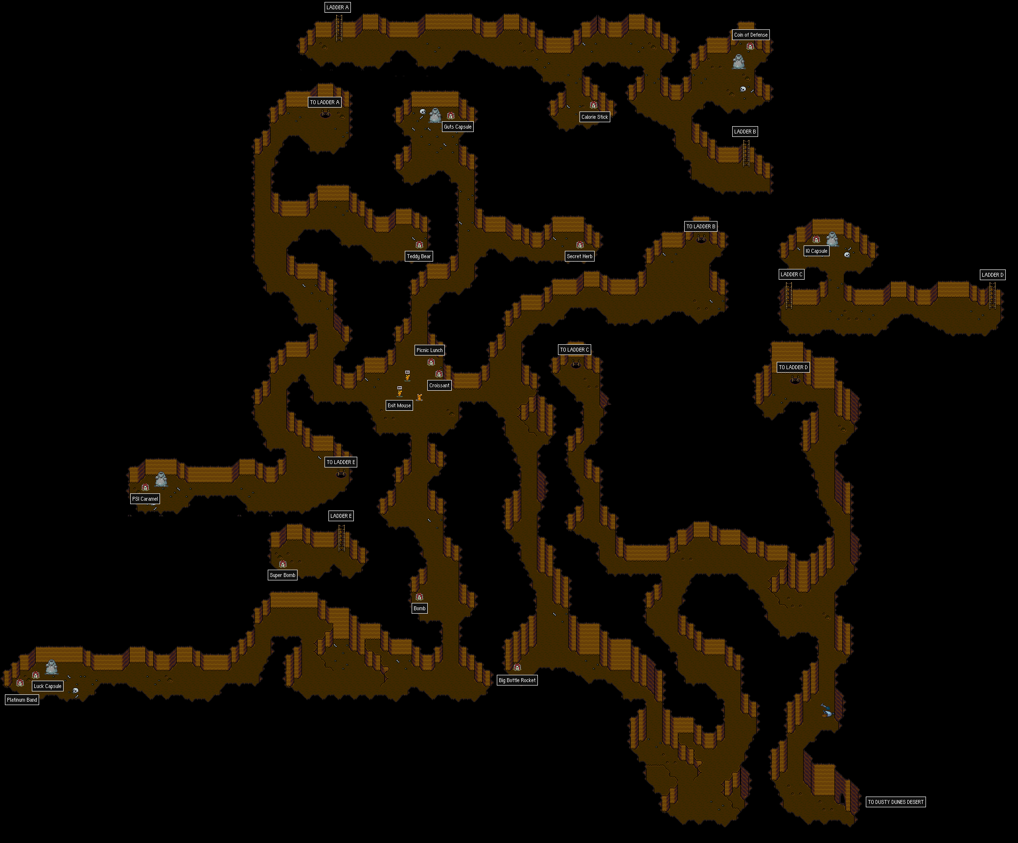
punkitt: http://walkthrough.starmen.net/earthbound/image/maps/goldmine.png
i suggest using the rule of three a bit to hack up your diagonal walls. also, maybe just make the cave a liiiitle tighter. i think it'd help a lot.
another random suggestion: try seeing what it looks like if you don't have the outline on the very bottom layer of the pebbles, stones, etc.? it might them look more organic, like they're a proper part of the ground.
otherwise, looks good =) i like the very somber palette.
oh, i guess this is just a suggestion but maybe try spreading the right out a bit more on the x axis? the immediate left/right icons and the ones behind those are maybe a bit too overlapped? it's not really an issue, just... i think it might look better if you try spreading them out a bit more.
punkitt: http://walkthrough.starmen.net/earthbound/image/maps/goldmine.png
i suggest using the rule of three a bit to hack up your diagonal walls. also, maybe just make the cave a liiiitle tighter. i think it'd help a lot.
another random suggestion: try seeing what it looks like if you don't have the outline on the very bottom layer of the pebbles, stones, etc.? it might them look more organic, like they're a proper part of the ground.

