


SCREENSHOT SURVIVAL 20XX
Posts

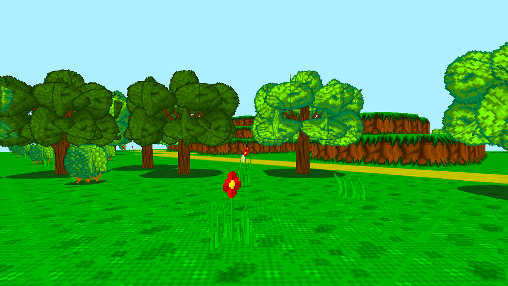
Been working on making my chunks look a little more detailed and varied.
Added in flowers, a different shade of tree, winding pathways, and repixelated the tree chunks
https://www.facebook.com/grimoireofworlds/


Added some sand detail, driftwood and cliffs to the beach areas after failing to do the original water effect that I wanted. Going to go with a simpler look now, but haven't added the water yet. Are the sand dunes apparent enough?
Also, bumped up the resolution from 640x416 to 640x480. This scene was the first time I ran into problems with the squished screen size, as you couldn't see the water area properly.
Thanks for the advice! I made it a lot better a few days ago. I'll post a screen is when I get home.
Looks good, Pizza! However, I'd make the sand a little bit lighter. The dunes them selves are a little hard to tell what they are at first glance, at least the single-dune ones.
EDIT: Here we go! Corner piece isn't done yet but the cave layout itself is getting better.

(Ignore the EB placeholder graphics!)
Also, hey, have some more battlescreens too.
Looks good, Pizza! However, I'd make the sand a little bit lighter. The dunes them selves are a little hard to tell what they are at first glance, at least the single-dune ones.
EDIT: Here we go! Corner piece isn't done yet but the cave layout itself is getting better.
(Ignore the EB placeholder graphics!)
Also, hey, have some more battlescreens too.


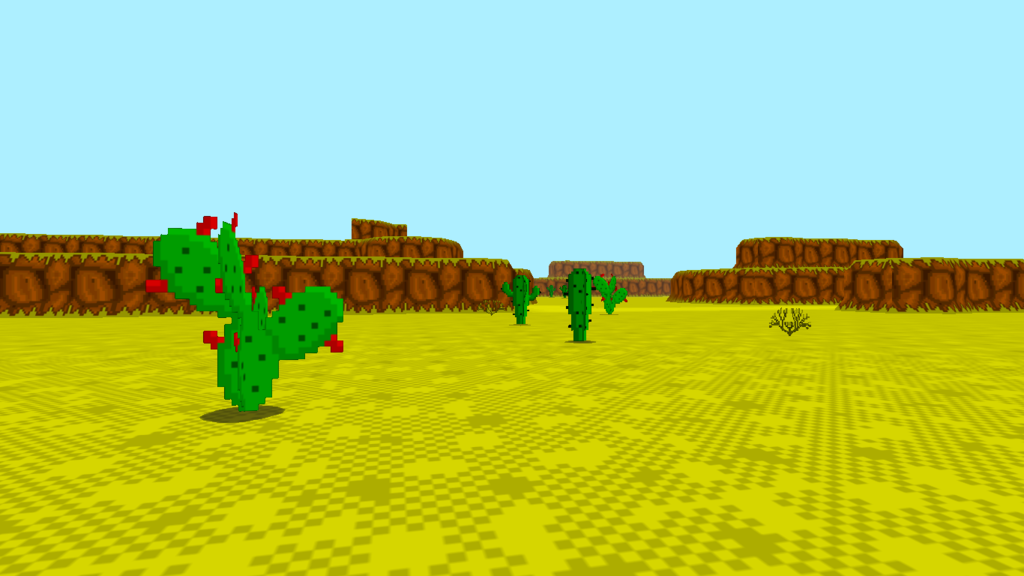
Still working on biomes at the moment.
Got the desert biome finished. changed the cactus from a 3D model to a quad. It fits in with the style better that way.
And dont be shy guys, go and like my page ;)
https://www.facebook.com/grimoireofworlds/

@Sated: The layout is good, though there may be too many 'straight diagnals'. =) But still, its better than what I could achieve. I find mapping hills and mountains a pain, mainly due to elevation issues.
More Tristian stuff:
[


The detailed pixel-art style is getting to me. ;_;
More Tristian stuff:
[
The detailed pixel-art style is getting to me. ;_;
Some new shots from Shadows of Adam. Trying to get funded on Kickstarter, but in the mean time we are approaching a near finished Alpha Build.


@Luchino: The first screen look great. But why is the tall grass so vibrant when every other color is not? It doesn't look bad per se, but it stands out a bit too much. ...Overall your textures are a tad busy. And sometimes the lines are too pronounced, giving things a cartoony look; like those columns in the third screen. Try to be more subtle with that kind of details.
@Erave: Sick pixels, man. Nuff said. And I love the colors too. It's nice to see a palette the favors more cold colors for a change.
@Erave: Sick pixels, man. Nuff said. And I love the colors too. It's nice to see a palette the favors more cold colors for a change.
author=alterego
@Erave: Sick pixels, man. Nuff said. And I love the colors too. It's nice to see a palette the favors more cold colors for a change.
Thanks I'll relay that to our artist. I just write music and make forum posts :P

Made this mostly on Tuesday! It will replace the current Ara Fell crafting menu which is just a text box.

@Luchino- Agreed with alterego about the bright tall grass.

Trying to get away from photoshoppy/blurry looking lighting effects and do more on the actual map itself I stead of an overlay, think I'm liking the results so far..


farting around with making my own animated battlebacks
this one's in the first area, Echo Laboratories
(sorry for quick gif resolution)
author=alterego
@Luchino:The first screen look great. But why is the tall grass so vibrant when every other color is not? It doesn't look bad per se, but it stands out a bit too much. ...
Yeah, my immediate thought was "why is that grass neon-colored?" You can still have it be bright without being searing yellow


@Dookie, the new lighting looks good. Especially the first screen. Will you be able to give the candles a flicker with this technique though?
@alterego: I do have a habit of going into too much detail when doing pixel art. >< I suppose less is more in this discipline.

This should be a bit better.
This should be a bit better.
@Erave
Oh man, those look absolutely fantastic! Everything I've seen of this game has been completely wonderful.
In the first pic, though, the overworld one, the water looks really...muddled. Perhaps pick a slightly brighter shade for it?
@charblar
Oh, wow, that's some interesting work! It's a little tough to grasp just watching the video, personally, but I think it looks pretty cool.
@Dookie
I always love your art! It's a nice, sort-of-cartoony style that has a lot of detail in it. The lighting looks fantastic.
@Versalia
Interesting concept, but those monsters are far too small on the screen! Make them occupy it more to get rid of all that weird blank space.
On my end I've been giving enemies "expressions" of sorts. When fighting them, enemies have idle moves or moves that let them regain a small amount of SP when used. These use special animations made just for them! For example, this bee or this snail:


The Snarlsnail's sweat animation is a little hard to see at this size, but it's much easier to see when playing. Plus, it comes with a neat little gross sound effect! (The purple flash has been extended a little since the time I made the .gif.)
Oh man, those look absolutely fantastic! Everything I've seen of this game has been completely wonderful.
In the first pic, though, the overworld one, the water looks really...muddled. Perhaps pick a slightly brighter shade for it?
@charblar
Oh, wow, that's some interesting work! It's a little tough to grasp just watching the video, personally, but I think it looks pretty cool.
@Dookie
I always love your art! It's a nice, sort-of-cartoony style that has a lot of detail in it. The lighting looks fantastic.
@Versalia
Interesting concept, but those monsters are far too small on the screen! Make them occupy it more to get rid of all that weird blank space.
On my end I've been giving enemies "expressions" of sorts. When fighting them, enemies have idle moves or moves that let them regain a small amount of SP when used. These use special animations made just for them! For example, this bee or this snail:
The Snarlsnail's sweat animation is a little hard to see at this size, but it's much easier to see when playing. Plus, it comes with a neat little gross sound effect! (The purple flash has been extended a little since the time I made the .gif.)
It's not a UI mockup, it's just the battleback animation~
Luchino, that looks much nicer!
Punkitt, for visibility why not make the bee's sweat animation a different color? Currently it's yellow like... everything it overlaps with! Make it very bright white with a thin black border around it? Alternatively, if it's "anger sweat," try making it bright red. A little color contrast will help and is clearly not something you're afraid of ;)
Oh, the bee isn't sweating! The snail is. The yellow lines are supposed to connotate talking or making noise. A neat little buzzing noise accompanies the move!
@Dookie: Whoa! That looks awesome. I get what you say about the lighting effects overlays. It's more of a convenience thing. But if you're putting this amount of work into "painting" every map already, it really pays off going the extra mile. Good job!
@Versalia: Animated battle backgrounds are always a plus. But the maps seems a bit bare. Are you still going to add more details to it? If not, making the enemies bigger may also help with that... Besides that, it looks fine. Perhaps the glow from the lights is too visible? If it was dark I would understand their radius to be that wide, but since it's not, it looks odd.
@Punkitt: Following up on Versalia's observation. Maybe make the "sweat" blue? Unless that animation and that background are not exclusive to the Bee enemy, in which case it stands to reason that unfortunate combinations are bound to happen. Other than that, I really like the style of your battles. Are you making an Earthbound fan game perhaps?
There's some real talent on this page alone!

