SCREENSHOT SURVIVAL 20XX
Posts
@Darken
Ugh! Those are gorgeous. Excellent work. I love the style mixing you have in the first set and the cleanliness of the second set.
@Frogge
I like the idea here, but everything looks very...flat. I get no sense of depth. If you included some dirt drifting down from that cliff to signify it was high up, or if you had a shadow beneath, that'd work.
@Dookie
Fantastic as always. I love your style. Those enemies are really cute!
@Chilly-Pheese-Steak
Your animations are wonderful! This is shaping up to be really promising! I'm assuming the enemy in the first .gif will react from damage, correct? For now it doesn't seem to have much of an impact without a reaction!


Working on some new backgrounds. Also, thanks Darken!
Ugh! Those are gorgeous. Excellent work. I love the style mixing you have in the first set and the cleanliness of the second set.
@Frogge
I like the idea here, but everything looks very...flat. I get no sense of depth. If you included some dirt drifting down from that cliff to signify it was high up, or if you had a shadow beneath, that'd work.
@Dookie
Fantastic as always. I love your style. Those enemies are really cute!
@Chilly-Pheese-Steak
Your animations are wonderful! This is shaping up to be really promising! I'm assuming the enemy in the first .gif will react from damage, correct? For now it doesn't seem to have much of an impact without a reaction!
Working on some new backgrounds. Also, thanks Darken!

@Dookie:
Ah, that second link worked. Really great animations, I'd play the heck out of that! I think Dustin's sword could use some colour, though. Walker (heh) has some really nice contrast between his kerchief and coat and shadowy non-body, but Dustin is much more monochromatic. I think that works great as his overworld sprite, but in battle, with the sword added, it's a little too much grey. I don't know how your sprites are handled and maybe it'd be a bonkers amount of work to change it (and maybe his sword changes with equipment?), but I think some rust or something on the blade would give him lots of great contrast.
Ah, that second link worked. Really great animations, I'd play the heck out of that! I think Dustin's sword could use some colour, though. Walker (heh) has some really nice contrast between his kerchief and coat and shadowy non-body, but Dustin is much more monochromatic. I think that works great as his overworld sprite, but in battle, with the sword added, it's a little too much grey. I don't know how your sprites are handled and maybe it'd be a bonkers amount of work to change it (and maybe his sword changes with equipment?), but I think some rust or something on the blade would give him lots of great contrast.

author=Kaempfer
@Dookie:
Ah, that second link worked. Really great animations, I'd play the heck out of that! I think Dustin's sword could use some colour, though. Walker (heh) has some really nice contrast between his kerchief and coat and shadowy non-body, but Dustin is much more monochromatic. I think that works great as his overworld sprite, but in battle, with the sword added, it's a little too much grey. I don't know how your sprites are handled and maybe it'd be a bonkers amount of work to change it (and maybe his sword changes with equipment?), but I think some rust or something on the blade would give him lots of great contrast.
My vote is purple lichen.
But seriously, not bad advice. My only worry would be that it makes it more noticeable when Dustin does a Lid Toss and the sword quickly disappears and reappears.

@Darken: I absolutely love how that game boy section looks!


author=Punkitt
@Chilly-Pheese-Steak
Your animations are wonderful! This is shaping up to be really promising! I'm assuming the enemy in the first .gif will react from damage, correct? For now it doesn't seem to have much of an impact without a reaction!
It does move but the animation is very subtle. But I see what you mean, it only plays for a few frames between hits which looks weird. I'll fix that ASAP.

I need to start posting here more. I love how everyone is starting to use custom graphics on their own ( and good stuff at that ).
Btw, does anyone know why ESBY was banned?
Btw, does anyone know why ESBY was banned?

@Punkitt: Those backgrounds are really beautiful. Very impressive for 2k3.

Hey, can I get some opinions here? Which one of these message options is the most readable/looks best?
Hey, can I get some opinions here? Which one of these message options is the most readable/looks best?

I think all of them are more than easy enough to read. I do like the color of C though.


I like C and D, and all are easy to read for me, Pizza.
I'm partial to the darker shade
I'm partial to the darker shade

I kind of like A because you can see the text shadow, but it might depend on how busy the stuff behind the text box is. The anti-aliasing in the text kind of ruins all of them for me though since the rest of the art is so crisp. :-/
As far as I know there's not a whole lot I can do about the AA, especially not at this stage since a lot of stuff is based around that font at that size. Truth be told it's not something I'm super worried about myself, even though it could be more ideal.
C seems to be the universal favourite from the feedback here and elsewhere. Thanks everyone.
C seems to be the universal favourite from the feedback here and elsewhere. Thanks everyone.

I prefer C, Pizza. It seems the easiest to read. And your spritework is absolutely stunning as always, Luchino! :-) Nobody on this website ever fails to impress me (and make me feel so unskilled in comparison!)
I've gotten a lot of work done recently, which means I have no screenshots to show off:


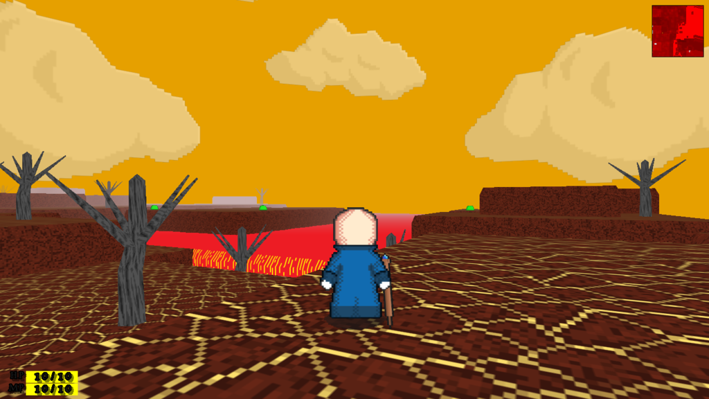
I appreciate any feedback. Also, I'd like some opinion on the cloud overlay: do you guys prefer them to have a slightly greenish tint, as in the first screenshot, or to have the reddish tint as seen in the last two screenshots? I can't decide. I'm going for a spooky and somber vibe to this map. One of the most important aspects to all of my maps is its atmosphere.
I've gotten a lot of work done recently, which means I have no screenshots to show off:
I appreciate any feedback. Also, I'd like some opinion on the cloud overlay: do you guys prefer them to have a slightly greenish tint, as in the first screenshot, or to have the reddish tint as seen in the last two screenshots? I can't decide. I'm going for a spooky and somber vibe to this map. One of the most important aspects to all of my maps is its atmosphere.