


SCREENSHOT SURVIVAL 20XX
Posts

@Toaster_Team: I dunno, I'm not seeing an appreciable difference in texture or colour on the road since all ground tiles/textures use two colours max for their repeating sections.
Regardless, there'll be some additional stuff thrown in later to vary up the larger repeating sections and the edges, like missing/smaller cobbles and grass/dirt patches.
Regardless, there'll be some additional stuff thrown in later to vary up the larger repeating sections and the edges, like missing/smaller cobbles and grass/dirt patches.

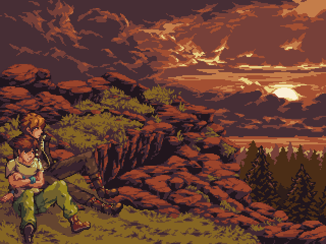
Finished the final variation of BR's title screen. Pretty exciting! We got it pretty crazy close to the concept art.


Oh. muh. gawd. BlindMind, calm down!

I'm just, uh, saving that post for the next POTM. We can work with no game page... though a 320x240 version would be nice for that if you have one? >.>

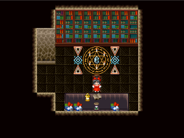
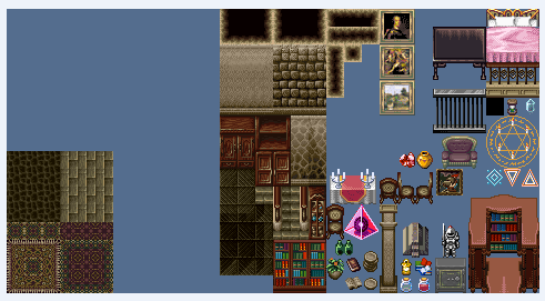
A very barebones part of the dungeon. This is to the left of the library area (the 6 pillars were removed, and now is just a magic circle that'll teleport the player into the main dungeon itself). Can you guess what the solution to the puzzle is??
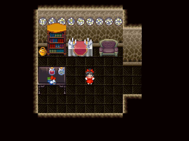
Meanwhile, the right side of the library. I...don't know what I'm going to do with this room at all. I haven't decided if the special treasures should be in the teleporter area itself, or if you need to unlock the seals within the teleporter area in order to unlock the doors within the main mansion itself to get the treasures or what. Suggestions?
author=Pizza
You gotta submit that to your gamepage so it can be Picture of the Moment.
post it on pixeljoint and be on the hall of fame forever
forever
I have no idea what to suggest regarding the treasure thing Xenomic but those maps look pretty sweet!
The only problems are the ceiling tiles whose corners are missing, and the face the books look a bit patterned on the second screen. Try mixing them up a little bit!
Yeah, not sure why the tiles are missing like that. I might be using the wrong ceiling tiles or missing a tile or something. As for the books, I'm assuming you're talking about the bookshelves? Thinking on it, I guess I could use the middle tiles to better extent. I know I did elsewhere, so don't know why I didn't think of that. Huh.
quick fix: paste either of these into your chipset, replacing the current ceiling autotile, and it should work.
one of this is incorrect bc i dont remember the right format, but i think the first one is the right one.


one of this is incorrect bc i dont remember the right format, but i think the first one is the right one.
Hey, thread. I'm trying out some vignette effects for "dark" and night-time areas of the game. All I have to work with is a single vignette size value (so I can't change the width or sharpness of the effect), so I have a few different samples of how it looks in-game.
Warning: Here be dragons and also a gigantic PNG file:
Top image is 0 vignette.
Middle image is level 6 vignette.
Bottom image is level 10 vignette.
I'm leaning toward 6 or maybe 8 at the moment, but that could be because my monitor is bright, so I want to solicit feedback first! I can also provide an example in motion if needed.
Thanks in advance!
Warning: Here be dragons and also a gigantic PNG file:

Top image is 0 vignette.
Middle image is level 6 vignette.
Bottom image is level 10 vignette.
I'm leaning toward 6 or maybe 8 at the moment, but that could be because my monitor is bright, so I want to solicit feedback first! I can also provide an example in motion if needed.
Thanks in advance!

I love them all, but middle looks the most sencial and atmospheric to me :)
I feel like an 8 might be best, at least on my monitor. 6 and 10 are just a little too much to either side.
yeah i'd say between 6 and 8 too! nice, nonetheless.
and i'd recommend smaller thumbs when you want us to judge whole screens like that, probably around 700px width which is the rmn post width i think (so we don't have to scroll. or just link instead of using img tags)
and i'd recommend smaller thumbs when you want us to judge whole screens like that, probably around 700px width which is the rmn post width i think (so we don't have to scroll. or just link instead of using img tags)
Thanks y'all! Yeah, sorry about the size - I always forget what the max width is here, and the engine is spitting out at 720p, so I didn't size them down to keep things from blurring.
I'd actually say a 3/4 because then I can actually see the nice details of the fore- and back-ground better. Covering that up for the sake of 'dark' kinda defeats the purpose of it even existing. You could just remove it and have a black square instead in that case.
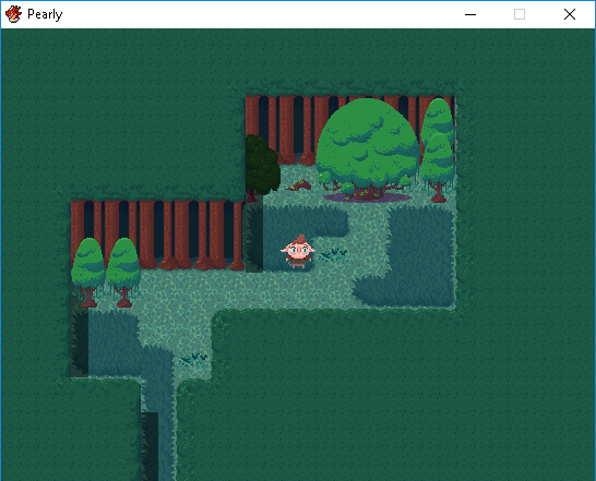
Here's a super rough draft for one of my maps. I'm very new to RPG Maker, but once I learned how "easy" it is to create tilesets and being an illustrator myself, I had to do this.
I don't know if this style will ever appeal to anyone, but I'm having a lot of fun with it.
Thanks for lookin'!
I don't know if this style will ever appeal to anyone, but I'm having a lot of fun with it.
Thanks for lookin'!
@JosephSeraph: Hm...I don't think it's an auto-tile, since I have to manually select each part.
The ceiling tiles are weird in that regards. Most of the other ceiling tiles I've never had to do manually like that. Would it go to the left of the current wall tile in the blank space??
The ceiling tiles are weird in that regards. Most of the other ceiling tiles I've never had to do manually like that. Would it go to the left of the current wall tile in the blank space??

