SCREENSHOT SURVIVAL 20XX
Posts
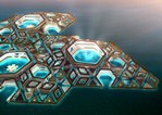
dethmetal: that looks pretty nice with one possible exception - is that lake meant to be a cultivated area where plants/trees have been intentionally planted by a gardener or forester in particular spots? The current pattern looks var to uniform to be the result of nature - it looks like an intentionally planned scenic area - now if it's owned by a wealthy family/king or something that would make sense, if it's an area out in the wilds miles from civilisation it should be messier.
BadLuck: I don't like the font but meh; other than that I definitely see your point on too dark, if it's meant to be a night scene it's probably ok - I probably wouldn't have the whole game like this would take a lot of effort for someone to keep paying attention.
BadLuck: I don't like the font but meh; other than that I definitely see your point on too dark, if it's meant to be a night scene it's probably ok - I probably wouldn't have the whole game like this would take a lot of effort for someone to keep paying attention.
author=Red_Nova
karins_soulkeeper: I like that equip scene. Is there a reason for the blank space in the upper left quarter of the screen? If not, then perhaps extend the equip items list at the bottom left to cover the screen? Better yet, consider rearranging the layout so that the equip slots on the bottom right are actually on the left. I think players would like to select the equip slot they want to change first before choosing what to equip in that slot.
Surprisingly few players I've shown PotF to noticed the turn icons on the upper right, so I added a white outline to make them pop out more. How does this layout look?

The layout looks fine, altho a bit hectic. But I get the idea that, that's what you're going for. I'm liking the screen otherwise too. I've been working with similar imagery lately, you know, blood, gore, iron maiden and mutated grotesques - so it's fun seeing others' works alike. I like the idea of Iron Maiden mimic-like monster. I might just copycat that a little bit if you don't mind :P

author=Rhuan
dethmetal:
BadLuck: I don't like the font but meh; other than that I definitely see your point on too dark, if it's meant to be a night scene it's probably ok - I probably wouldn't have the whole game like this would take a lot of effort for someone to keep paying attention.
Yeah, it'll only be this dark in a few scenes where a really bright object (like the moon) is behind you. It's tough to mess with because in RM2k3, you can't make the screen tone only affect tiles/sprites/etc and ignore the panorama, so I have to color everything by hand to get this effect.


@BadLuck Looking good to me!
@dethmetal my lord those are some well done maps, look forward to trying your game out!
@orange Extraordinary pixel art in my eyes! Wait a second...
No but seriously I'm loving that style! Is there a game page up for it?
@dethmetal my lord those are some well done maps, look forward to trying your game out!
@orange Extraordinary pixel art in my eyes! Wait a second...
No but seriously I'm loving that style! Is there a game page up for it?
haha, thanks man! :D
The game page is not up yet. I didn't want to rush it because 100% of my projects die before they become anything. But I've seen enough effort into this project to say I'm not just gonna abandon it - so gonna make the game page soon enough.
The game page is not up yet. I didn't want to rush it because 100% of my projects die before they become anything. But I've seen enough effort into this project to say I'm not just gonna abandon it - so gonna make the game page soon enough.

author=Rhuan
dethmetal: that looks pretty nice with one possible exception - is that lake meant to be a cultivated area where plants/trees have been intentionally planted by a gardener or forester in particular spots? The current pattern looks var to uniform to be the result of nature - it looks like an intentionally planned scenic area - now if it's owned by a wealthy family/king or something that would make sense, if it's an area out in the wilds miles from civilisation it should be messier.
It's supposed to be completely natural, so I'll try to make it look a bit more random. Thanks!
author=Max McGee
not technically a screenshot, but I just got some sweet Iron Gaia fanart:
ps nice christmas map gourd

Damn, stumbling upon this in my unsystematic archive binge was really cool. I can't definitely prove that the TVTropes page I made for it 2 years ago + some promotion on Quora was responsible for the ~26 downloads a month it's been getting for the past year or so, and thus, indirectly, for this...but considering this was the game that got me to stay around on RMN, I'll "put myself in the narrative" just this one time.

@orange-: Looks dark and grimm, not in a bad way though. Pretty impressive Pixelart there.
@topic:
Made character portraits for my main cast and added them as well as some particle effects to my title screen:
@topic:
Made character portraits for my main cast and added them as well as some particle effects to my title screen:

More Shadows of Adam (www.shadowsofadam.com). Finally releasing next month after 3 long years of development time!
Here's some fun character battle montages in gif form.


Here's some fun character battle montages in gif form.

Updating a good chunk of Soma Spirits' visuals for the new version. The first area is getting a big facelift, especially.
Here's some Old and New:


Here's some Old and New:


author=Ramshackin
New version definitely looks better, especially the simplified background.
Agreed, lets the enemies stand out more and take the forefront.
@Lihinel, that's really awesome title screen idea you got there. Love the portraits appearing n disappearing.
@Archeia_Nessiah, that's nice to hear! ^^ I don't have anything like that yet. But I promise I'll make a game page here at least. I might make something else later on too. The thing is, I hate to make anything "official" and advertise my works, because I got such a bad track record of getting anything done. That said, I do have a good feeling about this project.
@Erave, that's looking godly! I really need to give that a try!
@SgtMettool, I agree with what's said, the background has seen great improvement! Enemies look better too, but the jump isn't as big as with the BG.

Man I missed this thread

WIP of an early game dungeon. This is only the main entrance and it will most likely be a lot larger when it's done.
WIP of an early game dungeon. This is only the main entrance and it will most likely be a lot larger when it's done.