


SCREENSHOT SURVIVAL 20XX
Posts

This isn't really a screenshot (sorry) but I need opinions on this.
For a main menu, what do you prefer? Stroked text or shadowed text?

I was leaning to stroked at first, but shadowed text might be easier on the eyes. But maybe that looks too similar to the default menu text. Idk.
For a main menu, what do you prefer? Stroked text or shadowed text?
I was leaning to stroked at first, but shadowed text might be easier on the eyes. But maybe that looks too similar to the default menu text. Idk.

author=Sidewinder
@Ramshackin
That looks great. I really like the little bits of machinery here and there.
Thanks :)
author=Frogge
My only miner (hehe) complaint is that some of the bridge supports have water at the bottom.
Wow this whole time I thought it was metal plating at the bottom...


author=JustRob
This isn't really a screenshot (sorry) but I need opinions on this.
For a main menu, what do you prefer? Stroked text or shadowed text?
I was leaning to stroked at first, but shadowed text might be easier on the eyes. But maybe that looks too similar to the default menu text. Idk.
ABS- Always be shadowing

What's "stroked"? Like, outlined? I always prefer shadowed over outlined unless it intentionally wants to look clunky (some cute mother-inspired games do it and it looks wonderful etc)

Any thoughts on the design / layout? Tried to keep the basic look of the default menu but spicing it up a bit with icons and spacing. Thinking about adding icons in front of every menu option as well

@JustRob: Maybe align the money and time window with the rest? Not to sure if that would imporove the look or make it worse though so maybe just play around with it and see how it turns out.
@Topic:
Decided to finally use the MV for more than generating Facesets for my main project and also lern Javascript.
For this purpose I opted to creade a remake of an old project I originally did to get familiar with the VXAce and RGSS3.
This time I want to use 100% legal resources instead of bad midi sounds and images taken from google searches. (Yeah, I know its bad, but back in the day I came from a community that mainly used Rips and other Copyrighted material, so I didn't really care about that.)
The Titlescreen is done. (Took me like 2 hours to figure out the basics of the plugin system and how to display a sprite. The rest didn't take nearly as long, though I still kinda hate the whole .addChild() instead of .z functionality, if anyone knows a different way to simulate a z index/priority for sprites, please let me know.)


@Blind
Makes me wonder about the point of having charset poses if the portrait poses are doing the job just fine. It might make sense for action sequences, but minor facial expressions on characters while a more detailed expression is shown at the same time feels a bit redundant.
I guess I'm not critiquing it so much as wondering the possible justification for it.


I think it's nice to have both since a static sprite with emotion portraits can still be pretty boring to look at, especially if you only have a limited number of portraits.


I'm currently working on porting a box2d-js (the Box2D physics library ported to JavaScript) version to miniSphere (a modern descendant of the Sphere game engine).
It's definitely not done, but it sorta kinda works. As a demonstration, I'm eventually going to create a game similar to Slime Volleyball, but with catapults.

It's definitely not done, but it sorta kinda works. As a demonstration, I'm eventually going to create a game similar to Slime Volleyball, but with catapults.

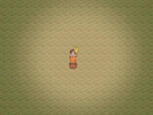
When she walks left, the fire looks like it's too far "back", and the fire sprite probably shouldn't appear in front of her hair.

Well, the last part I don't know how to fix. It's an event on top of the hero that copies his movements, but there's always a delay, which is what you identified.
:/
:/

Make the left facing sprite for that event a few pixels further to the left to compensate? For the up facing sprite just delete the right half of it. Should be clean enough.

