


SCREENSHOT SURVIVAL 20XX
Posts

@Frogge:
You helped me a lot! I will show you my update here. Its not 100% done, but I think it is the right direction.
@grindalf: What exactly, then i can work on it :)
@BillyX and Kaempfer: Thx for your advice, I will try to figure it out.
Updated Screen:
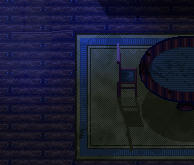
I made something new! A foggy bathroom:

@Momeka: Really like the visual style. I would gladly buy it! :)

It's a step up for sure! I'm glad to have been of help.


Very smooth! I'd be lying if I said the first place my eyes went weren't those gorgeous chunky cliff edges, though.
By the way, the underwater grass and bushes doesn't really make sense. Would look better if that grass area was replaced with small rocks/twigs/forest debris. Your call though.
By the way, the underwater grass and bushes doesn't really make sense. Would look better if that grass area was replaced with small rocks/twigs/forest debris. Your call though.
I actually agree with Roden, grass underwater feels a bit weird to me unless this area only got flooded like a day ago.

@circledrain
The chair shadows are turned they should be the exact same angle but skewed
a bit like this
The chair shadows are turned they should be the exact same angle but skewed
a bit like this

Working on a platformer in Pixel Game Maker.

I'm calling this game Awesome Andy.
So far it's coming out pretty good.
I'm not sure about the hills though, should I reshape them in the background?
(sorry, the screen shot is huge and i forgot how to use spoilers)
I'm calling this game Awesome Andy.
So far it's coming out pretty good.
I'm not sure about the hills though, should I reshape them in the background?
(sorry, the screen shot is huge and i forgot how to use spoilers)
I think the hills look fine, but ensure about the trees. The perspective for the top half looks completely off, like it's supposed to be for an rpg maker view game rather than a platformer
LockeZ

I'd really like to get rid of LockeZ. His play style is way too unpredictable. He's always like this too. If he ran a country, he'd just kill and imprison people at random until crime stopped.
5958
Well just in terms of the shape, they don't really look like hills. They look like... giant sand nipples.


author=LockeZmmmmm, giant sand nipples. *insert homer drooling gif*
Well just in terms of the shape, they don't really look like hills. They look like... giant sand nipples.
I chock that up to stylizing.. it's a whimsical game.. i'm not trying to get it to look like real life lol
But i do appreciate the feedback on the trees.. it's something I noticed, but I kept thinking the perspective would be okay.
But i do appreciate the feedback on the trees.. it's something I noticed, but I kept thinking the perspective would be okay.
@Markus- Sorry, I wasn't trying to make a comment on your work, just couldn't pass up a dumb joke. The screen actually looks great to me and I don't think the hills look weird at all.
I'm not offended. It's fine.
I mean, yeah they are kinda funny looking.. but i'm not exactly shooting for realism.
Also, it seems you replied to a comment I can't see.. sorry for the mix up..
I mean, yeah they are kinda funny looking.. but i'm not exactly shooting for realism.
Also, it seems you replied to a comment I can't see.. sorry for the mix up..
Trees look good now, and I think the sand tiddies are fine personally

I have a custom item menu, thanks to the conventional one crashing due to one of the DynRPG patches. So now you can set four items to "equip" them for battle.
Ring menu with Item Equip.

Item Equip menu

End result in battle.

Ring menu with Item Equip.
Item Equip menu
End result in battle.
Looks good, though I think your ring menu could use a lot of polishing. Is there any reason it's not centered on a character? Regardless, the whole things needs to be squished a lot closer to the center of the screen. It's a bit of strain to have your eyes traveling the entire height and width of the screen just to find a menu selection. When you look at Secret of Mana, you see the ring is just big enough to fit the player character's sprite inside.
I would also suggest reducing the amount of colors used for the menu icons. I'm unsure how much of this is just a placeholder or representative of where you want to go, but it's hard to tell what parts of the UI are the ring command. After looking at a bit, I realize the ring menu's the only UI on the screen, but at first glance I thought that compass at the bottom was for a different UI element. Not to mention, some of the icons pop and others don't, there's a lack of consistency and some blend with the greyscale behind it.
Now, personally I would reduce the icons down to just three colors and darken the game world instead of turning it greyscale. Here's a small mock up I made to show you what I mean:

I favor flat design, obviously you don't have to go that drastic. I just wanted to show how fewer colors can really make your menu pop. Looking at what you have, it's clear you prefer something more skeuomorphic, which is cool, but I still think you can have greater consistency with that. I would actually suggest looking more at Sword of Mana rather than Secret:
http://www.rpgfan.com/reviews/swordofmana/ss-03.jpg
This is a great example of easy-to-read icons with a consistent small palette without getting too minimalistic as in my mock up. Also, notice how it's wider than it is tall? Yes, this was probably done to fit with the GBA's resolution, but it really works. It gives the ring design an oomph of depth, it's hot.
That's just me being nitpicky about UI design though. I'm a big fan of the ring menu, I think it's really cool you got it working in your game!
I would also suggest reducing the amount of colors used for the menu icons. I'm unsure how much of this is just a placeholder or representative of where you want to go, but it's hard to tell what parts of the UI are the ring command. After looking at a bit, I realize the ring menu's the only UI on the screen, but at first glance I thought that compass at the bottom was for a different UI element. Not to mention, some of the icons pop and others don't, there's a lack of consistency and some blend with the greyscale behind it.
Now, personally I would reduce the icons down to just three colors and darken the game world instead of turning it greyscale. Here's a small mock up I made to show you what I mean:
I favor flat design, obviously you don't have to go that drastic. I just wanted to show how fewer colors can really make your menu pop. Looking at what you have, it's clear you prefer something more skeuomorphic, which is cool, but I still think you can have greater consistency with that. I would actually suggest looking more at Sword of Mana rather than Secret:
http://www.rpgfan.com/reviews/swordofmana/ss-03.jpg
This is a great example of easy-to-read icons with a consistent small palette without getting too minimalistic as in my mock up. Also, notice how it's wider than it is tall? Yes, this was probably done to fit with the GBA's resolution, but it really works. It gives the ring design an oomph of depth, it's hot.
That's just me being nitpicky about UI design though. I'm a big fan of the ring menu, I think it's really cool you got it working in your game!
It's centered on the screen. Because I wanted to save the nuisance of constantly updating the center (and because I have a LOT of common events running at different frequencies, including a geomancy effect, and don't want to lag the screen up by updating the location). What I could do is remove hero opacity, then add the hero to the center of the circle. This way, it looks centered without messing with variables.
I suppose I could bring them closer.
Yeah, you're being slightly nitpicky. And I'm gonna reject most of what you said, except maybe bringing the ring smaller. You know the more amazing thing? This ring menu was created (aside from the key press to open the menu in the first place) entirely without variables. I used hero name to change the thing getting selected, and changed the pictures depending on the name.
Thoughts on the Item Equip screen?
The item equip screen looks fine. Reminds me a little bit of Momodora Reverie under the Moonlight with the slots. I guess my only quibble would be the black space. I assume it's where the item description is going to go. I would maybe snuggle a blank menu box in there. As long as every item has a unique sprite - which looks to be the case so far - then your golden, it's very Morrowind, I dig it.
I know the ring menu is centered on the screen, it was the character not being centered that was throwing me off. Admittedly, even after reading your post, I'm still not entirely clear on why that's case, but you obviously have your reasons. I wouldn't recommend the thing with making the character invisible and adding a new sprite to the center. It would look too wonky have character pop into a different place like that. You're better off sticking to what you got on that one.
Now the one thing about the ring menu I will say is egregious, and not a nitpick, is having the currently selected menu option(the treasure chest) all the way at the bottom of the screen, and the name (battle favored items) all the way at the top. If nothing else, I would try to fix this. Perhaps put the textbox at bottom of the screen and move the ring up by however many pixels tall the textbox is. That may require fiddling a little bit with variables, but it could be worth it.

