


MY SCREENSHOT IS BIGGER THAN YOURS!
Posts


Ness, while it represents a level of customization I could never attain, due to my inability to grasp picture variables, I must say... that shit is way overcluttered and not at all easy on the eyes.

Ouch. Straight from too much space to too little?
I agree, that is a bit too tight, but I actually liked it before. =/
I agree, that is a bit too tight, but I actually liked it before. =/

I like the old layout with the diagonal character desciptions. I would only make the diagonal more aligned. The third character description is way out of alignment,
Haha, actually this was an old layout when someone told me why won't I use it, I didn't really like it either, I just did it for fun and see your reactions haha.

author=Karsuman link=topic=1971.msg32989#msg32989 date=1222033440
From a project I have not yet released information on.

My god
Horatio looks like a flamer.
...also, hi (why are you not screenshoting the ruins???)
Screenshot of my game:
It's a castle!

author=harmonic link=topic=1971.msg32894#msg32894 date=1221951184
I guess everything on the internet has to have an angry nerd with nothing better to do go into an over-the-top rant about it.
I like you a lot man and I don't want to slam you, but . . .
Not only was GreatRedSpirit's criticism constructive and polite and you need a chill pill, but he is correct and there is a flaw with your interface design.
GreatRedSpirit did not get rude until you cocked a snook, as they say.

Brandon: I'm going to drive to Wisconsin and smack you.
FOR FUCK'S SAKE DROP IT ALREADY
Karsuman is going to delete your post the moment he sees it. (and in doing so, will delete this one as well, please do)
FOR FUCK'S SAKE DROP IT ALREADY
Karsuman is going to delete your post the moment he sees it. (and in doing so, will delete this one as well, please do)
You also threatened to come kill me once, Harmonic, and it never really happened.
And you really don't want me criticizing your video, so everyone shut up about it before I flip out with nerd rage.
Also, stop minimodding.
And you really don't want me criticizing your video, so everyone shut up about it before I flip out with nerd rage.
Also, stop minimodding.

author=Craze link=topic=1971.msg33652#msg33652 date=1222252026
...also, hi (why are you not screenshoting the ruins???)
I will when they do not have the UGLIEST GRADIENT EVER and are finally properly ported into the game. =P
Edit: Also, as far as the once-again revival of the whole 'criticism' issue, I'll talk to WIP when I get home. So nothing is happening yet.


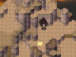
This is not finished yet, but I want some opinions. Do you think it's difficult to see where you're going? I think it might get confusing.
I'll post the finished version later.
I'll post the finished version later.
You should use VX instead, Max.

If he was joking, I don't get it. Confusion: ???
I specified that it was VX cause I know it looks like XP.
I also included lots of graphics converted from XP, but you can't really see them in the screenshots, I admit.
I specified that it was VX cause I know it looks like XP.
It is VX since the screenshots indicate he is using the expanded Sci-fi VX RTP graphics.
I also included lots of graphics converted from XP, but you can't really see them in the screenshots, I admit.

