MY SCREENSHOT IS BIGGER THAN YOURS!
Posts
author=Little Wing Guy link=topic=1971.msg34298#msg34298 date=1222465609
This is not finished yet, but I want some opinions. Do you think it's difficult to see where you're going? I think it might get confusing.
Not quoting a picture. I'd have to see the whole map, but if that screen is any indication then I don't think that navigation will be an issue.
If I were you, I would do each elevation a different shade (alternating, of course)
@ Max: Ohh, so that's VX, huh? Wow. I thought it was XP for a moment (possibly because I never read your comment before looking at the screenshots =P). BUt then the TileSets, and the the maps were made me wonder... There seems to be a decently big difference between the way the XP and VX tiles are. Well, to me anyway. Maybe that's because I haven't seen all that much of VX yet. =O
Anywhoo, they're good. I like the sci-fi aspect of 'em. I'ts not medieval or anything liek that! I'd have to say that I'm a sucker for those types of games, though, so I'ma not gonna say anything bad about them. But I like the way everything looks, so this sci-fi is good!
@LWG: Difficult to see where your going? Not really. I can clearly tell the difference between the path and the different sections of the mountain. If it's all like what you've shown us here, then there should really be no problems. Also, I like the way you have the mountain set up! That, as well as it's color. It's warm...and peaceful. Makes me want to look at it for a while longer.
Thanks Demicrusaius and Ephiam! Warm and peaceful, huh? That's pretty much what I was going for, it's supposed to be a barren uncharted land at sunset. I've finished it, it's probably a little OTT but I like it anyway, especially since I got rid of them awful stairs. (whenever I get bored I'll probably alter it a bit xD).
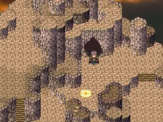


Maybe the stairs don't fit. Maybe they are arbitrary, but I like the look of the stairs better. And maybe ease up on the shading more like the first one, but keep the big rock from the second, me thinks.
author=Feldschlacht IV link=topic=1971.msg34502#msg34502 date=1222547260
The first one definitely looks a lot cleaner.
I don't do clean maps, I do clutter fuck :)
Maybe the stairs don't fit. Maybe they are arbitrary, but I like the look of the stairs better. And maybe ease up on the shading more like the first one, but keep the big rock from the second, me thinks.
Thanks man. I'll ease up on the shading for sure, but the stairs are staying out, I really think they look dreadful, sorry. Anything else need changing?
So do you both think the first one looks better? >_< this is why I should post on this topic more, I can't judge what looks good at all!
Either one is fine, don't worry about it. It's up to you. I personally would try to find a balance between the two.
And not save it as a .JPG.
And not save it as a .JPG.
@LWG>> Like Neophyte said, it's your choice. Depends on whether you like simplistic or detailed maps, and from the looks of it, you like detailed maps. So, in my opinion, I'd say the second one.
@Max>> I like the atmosphere! Btw, is the first screen meant to be a spacecraft of some kind?
@Max>> I like the atmosphere! Btw, is the first screen meant to be a spacecraft of some kind?
LWG, No, I think the second one looks better, but could use some smoothing out, particularly with the thicker cliff edges abruptly ending.
Um, WTF are you posting those for?
I certainly hope he is remaking all of those Final Fantasy games in RPG Maker VX and those are impressive screenshots of his current builds!
This is the Screenshot Thread in the forum that talks about game development. You are supposed to post screenshots of your games.
Man you are lucky I did not catch you doing this before WIP and Holb did!
Increase the quality of your posts, dude. Recently you posts have either been one liners or just garbage. You're smarter than this.
Increase the quality of your posts, dude. Recently you posts have either been one liners or just garbage. You're smarter than this.
I have no idea what the above posts are referring to. Has the offending pot been removed??
Thank you! Yes, all of the screenshots are from the same spacecraft. It's hard to convey a spacecraft with the tilesets I have, but I tried to give the impression using very cramped spaces and narrow corridors. And seeing the scrolling stars in motion helps.
@Max>> I like the atmosphere! Btw, is the first screen meant to be a spacecraft of some kind?
Thank you! Yes, all of the screenshots are from the same spacecraft. It's hard to convey a spacecraft with the tilesets I have, but I tried to give the impression using very cramped spaces and narrow corridors. And seeing the scrolling stars in motion helps.
I am having trouble sticking to one project. Due to certain motivations as of late, I have been interested in completing a demo for my Blade Runner fangame.
Today I randomly started to work on it again, and this is the result.

Today I randomly started to work on it again, and this is the result.

@Eschalt:
I like the style and the rusty atmosphere; but the tileset seems rather blurry and anti-aliased. I also think that it may be a good idea to put a "text box" per se around the "PHARMACY" pointer. c:
I also think that something should be done about the Coca Cola logo. One is its perspective: it looks "flat" compared to the buildings perspective-wise, because of the lighting. It could probably be fixed by running an upward black gradient through those tiles to simulate the effect. Also, darkening it a bit might make it fit into the background more.
But aye, I like the style and atmosphere, and the char-set seem to fit in with fair consistency.
---
I'm just going to post a poster that contains 6 screenshots, rather than going through the hassle of dissecting them. Serves as a shameless plug anyway :P :

http://www.youtube.com/watch?v=oQIoU7_XTlY
The trading system in full effect! As this took FOREVER to finally get done. God, this was probably the toughest fu*ker to do in my entire time on RM2k3. Wow. The other day I was trading for Boardwalk and for some reason got Park Place (and it was mortgaged) when I gave it back...I still had them! ****!!! So it works now.
God damn, everyone here has some awesome shots. Makes my movie look bad. :P
@Reives- Neat screenshots and i didn't even realise a new version was up. It's good to see your still continuing with it.

Reives, people have said before that it looks blurry, I just never got around to trying to fix it. Hopefully this looks better? The only thing I changed was the sidewalk and the roof tile above the coca cola sign (which is actually supposed to be like a giant LCD screen. In the game, it flashes and animates, just like almost all of the other signs.) Also, I added some texture to the road tile, to the point where I can now call it my own personal custom edit.
I wonder if I will ever finish this. (It has been like 5 years now, on and off. That is longer than a Nexus 6's lifespan and I feel so very unaccomplished...)


