MY SCREENSHOT IS BIGGER THAN YOURS!
Posts
author=VideoWizard link=topic=1971.msg35694#msg35694 date=1223012864
Note the heroes are on level 10. No 1000+ HP at level 10 in this game!
I think the monsters would look better with a custom battle background, how do I do that in RMVX (if possible)?
You just have to edit a few lines of code. The background is actually built off of a couple of images as well as a screenshot of your current map. You need to change the code and replace relevant images.
Anyway those bees look sweet man. Could use some antialiasing though?
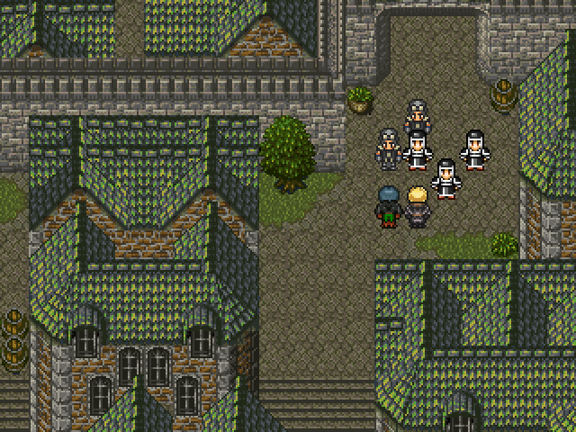
@Feldschlacht: PLEASE don't use those RTP edited Soliders They stick out way too much. Everything else is totally sexy!
I disagree, I think they look fine, but then again "Graphical Consistency" has never been as much of an issue for me as others.
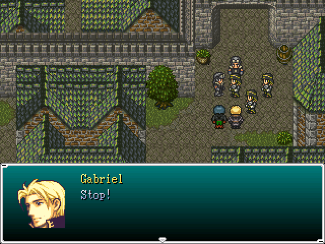
Those are much better. The gold could probably stand to be changed to silver or white (since it jumps out a bit too much at first), but it's still fine.
However, with that faceset, please recolor the outline on the hair to a darker blonde instead of that default dark purple. It makes me want to kill things when people leave that in on FE resources. It is so terrible..
However, with that faceset, please recolor the outline on the hair to a darker blonde instead of that default dark purple. It makes me want to kill things when people leave that in on FE resources. It is so terrible..
It would appear black on lesser monitors(cheaper monitors have trouble differentiating between very dark colors), but it's clearly visible on better displays with good image quality.
It appears quite purpleish-brown to me, in fact.
It appears quite purpleish-brown to me, in fact.
Yeah, it's supposed to look black without being black, since total black tends to mess up transparency and such things. But they used the same purple outline for all their blacks, and when it comes to hair, it tends to look especially terrible, unless it's a dark blue or purple hair tone.
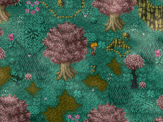
The result of a spontaneous RM experiment after not using it for a few months.
Too flamboyant? I was kind of iffy about the pink.

Too flamboyant? I was kind of iffy about the pink.

It is very pink and the character stands out a bit, but generally I like it! If you keep it mostly pink it could be a nice area that stands out almost with it's own unique atmosphere.
author=BlindSight link=topic=1971.msg36073#msg36073 date=1223276682
The result of a spontaneous RM experiment after not using it for a few months.
Too flamboyant? I was kind of iffy about the pink.
Leave in the pink! It gives some character/ theme, otherwise it'll just look like another green forest.
@Blind: The variance in the tile usage is good and well placed, with nothing standing too much out, but I'd personally change the colors a bit to make it match with the "pink" trees.
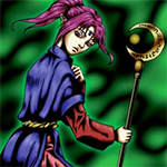
I'd go with something like this:
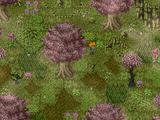
or this:
Though, I dunno if it's just personal preference.
I'd go with something like this:

or this:

Though, I dunno if it's just personal preference.
I like the second example by Rei best, it is all more blue-ish. Completing what Harmonic said: It reminds me of the Witch forest from Secret of Mana :)
The charset blows, though.


