SUMMER SCREENSHOT SPECTACULAR!
Posts
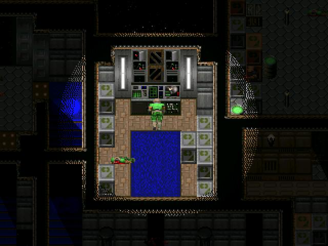
@YDS -Perhaps you may like to place seats along and next to the walls? You could also do a few tile/floor colour variations, to make things a little more decorative?
Also, is that a little wall/elevation near the windows (the blue things with the lights on them? They're lights, right?)? If so, you could possibly put stairs there so that people may have a better view of what is outside?
Though, it looks nice already :).
Also, is that a little wall/elevation near the windows (the blue things with the lights on them? They're lights, right?)? If so, you could possibly put stairs there so that people may have a better view of what is outside?
Though, it looks nice already :).
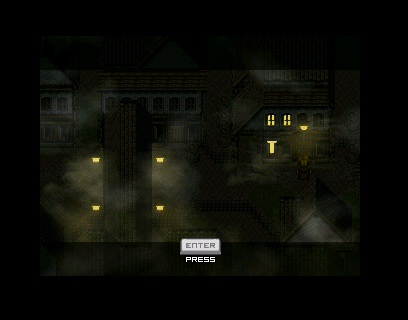
More unnecessary light overlays (yes, I know it is dark. It's not actually that dark in-game. Again, it's RMN's white site-skin that contrasts with it :( ).
ooOOOOh. More maps from nickad! this is so... Cute lol. I love your maps, they are so... precise, feelingful, i can't say. I just wov'em.
Thank you for the comments :).
@ Supremewarrior - Thank you :). I've been slowly trying to develop more realistic lighting.
@ JosephSeraph - Really? I do try to convey an atmosphere that is realistic, so that the player can become immersed in the game-world. Thank you :).
@ F-G - You do make a point. But this particular game is meant to be a dark one, hence the lights are more... 'Harsh' instead of 'soft and subtle' (if you know what I mean?). More of the inside areas have more transparent lighting (for candles, etc). Though, I suppose I could give the outside areas a little more transparency.
post=88246
I think the lights in that screenshot are too harsh. They should be more... transparent?
I disagree. I think the lights should be harsh by contrast. With the rest of the screen so dark, there's a greater sensitivity to light. Looks good to me.
I don't know. I was going to work on it but then I started playing zdoom and whoopsie daisy I remember crappy rm2k versions of doom years ago
EDIT:
actually, I will just make this a "practice"-project in VX instead.
EDIT:
actually, I will just make this a "practice"-project in VX instead.


