SUMMER SCREENSHOT SPECTACULAR!
Posts
Thanks for the feedback. :]
The shape and size of the HUD is sort of legacy based on an older release. Before I had another icon next to the HUD called the "action command"--much like Mario & Luigi Superstar Saga. It would show icons based on what you could do when you were near NPCs, ladders, chests, etc. But that got pointless and annoying to maintain so I removed it.
The shape and size of the HUD is sort of legacy based on an older release. Before I had another icon next to the HUD called the "action command"--much like Mario & Luigi Superstar Saga. It would show icons based on what you could do when you were near NPCs, ladders, chests, etc. But that got pointless and annoying to maintain so I removed it.
I think it looks great DHM. However, just to be nit-picky, there appear to be a few darker pixels within the man that stand out to me and wreck the fluidity of the graphic. I suggest brightening them up a bit some it makes the interface seem smoother. Hopefully, you can see what I'm talking about. Again, this is REALLY nit-picky.
Why is the running man so pixelated? If you would just solidify the running man silhouette it would look much better.
Some stuff from a project I'm starting with a friend- currently in super super alpha. Screenshots show off tentative graphical style and atmosphere tests.

The game is steampunk, and while I won't say much, large parts of it take place underground.

An underground room/atmosphere test. It's a forge.

A very very tentative CMS design. Not much of it works right now.
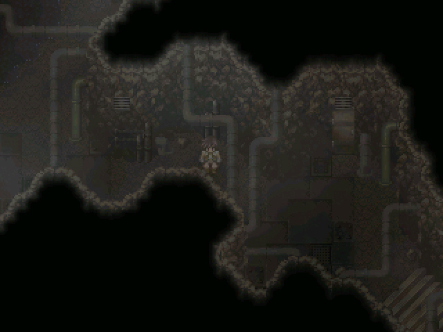
More cave-ness, this one's near an underground lake. And yes, the pipes do run overhead.

And of course, the pièce de résistance... A locker room. Awesome.
Yeah, it's not much, but like I said, early early alpha state. That character sprite is temporary until I come up with a better character design, and the current main character will probably get scrapped once the story gets further along. For now, opinions would be awesome. :D

The game is steampunk, and while I won't say much, large parts of it take place underground.

An underground room/atmosphere test. It's a forge.

A very very tentative CMS design. Not much of it works right now.

More cave-ness, this one's near an underground lake. And yes, the pipes do run overhead.

And of course, the pièce de résistance... A locker room. Awesome.
Yeah, it's not much, but like I said, early early alpha state. That character sprite is temporary until I come up with a better character design, and the current main character will probably get scrapped once the story gets further along. For now, opinions would be awesome. :D
Tardis that looks amazing. I'm really liking the custom menu and the glowing effects on the furnace and lights. Best of luck with this it's looking great so far.
ps. That's a lot of pipes.
ps. That's a lot of pipes.
I can't believe you did NOT overdo the lighting effects. I mean this is a dark 2k3 game after all!
...yeah, good job. The 2nd picture is my favourite because of the contrasting light sources.
...yeah, good job. The 2nd picture is my favourite because of the contrasting light sources.
Thanks for the comments all!
Yes, it is a lot of pipes. :) But I do love me some pipes, so this is like a *cough* pipe dream for me... Yeah, I know, I worked at that one.
Once we get some more miscellaneous characters nailed down, I'm going to start on the first town. For now, we just have a small series of test maps, but the first town is going to be pretty big, but cramped.
@FG- yes, it is an RPG. :) I'll probably get some form of a town put together in the next week or two.
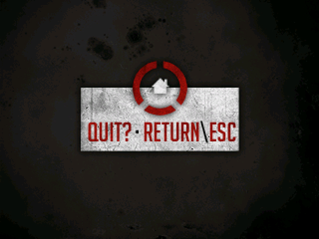
Also, have a bonus screen. This is the quit screen in the CMS.
Yes, it is a lot of pipes. :) But I do love me some pipes, so this is like a *cough* pipe dream for me... Yeah, I know, I worked at that one.
Once we get some more miscellaneous characters nailed down, I'm going to start on the first town. For now, we just have a small series of test maps, but the first town is going to be pretty big, but cramped.
@FG- yes, it is an RPG. :) I'll probably get some form of a town put together in the next week or two.

Also, have a bonus screen. This is the quit screen in the CMS.
You stole my half-custom lockers. =( Haha, it's not like my resources are original either! Looks pretty. I love the atmosphere and graphical style. Sort of dark and rough.
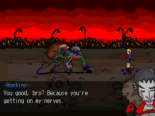
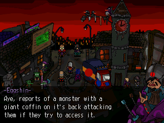
If you want to see gameplay video's, you can find them here:
http://tft-rnss.blogspot.com/2007_07_01_archive.html
@Rei
Well, keep in mind, nothing's permanent at this point, so there might be a locker holocaust if you want me to go make my own... ;)
@TFT-
God damn I love those face graphics. And pretty much your whole graphical style.
Well, keep in mind, nothing's permanent at this point, so there might be a locker holocaust if you want me to go make my own... ;)
@TFT-
God damn I love those face graphics. And pretty much your whole graphical style.
@TFT: That's looking really good. I enjoy the style of the art.
EDIT:
EDIT:
post=91656Ooo careful. You don't want to be sued by Tim Langdell
This is an older screen shot of my game Dark Chaos.
post=91665
If you want to see gameplay video's, you can find them here:
http://tft-rnss.blogspot.com/2007_07_01_archive.html
Too hawt.
Looks nice Tardis, I hope it's as fun as it looks. Incidentally, you might want to look at Breath of Fire 5's tracks if you're using ripped media for your soundtrack.


