


SHOW ME YOUR SCREENSHOTS - FALL EDITION
Posts

Unscreenshot related, but Spriter's Resource is back up and running, yay. AGH, DAMMIT!!! *gets a screenshot ready.*
Ignore the facesets. :P I've been remodeling some backdrops to try and match the chipsets the best I can.
Ignore the facesets. :P I've been remodeling some backdrops to try and match the chipsets the best I can.
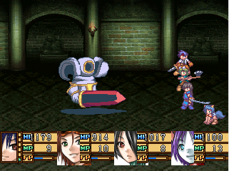
Why thank you Mr.Tardis, the monsters and battlers were custom, but the backdrop wasn't. I just put it together that was from Spriter's Resource using GraphicsGale. :D
post=102437
Knowing you, J-Man, that's all custom. Damn fine work, sir.
The enemy sprite looks like an edited Barberossa from Valkyrie Profile.

here's a quick little screenshot of the inside of a well:

The green slimes in there are described as "always talking complete and utter nonsense and making no sense at all"
Basically they talk about game mechanics and controls (heh, heh, 4th wall)
The green slimes in there are described as "always talking complete and utter nonsense and making no sense at all"
Basically they talk about game mechanics and controls (heh, heh, 4th wall)

post=102439post=102437The enemy sprite looks like an edited Barberossa from Valkyrie Profile.
Knowing you, J-Man, that's all custom. Damn fine work, sir.
Nah, it's based off of Barbarossa, but it's custom made. He's shown me the WIP for that one before iirc.

post=97488
Yeah, that screen's a bit old, it's not nearly as blue anymore.
My font...):
I saw that font in Terranigma
post=102474
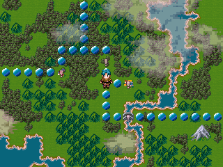
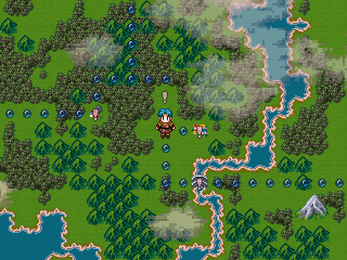
Left is old, on the right is the improved one. Better?
They look a lot better, well done! All I might say is that you could possibly make the colours a tad brighter so they appear more readily visible over the landscape. They're not really that obscured or anything, but I think making them a tad lighter will make them pop out instantly as a traversable path.

SovanJedi
They look a lot better, well done! All I might say is that you could possibly make the colours a tad brighter so they appear more readily visible over the landscape. They're not really that obscured or anything, but I think making them a tad lighter will make them pop out instantly as a traversable path.
Absolutely. The new shape and size is great, but they need to have a bit of a softer edge to make them really stand out. They're fine over grass, but when they run over forest they become easy for peripheral vision to lose, whereas the old ones didn't. Play around to see which one is most visible without being garish. But yeah, major improvement!


I have been using maps wrong my entire life!!!
(pretty menu btw, feel free to release that thing whenever you want)
(pretty menu btw, feel free to release that thing whenever you want)

This is just a little something of a side project im working on while my artist is busy on Red Skies. This game is made completely of rips, and charas graphics, with the exception of the world map. I want some honest opinions please. Plus keep in mind that this is all VERY rough draft.

+

+

+

+


+

+

+

+


post=102562
It's a pet peeve of mine, but it seems there is still room for "mother..." behind command. Yeah, plenty of room.


