


SHOW ME YOUR SCREENSHOTS - FALL EDITION
Posts

The table? I already showed you that: Layering charsets and transparency.
edit: asrasdasfjfdl top of page.
Well, I just posted this anyways:
edit: asrasdasfjfdl top of page.
Well, I just posted this anyways:
post=102030The break room of the lab. There's a sink, a window out into space, a TV, some movies, cabinet, etc. I really like my see-through glass table with teacups on top...

post=102018
When starting over I had remember neophyte's advice I hadignored due to lazinessoverlooked earlier and took special care to align icon and the text, something a lot of people apparently overlook.
;)
I'm loving the health and magic glyphs. In fact, that whole screen is...flawless.
post=101995post=101983That's your opinion, which is fine. However, the dark green is a far, far better choice than the lighter mint green you chose as an example.
The original dark green background? Sorry but that thing is terrible.
All right, then...what would you recommend? In reference to this:

vs. this:

I definitely like the check marks more, but don't know which backdrop to choose. I could always try a new color scheme...

Why not just keep the boxes white but change the actual background to another colour. Too much white drowns out the rest of the images, but the red in green contrasts too much.
Hell, I'd forget a green background and go with something a bit more like this (which took me a whole 2 seconds. ^.^)

A nice pastel-light/neutral colour to break it up a bit.
Or if you want something darker:

Hell, I'd forget a green background and go with something a bit more like this (which took me a whole 2 seconds. ^.^)
A nice pastel-light/neutral colour to break it up a bit.
Or if you want something darker:

@NB: Nero's pose looks absolutely retarded. Otherwise, it's really good! Seriously though, it looks like he is standing with his chest puffed out a foot in front of him, but his legs are clearly both in view so that's not possible... I just don't know what's is going on!
post=102054
@NB: Nero's pose looks absolutely retarded. Otherwise, it's really good! Seriously though, it looks like he is standing with his chest puffed out a foot in front of him, but his legs are clearly both in view so that's not possible... I just don't know what's is going on!
Making an idle stance for a weaponless caster is really, really difficult. I'm open to any ideas.
You could always study the other RS3 char poses. I use RS3 chars as well, and there are lots of idle poses floating around. Since regular RS3 chars don't show any weapon in their idle pose, one of them should give you something to emulate, especially since you aren't shrugging away from "actiony" poses. I would suggest one of the "psuedo-lean" forward ready poses, with less emphasis on the leaning and more on the fact that he isn't standing flat footed.
post=102076
You could always study the other RS3 char poses. I use RS3 chars as well, and there are lots of idle poses floating around. Since regular RS3 chars don't show any weapon in their idle pose, one of them should give you something to emulate, especially since you aren't shrugging away from "actiony" poses. I would suggest one of the "psuedo-lean" forward ready poses, with less emphasis on the leaning and more on the fact that he isn't standing flat footed.
The RS3 characters dont have an idle animation at all. They just stand there.
I have the entire RS3 sprite sheet, as well as a bunch of ROM hack sprites. =/

post=102083
The RS3 characters dont have an idle animation at all. They just stand there.
From what I remember, they do in fact just stand there, but when you select a command in battle for each character, they spin around and strike a pose.

post=102086post=102083From what I remember, they do in fact just stand there, but when you select a command in battle for each character, they spin around and strike a pose.
The RS3 characters dont have an idle animation at all. They just stand there.
Yes, exactly!
post=102087
And by pose he means: "EVERYBODY'S KUNG FU FIGHTING" literally.
Also exactly. Just move their bodies over a little so they are standing more... not stupidly.
Hello here is a double post because I have deemed this merits one:

You can recolour it yourself I think! 1 then 2 is the animation if you plan on using it, or you can use any one as an individual frame. His left arm doesn't move, but the animation is still alright.
Now you must agree to never go into a topic where people are asking for beta testers and give me dirty looks! Geez I said I was sorry!

I don't think I've posted a screenshot in a while.
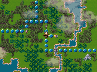
Trying out an idea. How naff do those circles look? Be honest.
Trying out an idea. How naff do those circles look? Be honest.
I'd go for much smaller circles and transparent maybe so they don't seem so out of place, but still serve as a visible path.
Yeah, what Darken said. Also it's nice to see that chipset again, it's been forever since the last time I did.
@halibalica: White is better but you should use the green one that Liberty suggested. Also you probably might want to do something about all that empty space.
@LWG: The circles draw more attention than anything else. I would go with something a little less fancy and also do what Darken said.
@LWG: The circles draw more attention than anything else. I would go with something a little less fancy and also do what Darken said.
post=102094
Hello here is a double post because I have deemed this merits one:
That actually looks...
Now you must agree to never go into a topic where people are asking for beta testers and give me dirty looks! Geez I said I was sorry!
The price is too high.
I'll check it out and see how it works, thanks a lot for the work.


