


SCREENSHOTS- 525,600 CHIPSETS
Posts
This is the new topic for screenshots. Try not to start an argument every three pages.
Please note, in the near future WIP has plans to implement a new feature for screenshots linked directly into the site itself. When that happens, there will no longer be any need for a screenshot topic. Until then, you have this one.
Reposting SorceressKrysty's Image from the end of the previous thread, for her benefit.
SorceressKrysty
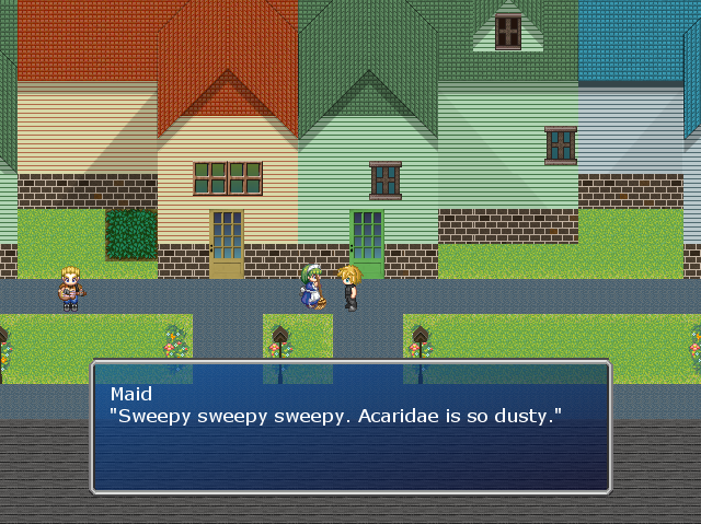
By the way, messages don't actually appear like this. I usually just test play from the map I want to take screenshots of and since the message setting is performed when the game gets started up, the message window returns to default.
edited for engrish D:.


Can I comment on Mary 4D's screen in the other thread?
That interface looks much, much better.
Oh, and I LOVE the puyo puyo games, so naturally I did some research on it and I know where it came from. Too bad Compile went out of business. :(
That interface looks much, much better.
Oh, and I LOVE the puyo puyo games, so naturally I did some research on it and I know where it came from. Too bad Compile went out of business. :(

@Kyrsty: The vertical rooves make no sense. Investigate references via google to see the error, it would take at least a thousand words to explain otherwise.
@Wolf: DARK MONITOR but that screen is very dark for no good reason. The menu might be... a TINY bit too simple, although I know that's what you're going for.
@Wolf: DARK MONITOR but that screen is very dark for no good reason. The menu might be... a TINY bit too simple, although I know that's what you're going for.
The screen is very dark for a good reason. If you read my other response you'll know I'm blackening the screen on purpose with an idea later of blurring it too as the menu is now the focus. The screen is normal when the menu is not open.

@WolfCoder: The problem is that the menu is so minimalistic that 85% of the screen is blackened. Even though it's suppose to be "in focus", your eyes are drawn to the darkness that is at the middle of the screen. Perhaps make the menu bigger? Add icons? Extra info?
Well of course, the menu is kind of sort of not complete (as in I barely started making it). When I say simple I mean there's few button presses needed, only the information the gamer cares about will be there and the like.
For one, there's going to be actual windows (so the text becomes more readable), and your entire party members info will (hopefully) be visible at all times (to aid in preps and using items on them). This menu is where the user prepares everyone for the stuff they use in battle.
For one, there's going to be actual windows (so the text becomes more readable), and your entire party members info will (hopefully) be visible at all times (to aid in preps and using items on them). This menu is where the user prepares everyone for the stuff they use in battle.

i was already tweaking the LOCOMOTIVE right after i posted that :) it's an access gangway so workmen are a given. as for the tracks i worked out a compromise with divisions between the track panels:
edit: fff i'm doing it again. always have to be tweaking.

Kaempfer
@geodad: Sorry I didn't mean the individual ties, I meant the larger metal ones. They look a bit like piece connectors in a train set. Those ones! I know regular ties are standardized. Also, I was curious about the fuel. I know how steam engines work (more or less!). I don't see a fuel car or anything, is all. I AM LOOKING FOR ANSWERS.
Needless to say I am excited and you can feel free to bombard this topic with graphical updates.
the smaller locomotive is a well tank engine with an internal fuel bunker. i am going to construct a tender for the larger locomotive. as for the connectors, this is how modern bridges are constructed.

oh it was literally just pixel-based work on the larger loco. i will post when i have done a tender / some more rolling stock


Find me a reference of bridges with straight vertical support, rockman! Every rail bridge I have ever seen has been trellised! Or do you mean "modern" as in "modern in the game world"?
edit: Guess who had a well tank engine? Thomas the Tank Engine, that's who! I guess that's why he's called a tank engine. I never put that together! I am learning so much. I love train games.
thomas has side tanks
also http://en.wikipedia.org/wiki/Bridge#Types_of_bridges (notice the trestle and segmental styles) as well as the tay bridge and the chicago L for really nice examples
not that you can see the bottom of the bridge of course ::)
edit: http://en.wikipedia.org/wiki/File:Sky_gate_bridge01s3200.jpg example too perfectly apt with the double level

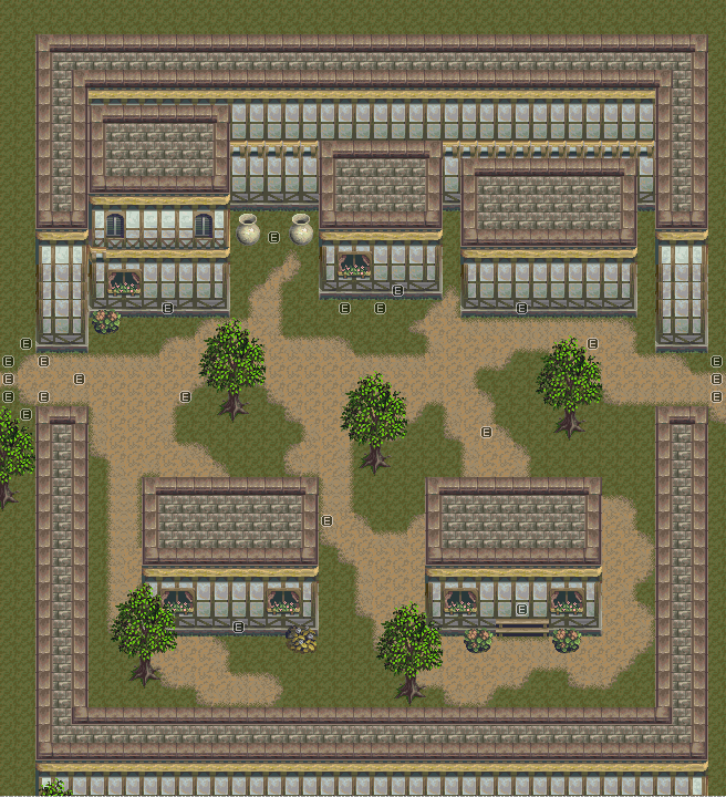

What really screws up my eyes is how the stair's 'rails' blend in with the sidewalk border. Since they are also the top of the walls, it is hard to tell if it's going diagonally down an elevation. There are many ways to fix that like adding a mini pillar to each end of the stairs to make it actually look like it hit the ground and isn't part of it. Also I'd space the bottom wall 1 tile away from the sidewalk so that part doesn't play with the eyes either.
Overall it's a pretty good map, just make sure the player can't get outside the walls or that would be kind of awkward (I strangely remember being able to do that through tileset errors).
Overall it's a pretty good map, just make sure the player can't get outside the walls or that would be kind of awkward (I strangely remember being able to do that through tileset errors).

